Jacob van Ruisdael Palette 2

Palette Analysis
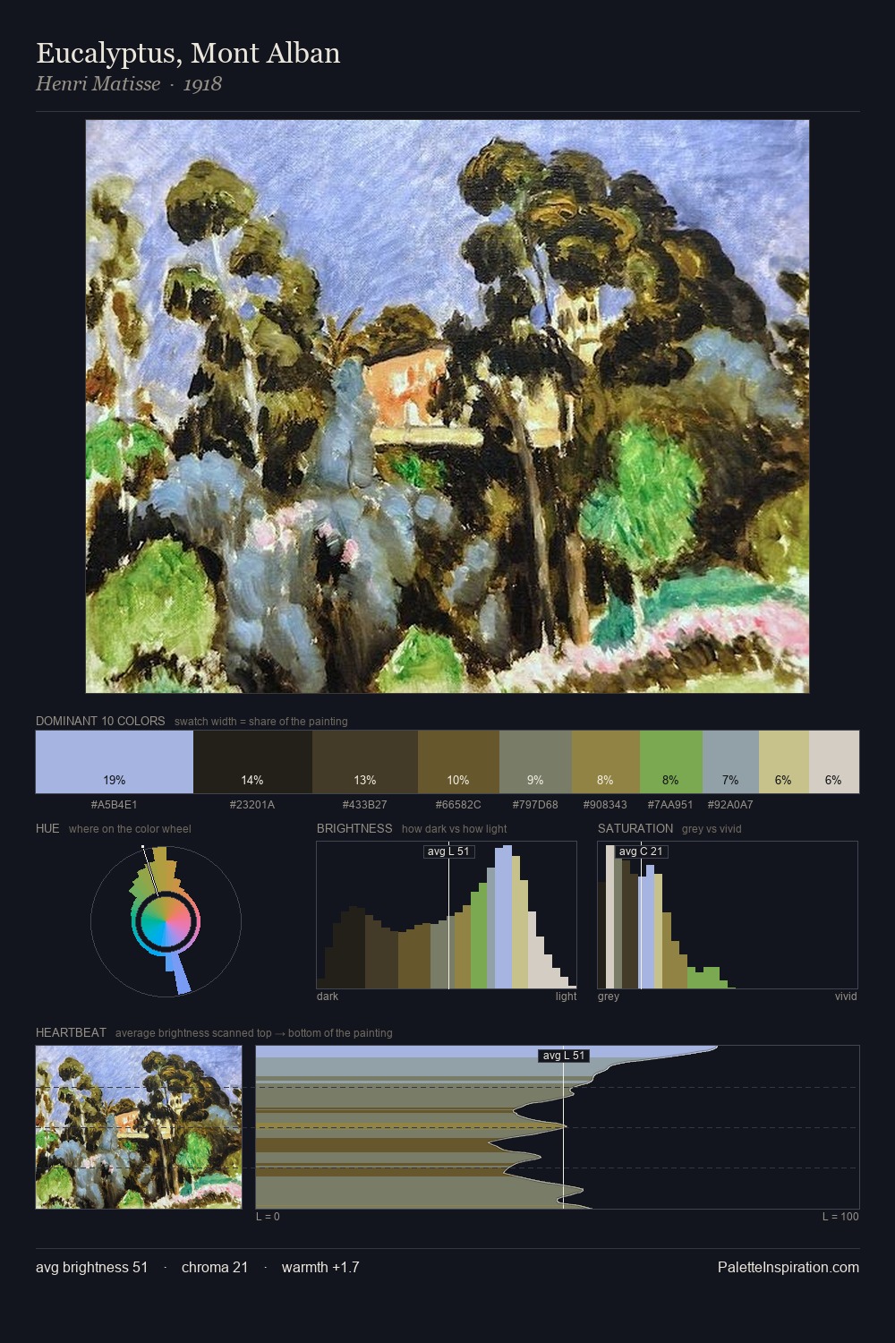
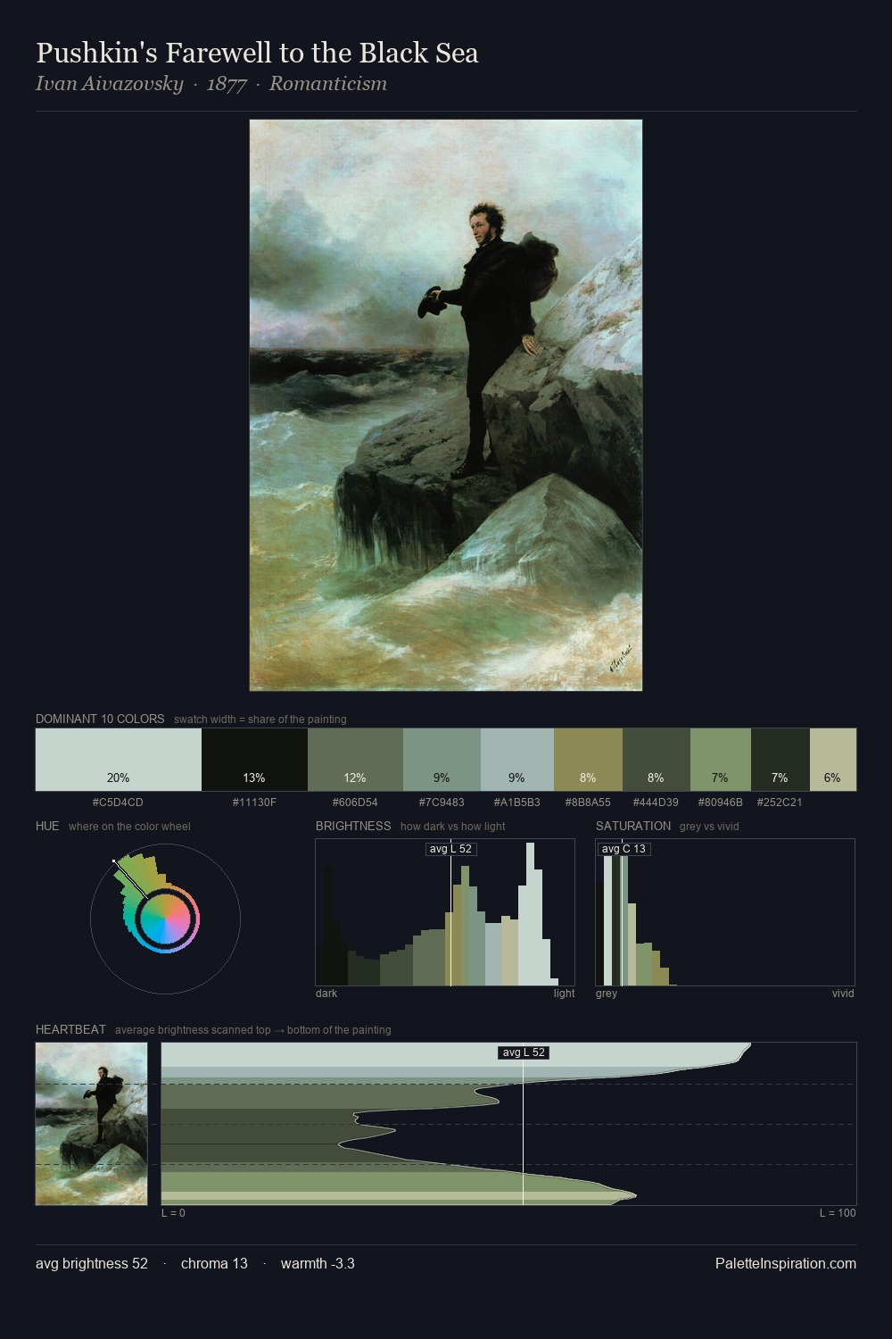
Values in Jacob van Ruisdael rest in the mid-range - neither dramatically lit nor steeped in shadow. Blues and teal-greys govern the palette, lending it an aquatic or atmospheric quality. Saturation is deliberately withheld - the beauty here lies in the near-monochromatic gradations rather than colour difference. The saturated accent, #9AB8CA, registers at 11.4% - sparse enough to feel like a deliberate surprise. From deepest dark to palest light, the palette traverses 60 units of the value scale - a span that creates natural depth. High luminosity and cool temperature suggest the plein-air condition: unfiltered daylight and open sky. In the context of Jacob van Ruisdael's full range of palettes, group 2 represents one movement in an ongoing chromatic dialogue.
Example use cases
- exhibition design
- foundation branding
- estate management
- art education
- museums & galleries
I Love This!
Copy, export, or download for your project