Nadezda Petrovic Palette 3

Palette Analysis
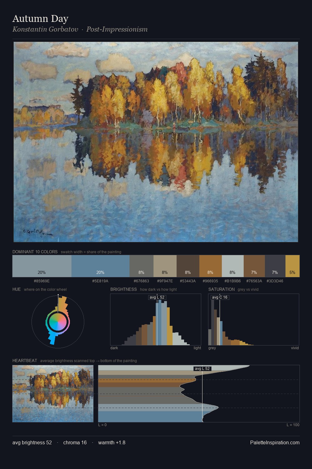
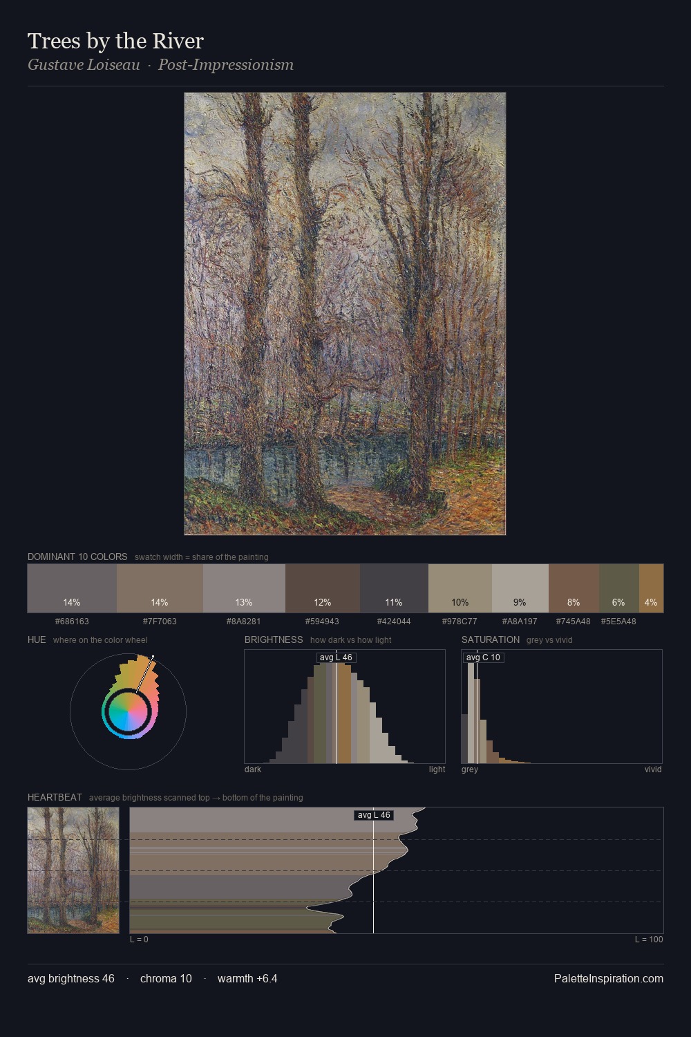
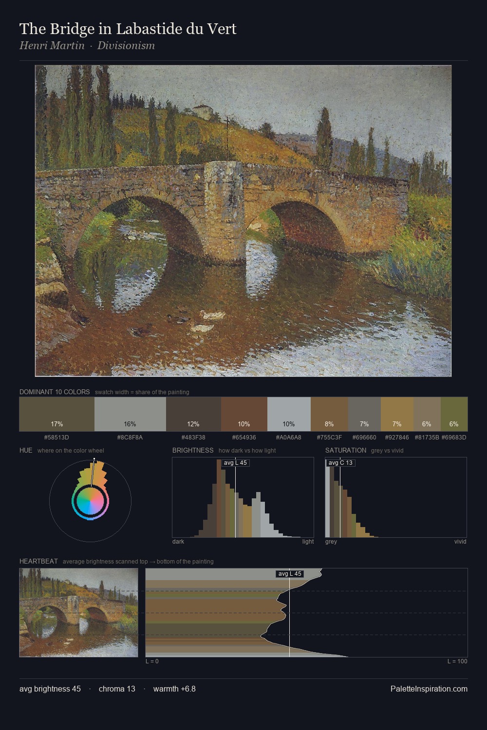
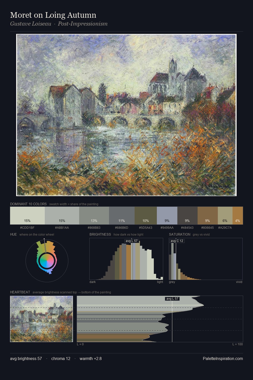
The high-key values of Nadezda Petrovic give it an effulgent, almost bleached quality. Nadezda Petrovic tilts toward cool - blues and silver-greys carry the structural weight. Saturation is deliberately withheld - the beauty here lies in the near-monochromatic gradations rather than colour difference. #7A5540 functions as the palette's exclamation mark: highest chroma, lowest percentage (4.9%). Value range is moderate at 45 units - enough contrast for legibility, not so much as to fragment the tonal unity. The mid-to-high key, cool bias, and moderate chroma point to outdoor observation - sky and diffused daylight as the dominant light source. Nadezda Petrovic's palette 3 carries its own internal logic while remaining in conversation with the artist's broader colour intelligence.
Example use cases
- archival print
- university identity
- rare books
- cultural institutions
- nonprofit identity
I Love This!
Copy, export, or download for your project