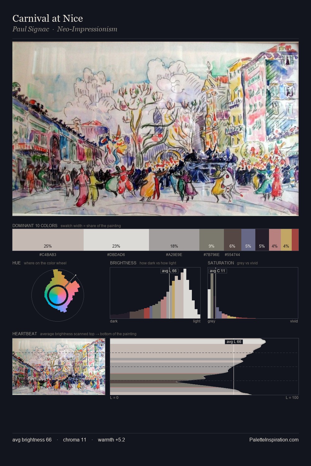
Boris Kustodiev Palette 5
Soft Ivory
Soft Low-contrast, gentle chroma - mid-key values and low saturation, approachable and calm.
Ivory Warm creamy white - the color of natural ivory, warmer than pure white.

Palette Analysis
Values in Boris Kustodiev tilt decisively toward white, giving the palette its luminous character. Temperature is balanced: the palette pits warm earth against cool sky without declaring a winner. Chroma hovers near zero; colour declares itself through subtle shifts in hue rather than outright saturation. The highest-chroma note - #AFBA75 - appears at just 4.5%, deployed as a precision accent against the quieter ground. At 66 units of value range, the palette has the tonal breadth to sustain complex spatial readings. In the context of Boris Kustodiev's full range of palettes, group 5 represents one movement in an ongoing chromatic dialogue.
Example use cases
- museums & galleries
- academic publishing
- heritage brands
- auction houses
- exhibition design
I Love This!
Use This Palette
Copy, export, or download for your project
Copy, export, or download for your project
Copy:
Download:
Share: