Boris Kustodiev Palette 12

Palette Analysis
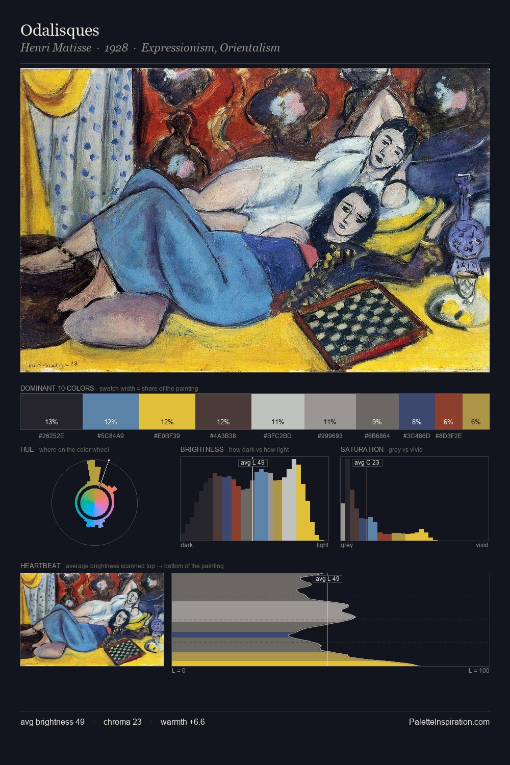
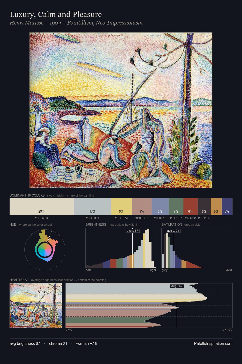
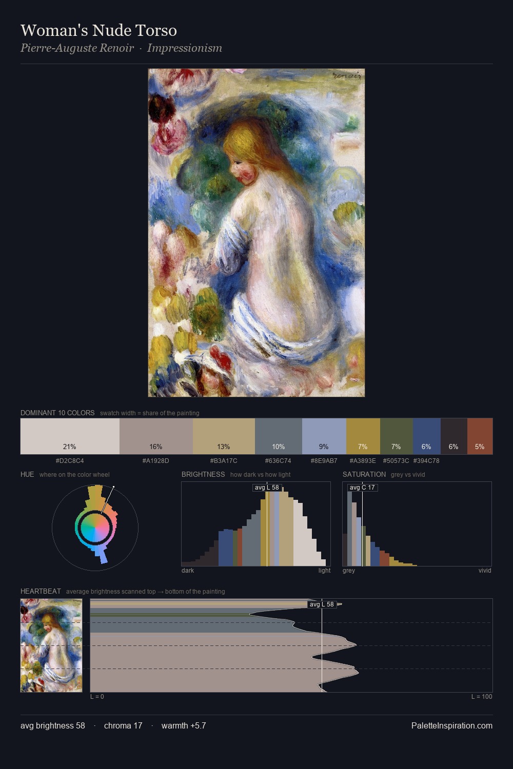
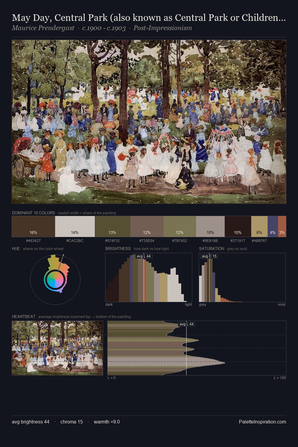
Boris Kustodiev is strongly light-biased - shadow is suggested rather than declared. Warm hues command this palette; Boris Kustodiev favours the reds, oranges, and yellows of firelight and earth. The absence of saturated colour is itself an expressive choice: this is a palette of restraint and atmosphere. #C5C1C0 at 32.1% of the palette: an overwhelming presence that pulls all other colours into its gravitational field. The most saturated colour, #394D7B, is reserved to 1.8% of the surface, where it acts as a focal punctuation. From deepest dark to palest light, the palette traverses 63 units of the value scale - a span that creates natural depth. Palette 12 sits within the larger chromatic argument that Boris Kustodiev's complete body of work advances.
Example use cases
- exhibition design
- foundation branding
- estate management
- art education
- museums & galleries
I Love This!
Copy, export, or download for your project