Nadezda Petrovic Palette 4

Palette Analysis
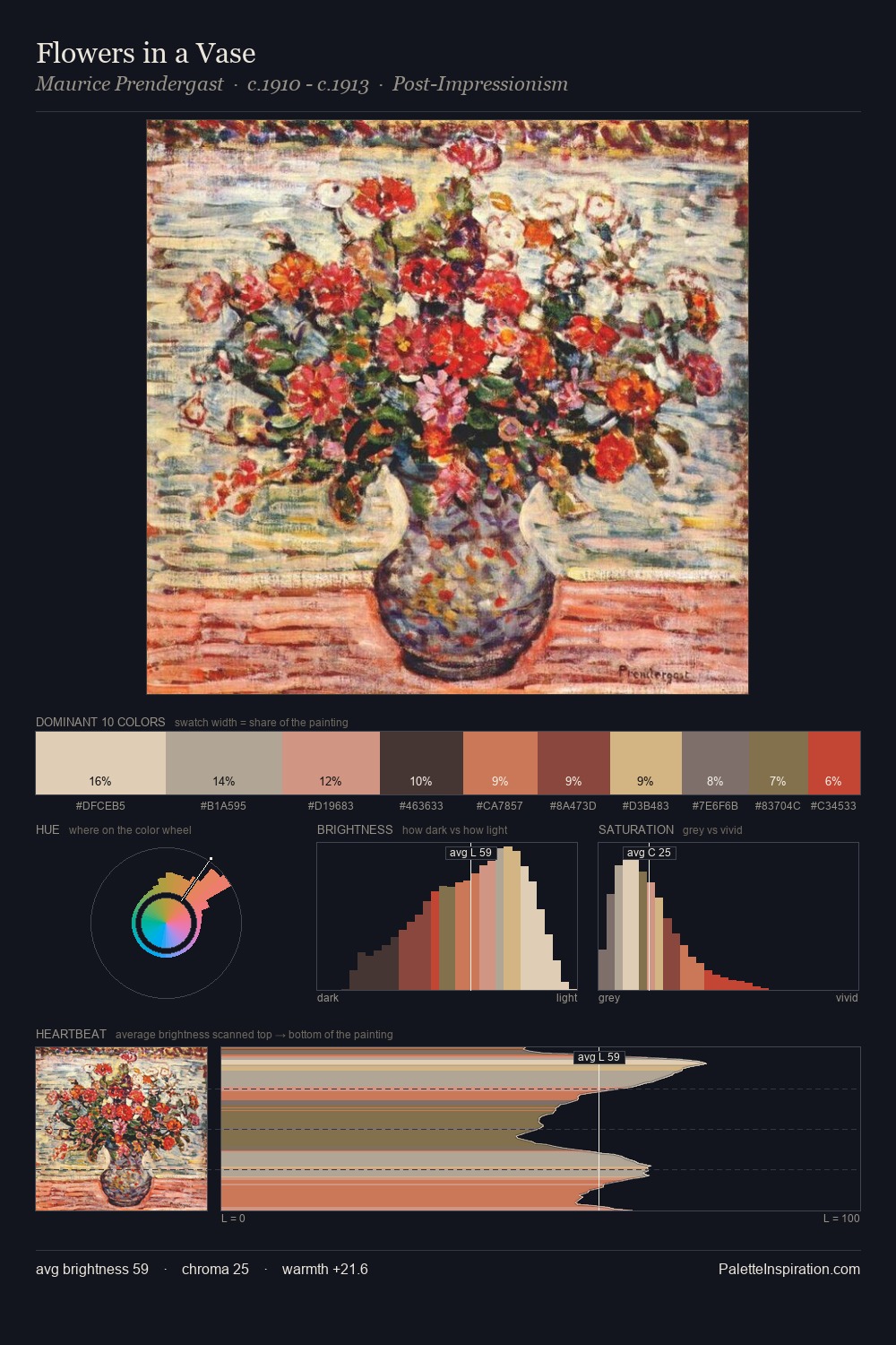
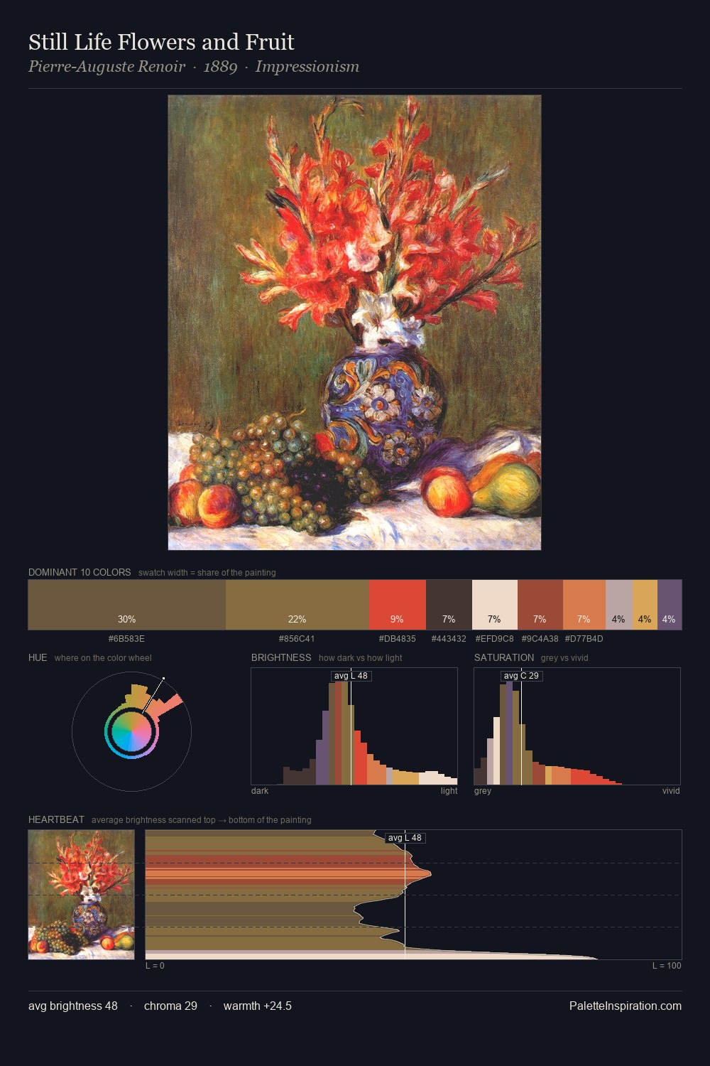
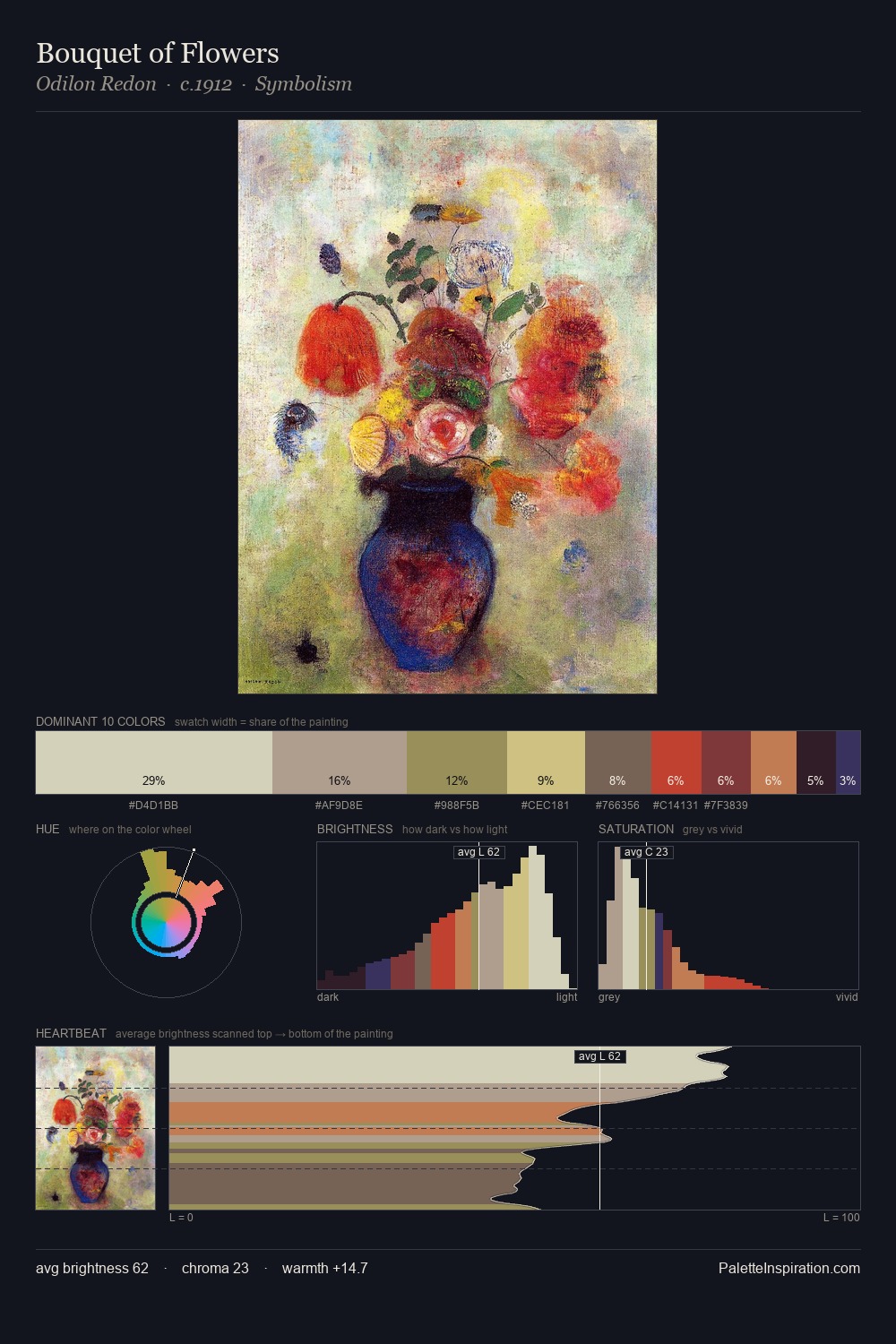
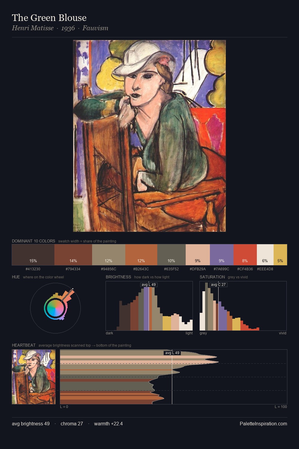
Nadezda Petrovic distributes its values across the middle register, creating harmony without high contrast. Warm and cool are kept in productive tension, creating the kind of chromatic harmony that sustains the eye. Chroma is held at a comfortable level - distinct colours, but no single hue is allowed to overwhelm. #D48051 functions as the palette's exclamation mark: highest chroma, lowest percentage (8.7%). Value range is moderate at 52 units - enough contrast for legibility, not so much as to fragment the tonal unity. The combination of mid-to-high key, balanced temperature, and elevated chroma is characteristic of Impressionist observation: light broken into its component hues. Nadezda Petrovic's palette 4 carries its own internal logic while remaining in conversation with the artist's broader colour intelligence.
Example use cases
- food packaging
- leather accessories
- travel & outdoor
- natural cosmetics
- interior design
I Love This!
Copy, export, or download for your project