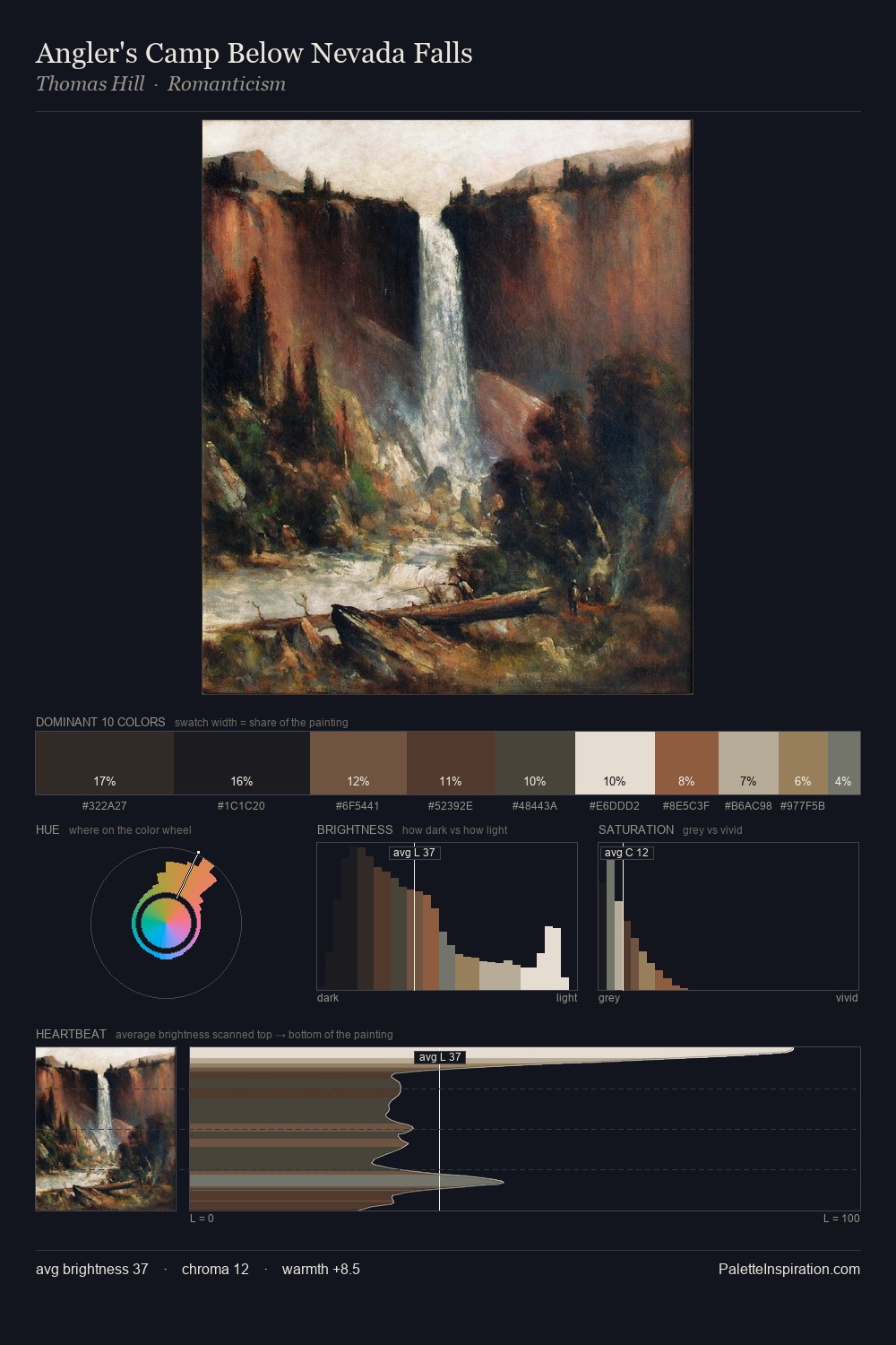
Hieronymus Bosch Palette 8

Palette Analysis
The value structure of Hieronymus Bosch is mid-key: quiet, controlled, and cohesive. Blues and teal-greys govern the palette, lending it an aquatic or atmospheric quality. Saturation is deliberately withheld - the beauty here lies in the near-monochromatic gradations rather than colour difference. The highest-chroma note - #201313 - appears at just 3.6%, deployed as a precision accent against the quieter ground. 70 units of value range underpin the palette's structural clarity: the eye always knows where light falls. The mid-to-high key, cool bias, and moderate chroma point to outdoor observation - sky and diffused daylight as the dominant light source. This is palette 8 of Hieronymus Bosch's sequence - a single chapter in a chromatic story told across many works.
Example use cases
- nonprofit identity
- public libraries
- historical sites
- literary journals
- archival print
I Love This!
Copy, export, or download for your project