Hieronymus Bosch Palette 1
Pale Ecru
Pale High-key and low-chroma - delicate, bleached, washed with light.
Ecru Unbleached linen - warm mid-neutral, slightly grayed, raw and natural.

Palette Analysis
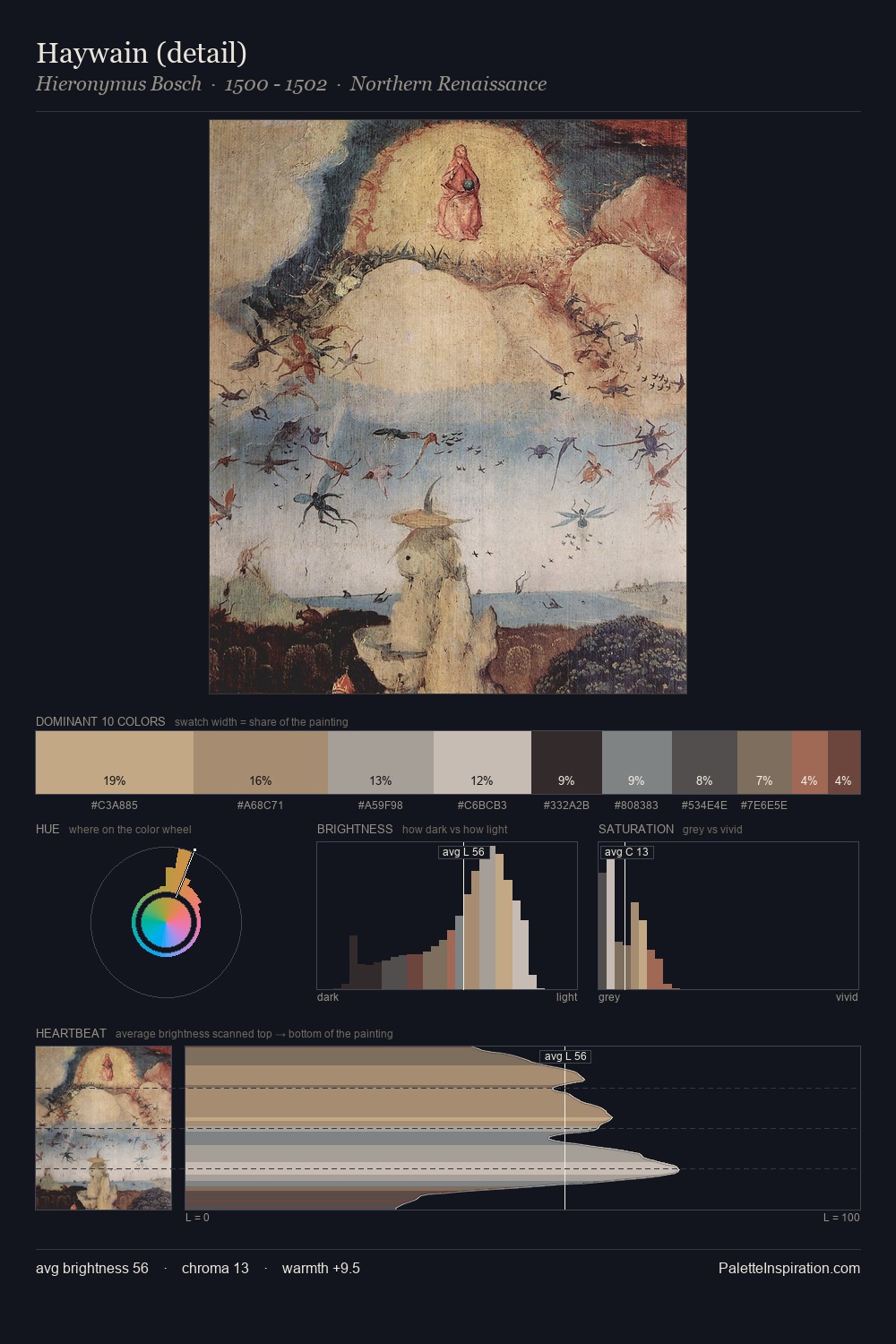
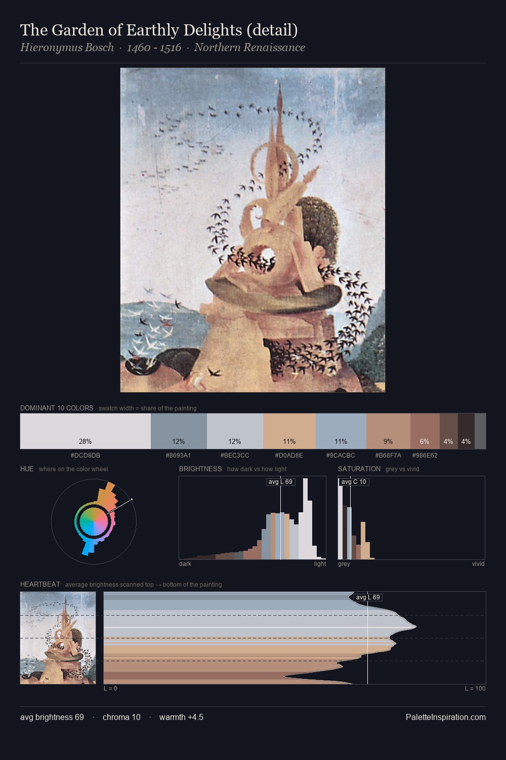
Hieronymus Bosch keeps values measured and balanced, a hallmark of tonal restraint. Warmth dominates - the palette of Hieronymus Bosch leans heavily on the yellow-orange-red arc of the colour wheel. Saturation is deliberately withheld - the beauty here lies in the near-monochromatic gradations rather than colour difference. The highest-chroma note - #D5BEAF - appears at just 6.8%, deployed as a precision accent against the quieter ground. At 50 units across the value scale, the palette keeps contrast readable without letting it dominate. This is palette 1 of Hieronymus Bosch's sequence - a single chapter in a chromatic story told across many works.
Example use cases
- museums & galleries
- academic publishing
- heritage brands
- auction houses
- exhibition design
I Love This!
Use This Palette
Copy, export, or download for your project
Copy, export, or download for your project
Copy:
Download:
Share: