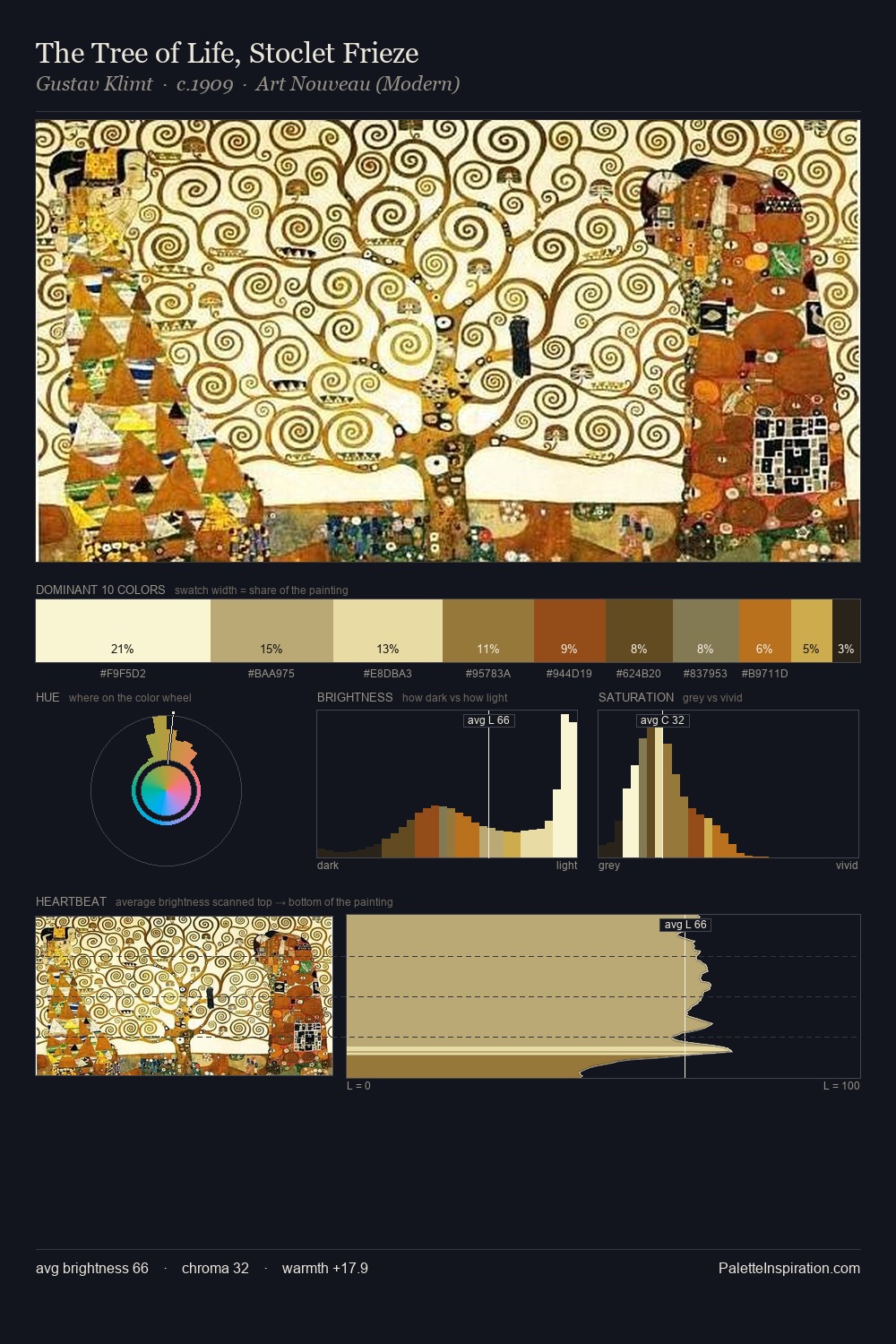
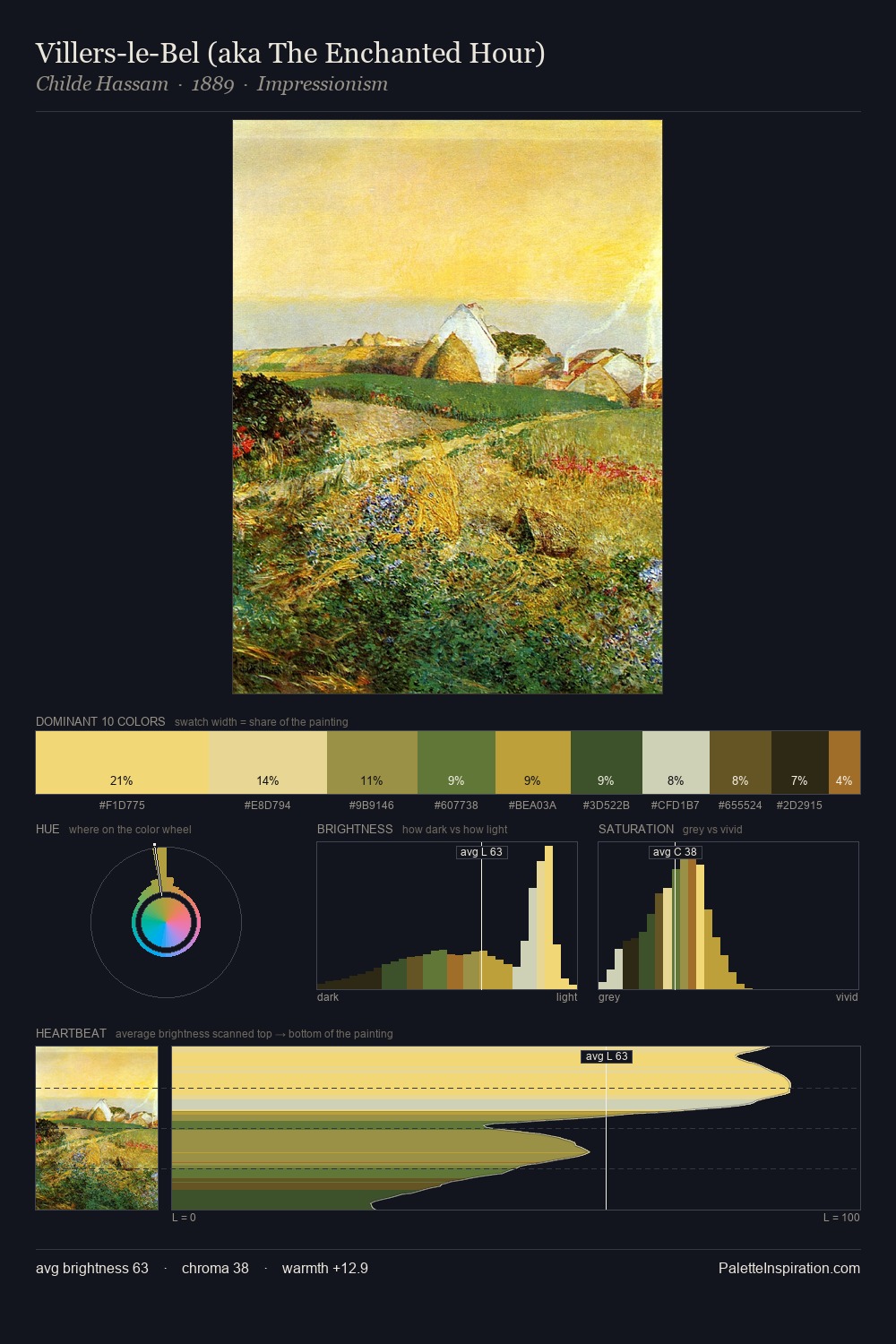
Hieronymus Bosch Palette 2
Soft Fawn
Soft Low-contrast, gentle chroma - mid-key values and low saturation, approachable and calm.
Fawn Light warm tan - the color of a young deer, soft and golden-brown.

Palette Analysis
Hieronymus Bosch distributes its values across the middle register, creating harmony without high contrast. Hieronymus Bosch builds on cool foundations: the palette favours the blue-cyan-green arc. Mid-range chroma keeps the palette grounded - colourful but not strident. Rather than a studied accent, #A68633 takes 10.7% - a bold allocation that saturates the composition's atmosphere. From deepest dark to palest light, the palette traverses 61 units of the value scale - a span that creates natural depth. High luminosity and cool temperature suggest the plein-air condition: unfiltered daylight and open sky. Palette 2 sits within the larger chromatic argument that Hieronymus Bosch's complete body of work advances.
Example use cases
- professional services
- specialty retail
- photography agencies
- tech products
- art galleries
I Love This!
Use This Palette
Copy, export, or download for your project
Copy, export, or download for your project
Copy:
Download:
Share: