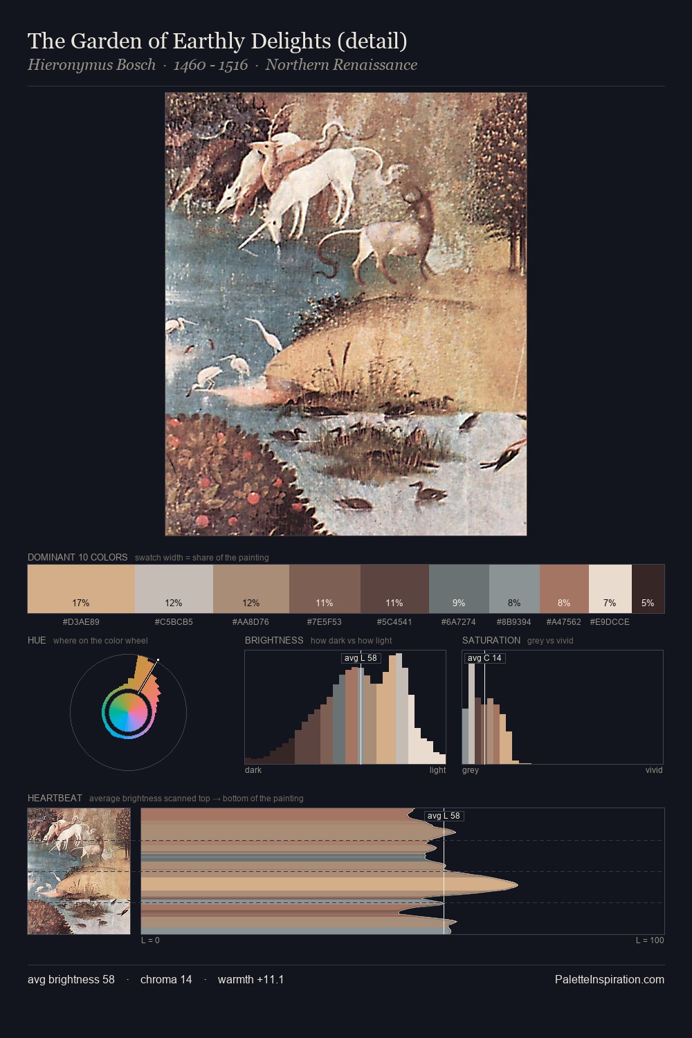
Hieronymus Bosch Palette 3
Muted Topaz
Muted Deliberately desaturated - chroma pulled toward gray, the restraint of tonal painting.
Topaz Golden yellow - the color of topaz gemstone, warm and slightly saturated.

Palette Analysis
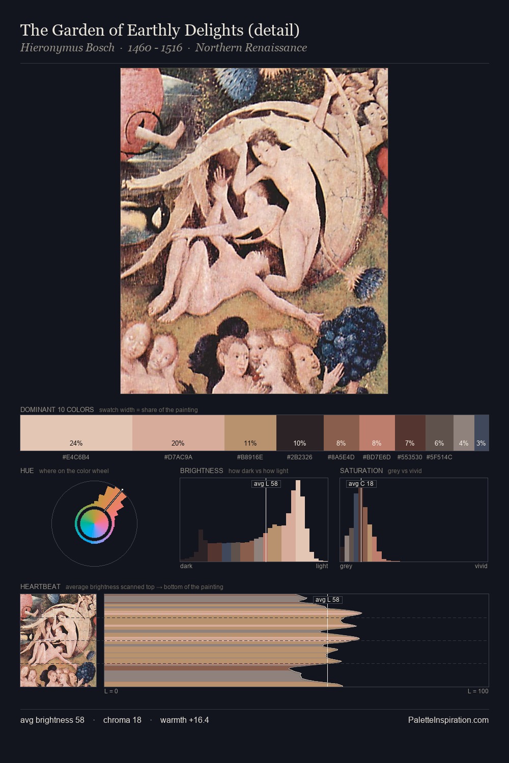
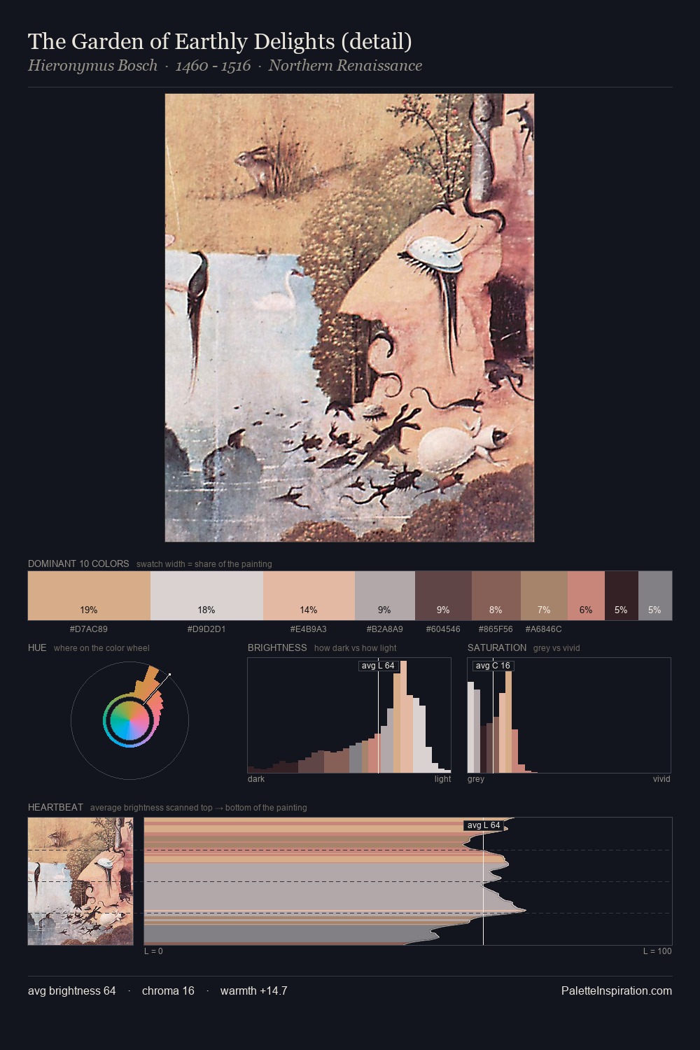
Hieronymus Bosch occupies the comfortable middle of the value scale, avoiding both extremes to hold the eye in a sustained middle grey. Temperature reads distinctly warm: the reds and earth tones from Hieronymus Bosch carry the compositional weight. Chroma hovers near zero; colour declares itself through subtle shifts in hue rather than outright saturation. The saturated accent, #E2D6CA, registers at 4.5% - sparse enough to feel like a deliberate surprise. 59 units of value range underpin the palette's structural clarity: the eye always knows where light falls. In the context of Hieronymus Bosch's full range of palettes, group 3 represents one movement in an ongoing chromatic dialogue.
Example use cases
- ceramics & pottery
- boutique hospitality
- menswear
- heritage food brands
- craft & artisan brands
I Love This!
Use This Palette
Copy, export, or download for your project
Copy, export, or download for your project
Copy:
Download:
Share: