Eric Ravilious Palette 3

Palette Analysis
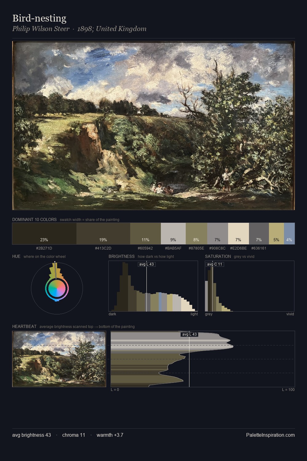
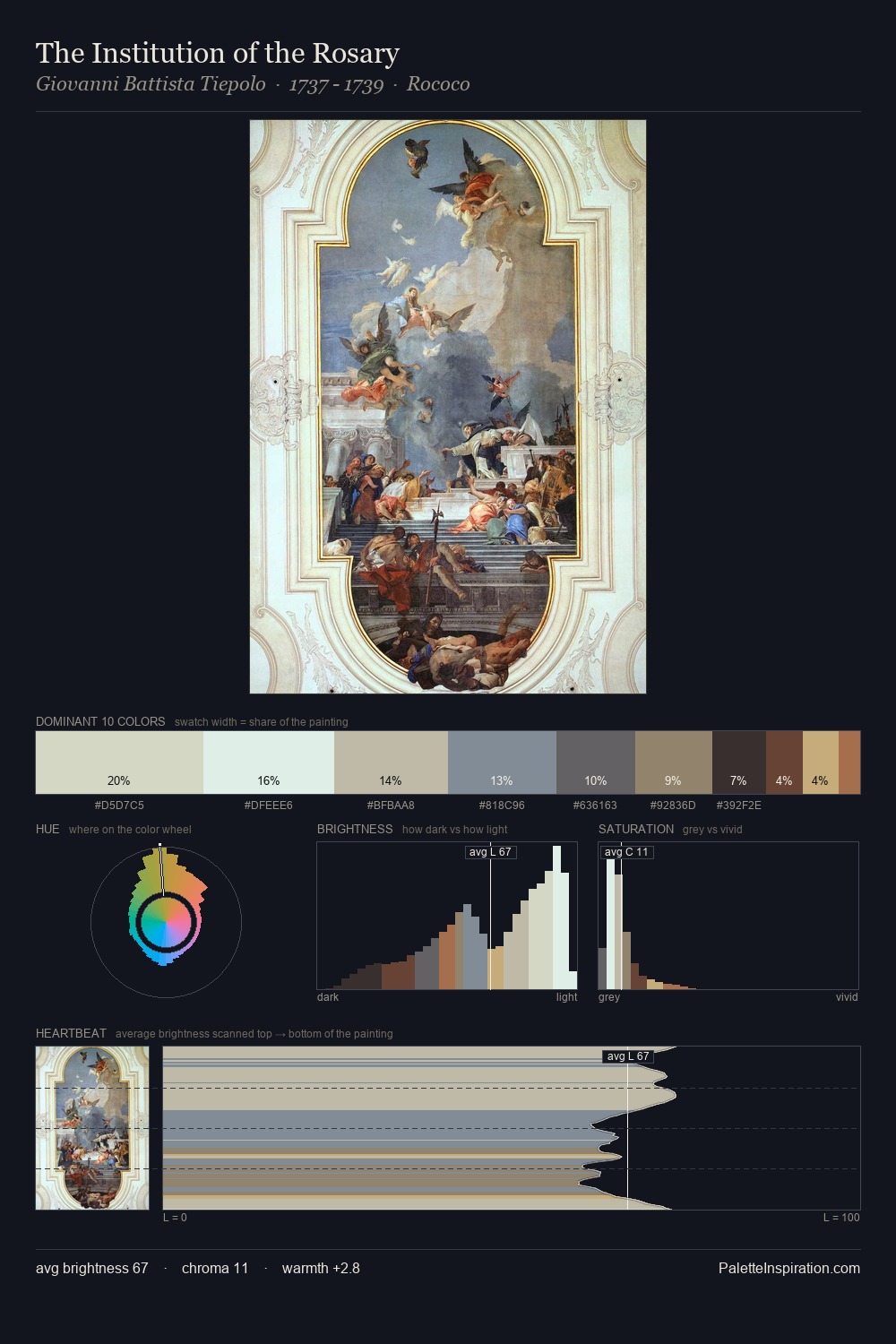
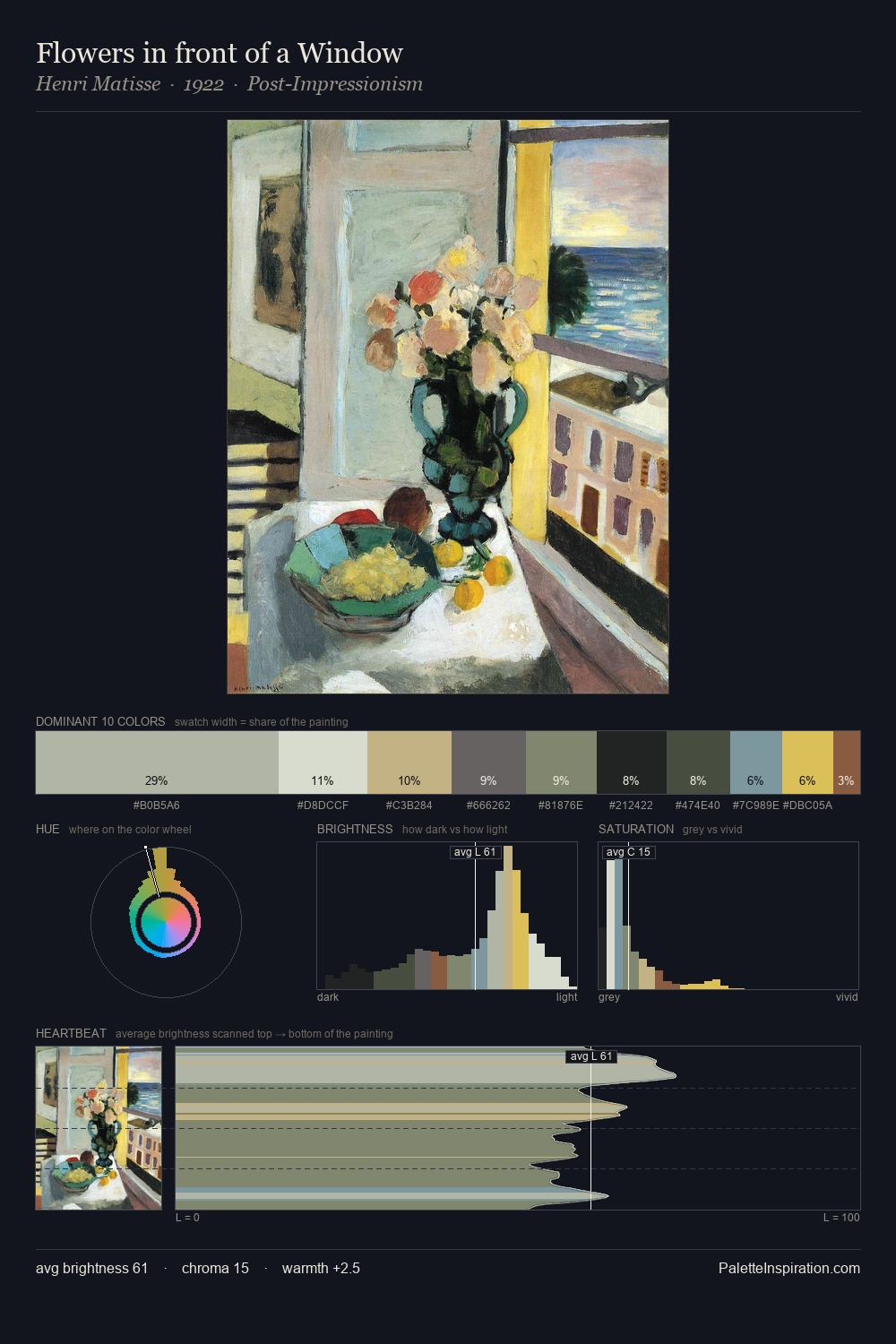
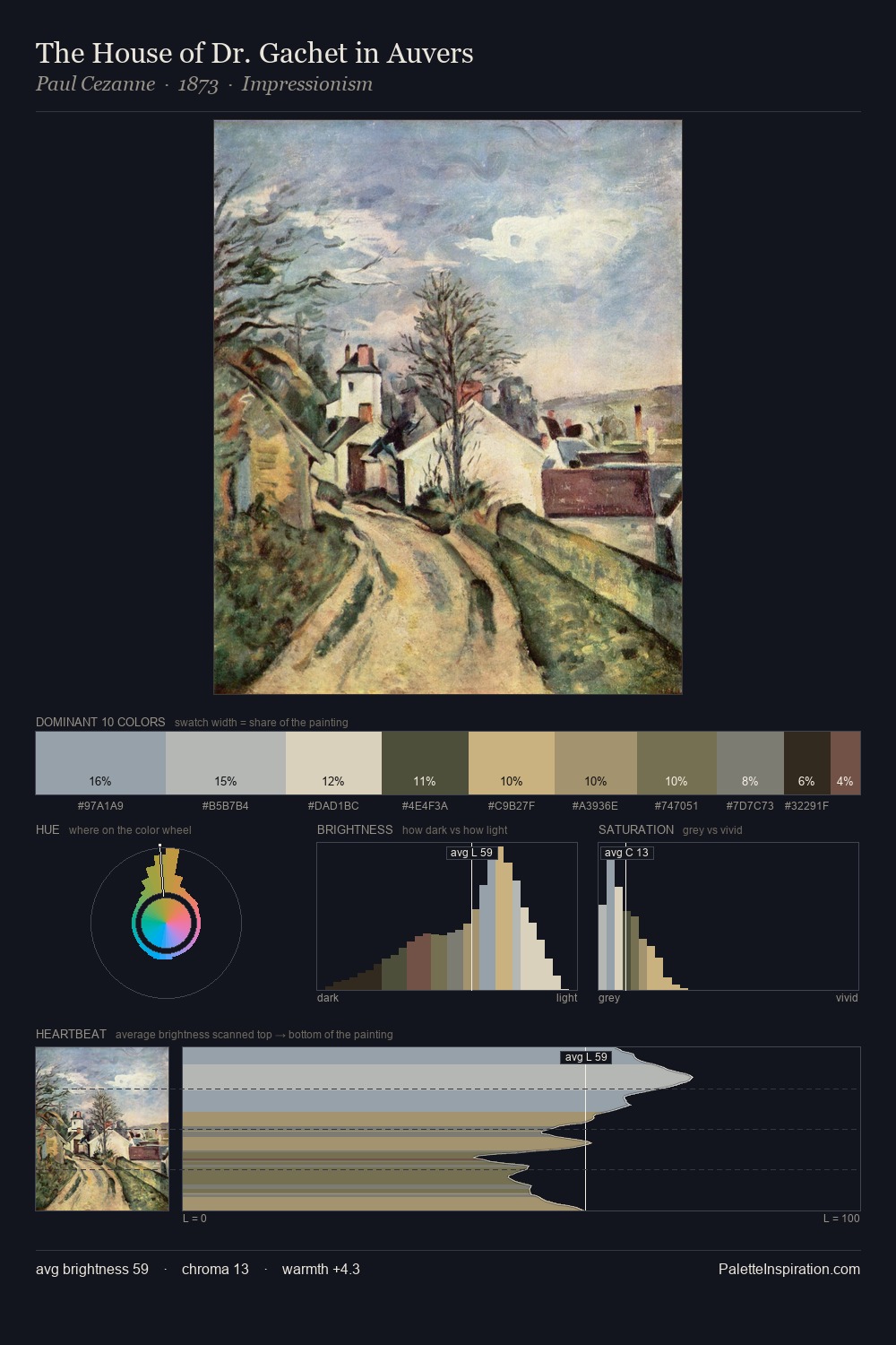
Eric Ravilious is high in key: pale, luminous, and filled with optical air. Temperature is cool-dominant, with blue and green families claiming the largest areas. Saturation is deliberately withheld - the beauty here lies in the near-monochromatic gradations rather than colour difference. #BEAC70 functions as the palette's exclamation mark: highest chroma, lowest percentage (5.6%). The value range spans 56 units across the palette, providing the full gamut from deep shadow to near-white and ensuring clear tonal hierarchy. High luminosity and cool temperature suggest the plein-air condition: unfiltered daylight and open sky. Eric Ravilious's palette 3 carries its own internal logic while remaining in conversation with the artist's broader colour intelligence.
Example use cases
- florist branding
- event design
- real estate
- jewelry retail
- hospitality branding
I Love This!
Copy, export, or download for your project