Eric Ravilious Master Palette

Palette Analysis
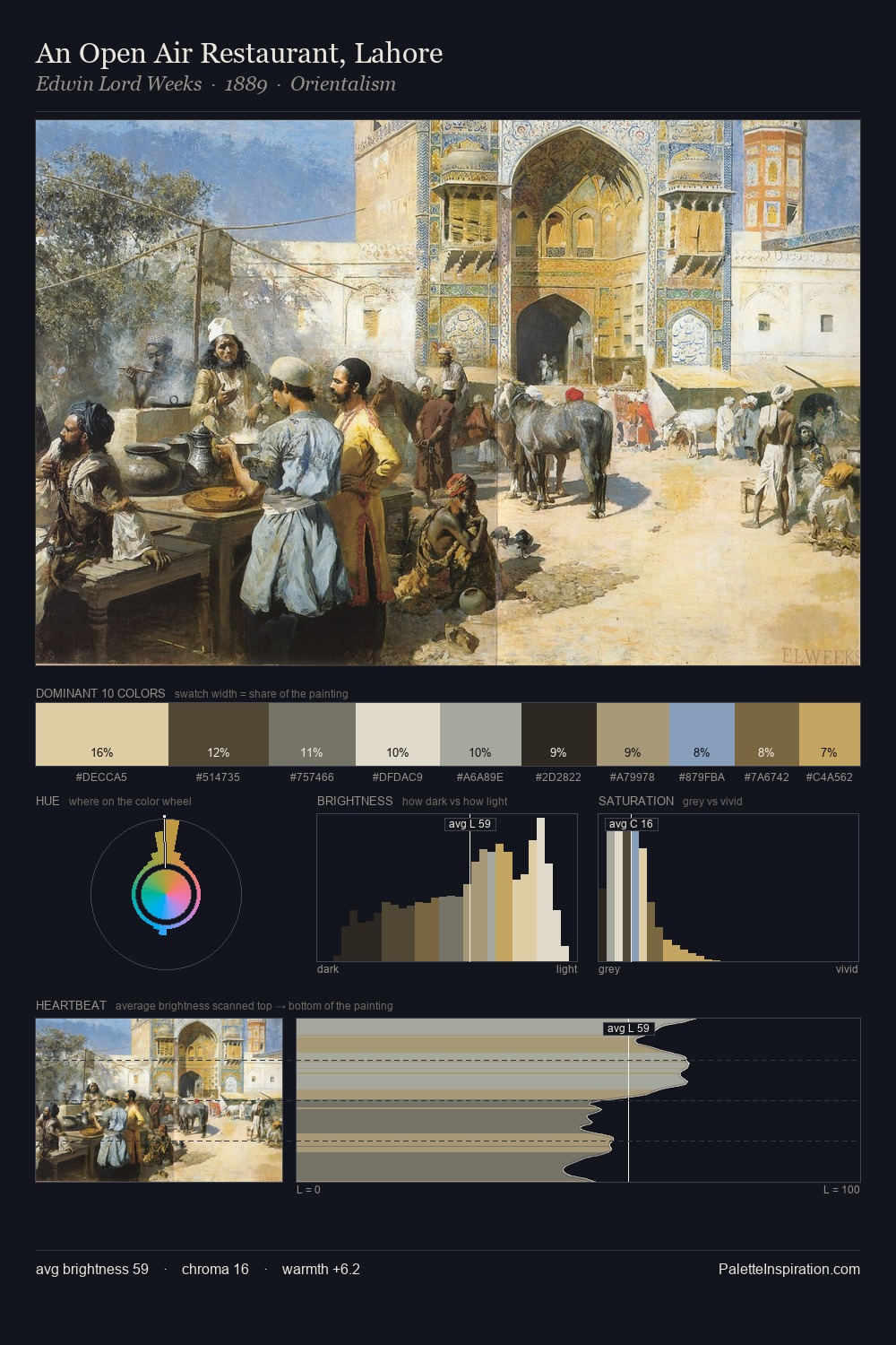
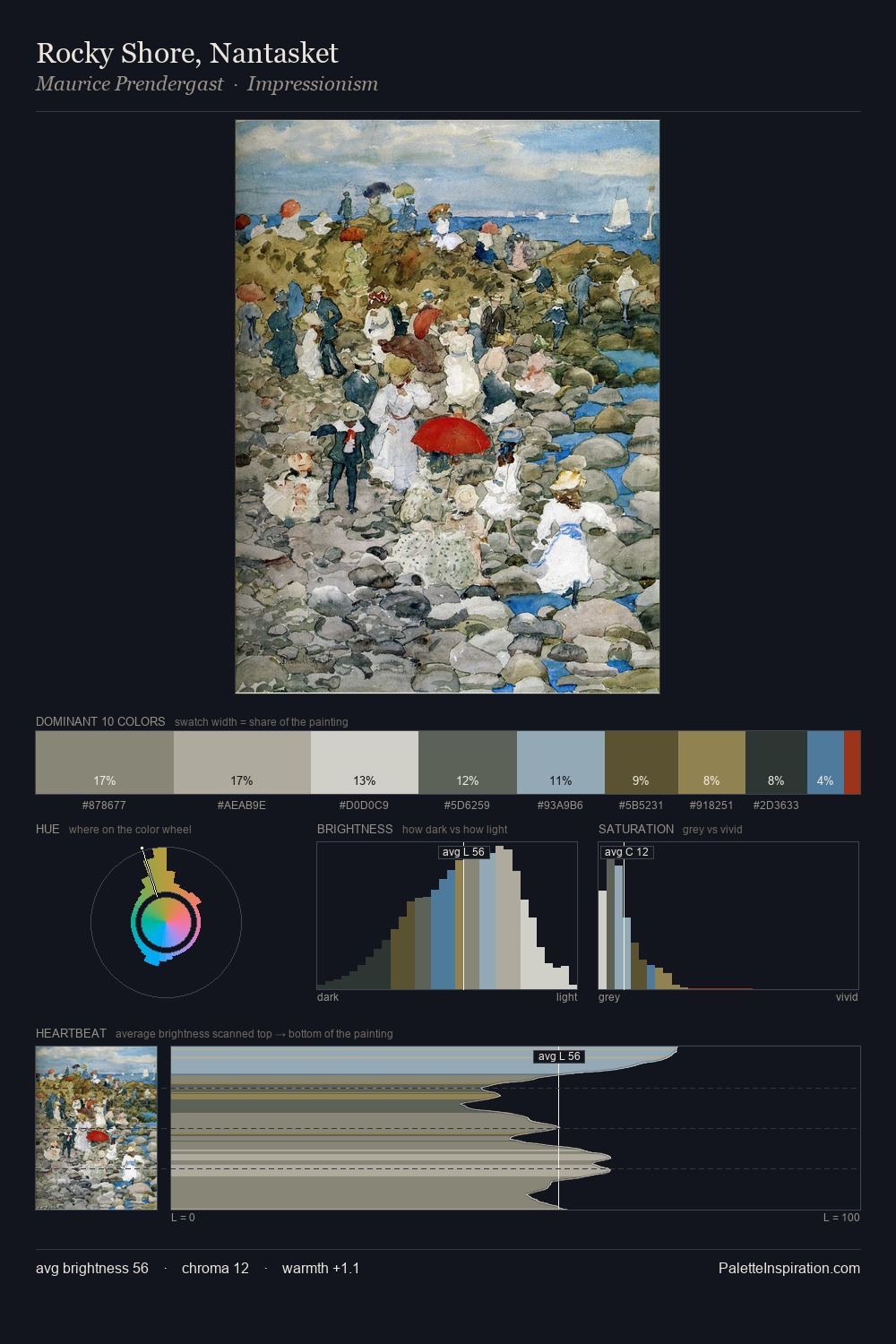
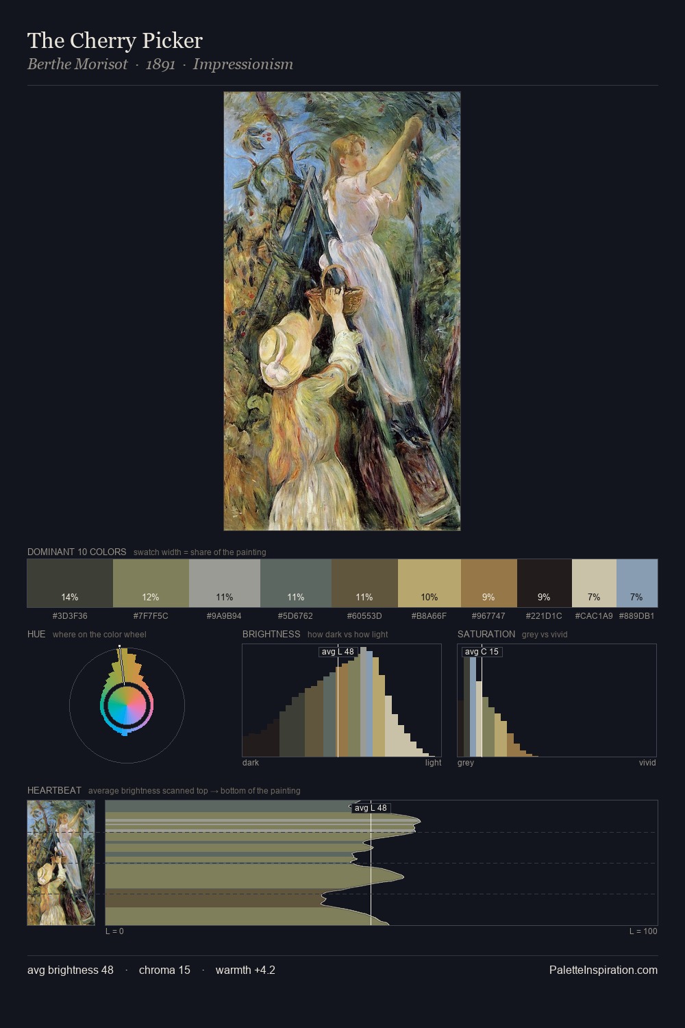
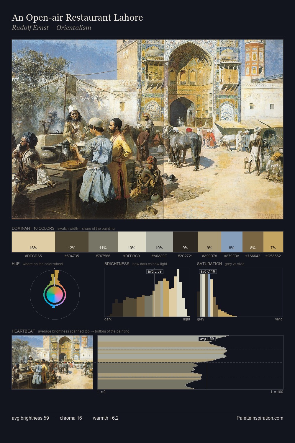
Eric Ravilious keeps values measured and balanced, a hallmark of tonal restraint. Cool tones set the register here - the blues and greens easily outweigh any warm accents. All colours lean toward grey, building depth through value rather than colour punch. At 1.7%, #79A6B6 carries the palette's sharpest chromatic charge: an accent that earns its place precisely because it is withheld. A value spread of 58 units gives the palette both depth and air - shadows are genuinely dark, lights genuinely light. The palette has the character of outdoor light: cool, mid-bright, with colour rendered faithfully rather than expressively. The palette is recognisably Eric Ravilious's own: particular in its temperature, chroma, and the economy of its brightest note.
Example use cases
- exhibition design
- foundation branding
- estate management
- art education
- museums & galleries
I Love This!
Copy, export, or download for your project