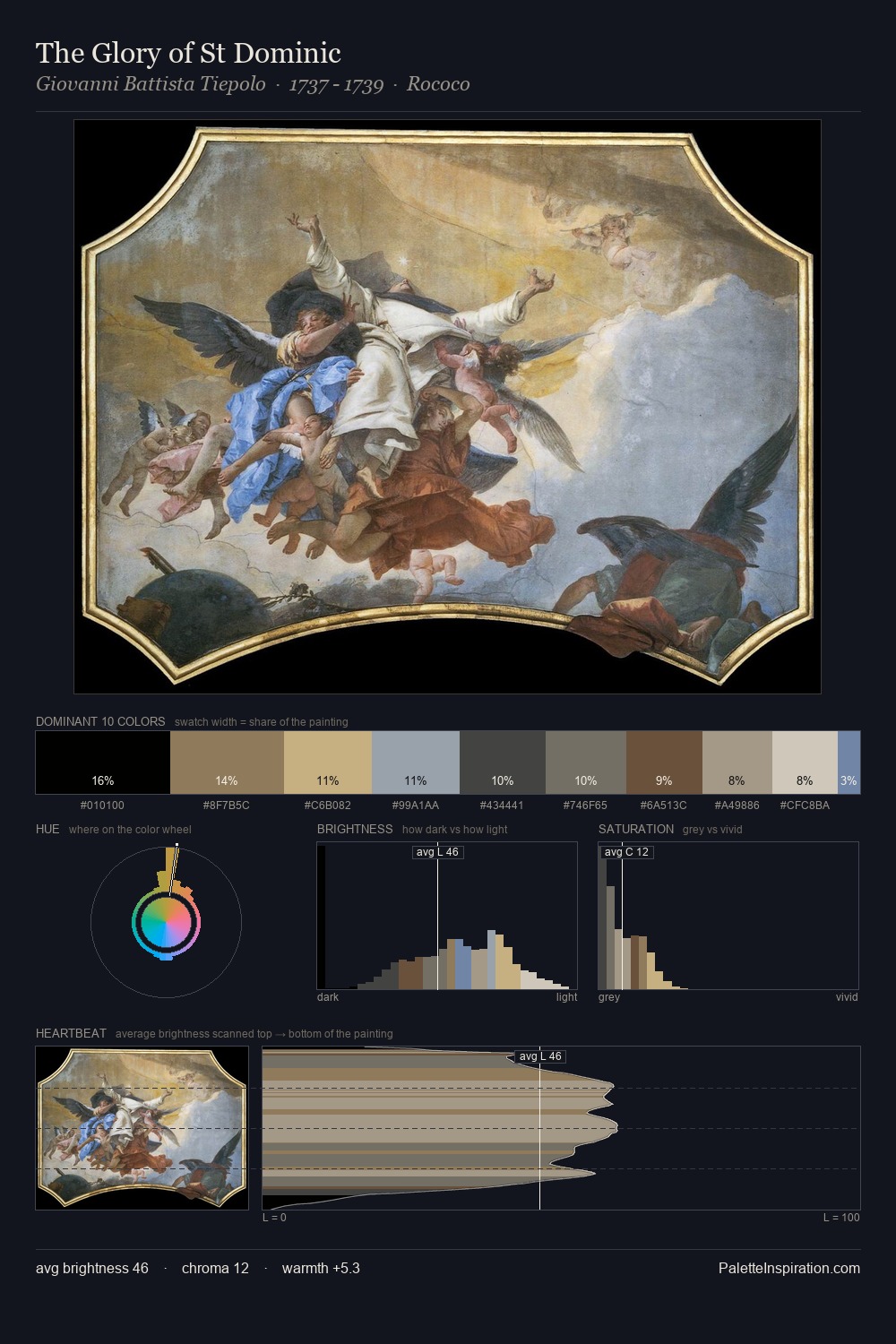
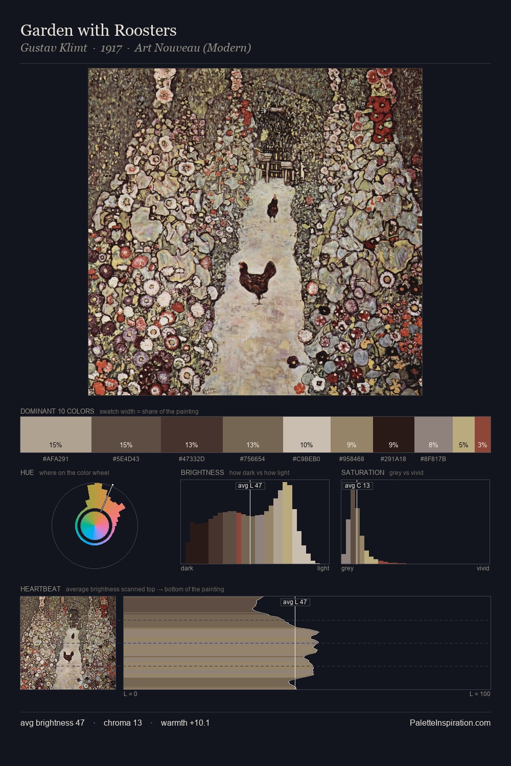
Eric Ravilious Palette 5
Soft Ecru
Soft Low-contrast, gentle chroma - mid-key values and low saturation, approachable and calm.
Ecru Unbleached linen - warm mid-neutral, slightly grayed, raw and natural.

Palette Analysis
The high-key values of Eric Ravilious give it an effulgent, almost bleached quality. The palette achieves thermal balance - reds and blues, ochres and greens, each holding the other in check. All colours lean toward grey, building depth through value rather than colour punch. The saturated accent, #BDAA7C, registers at 6.5% - sparse enough to feel like a deliberate surprise. Value range is moderate at 48 units - enough contrast for legibility, not so much as to fragment the tonal unity. Eric Ravilious's palette 5 carries its own internal logic while remaining in conversation with the artist's broader colour intelligence.
Example use cases
- exhibition design
- foundation branding
- estate management
- art education
- museums & galleries
I Love This!
Use This Palette
Copy, export, or download for your project
Copy, export, or download for your project
Copy:
Download:
Share: