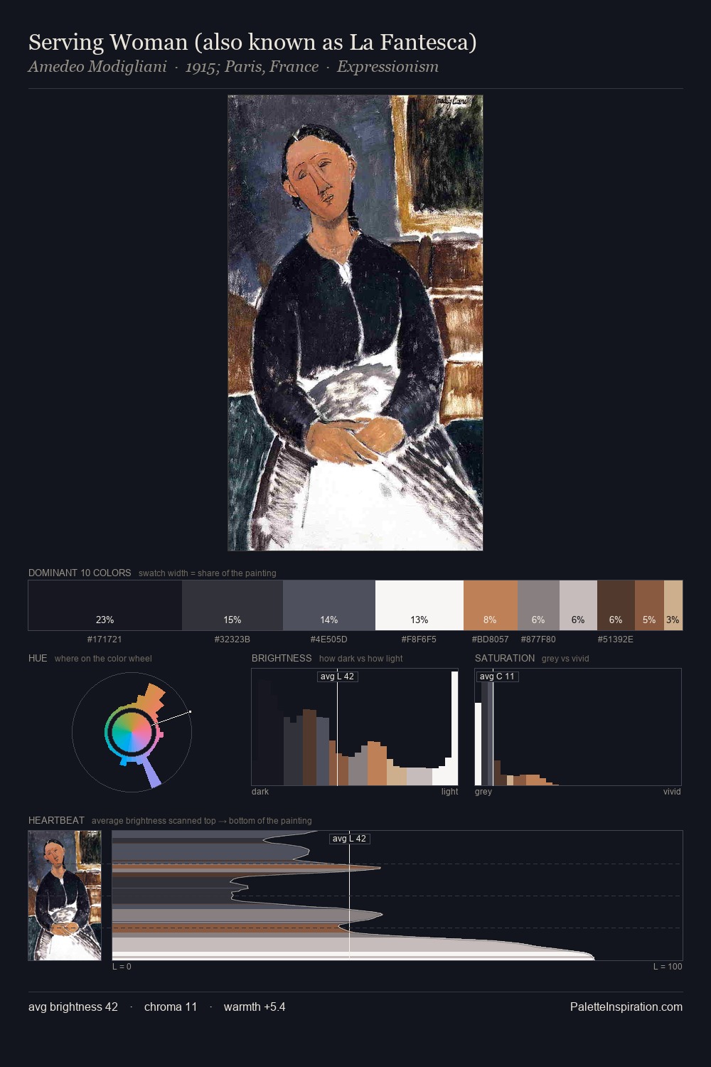
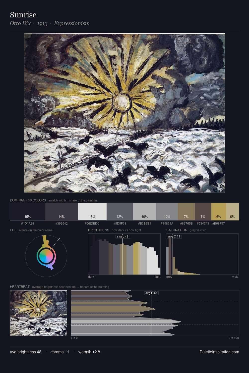
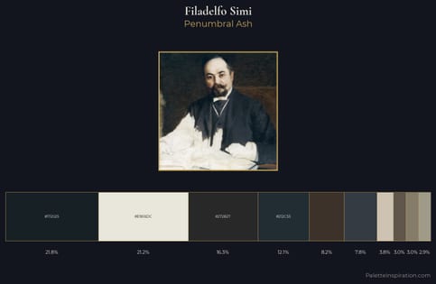
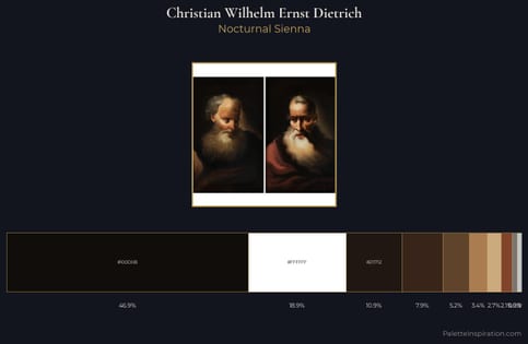
Eric Ravilious Palette 10
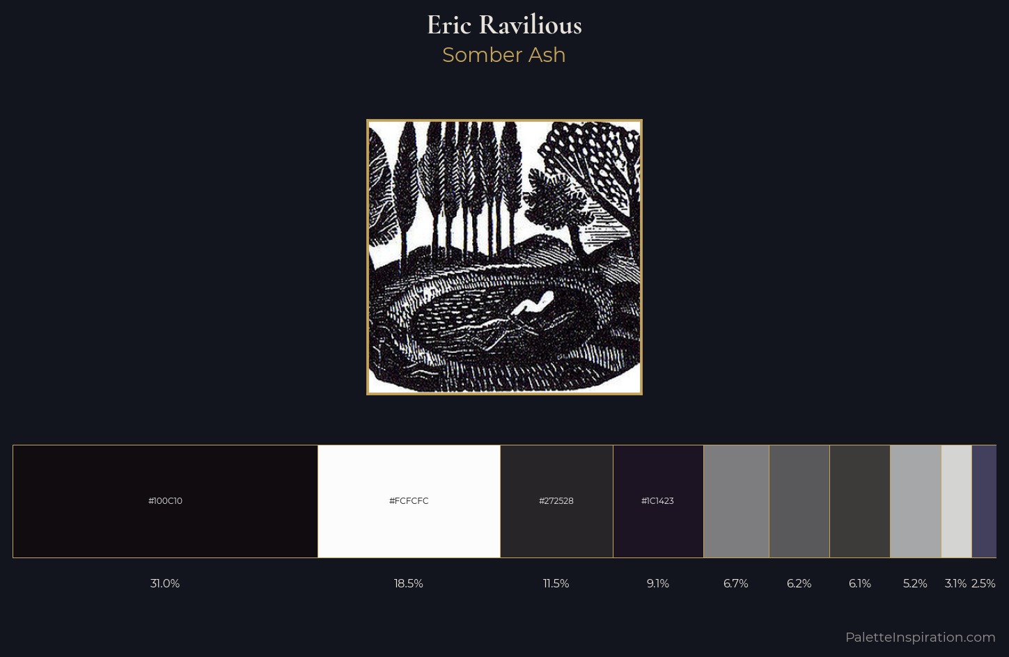
Palette Analysis
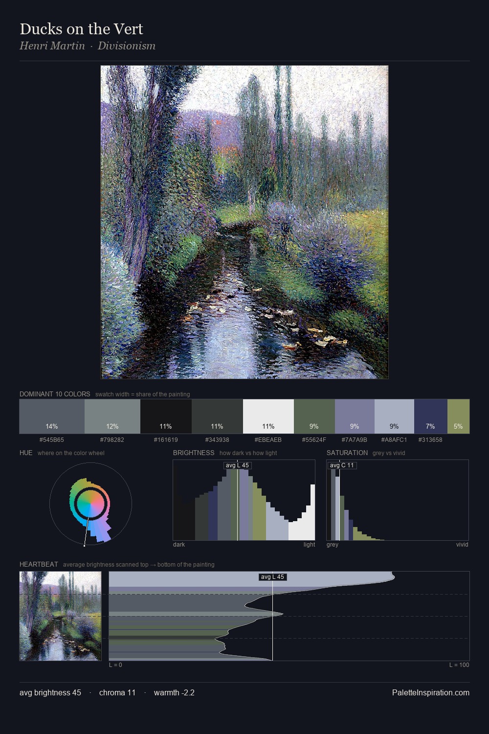
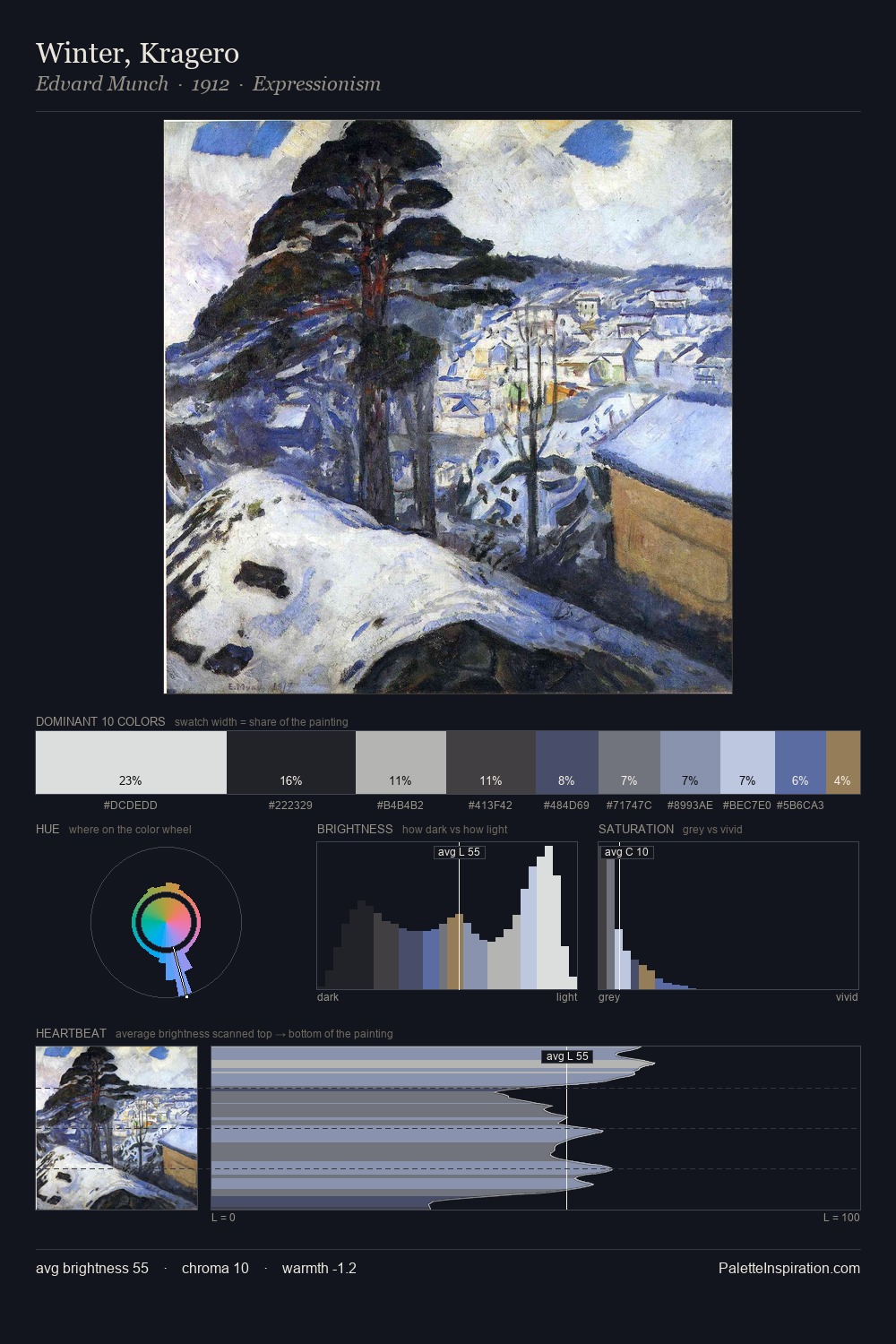
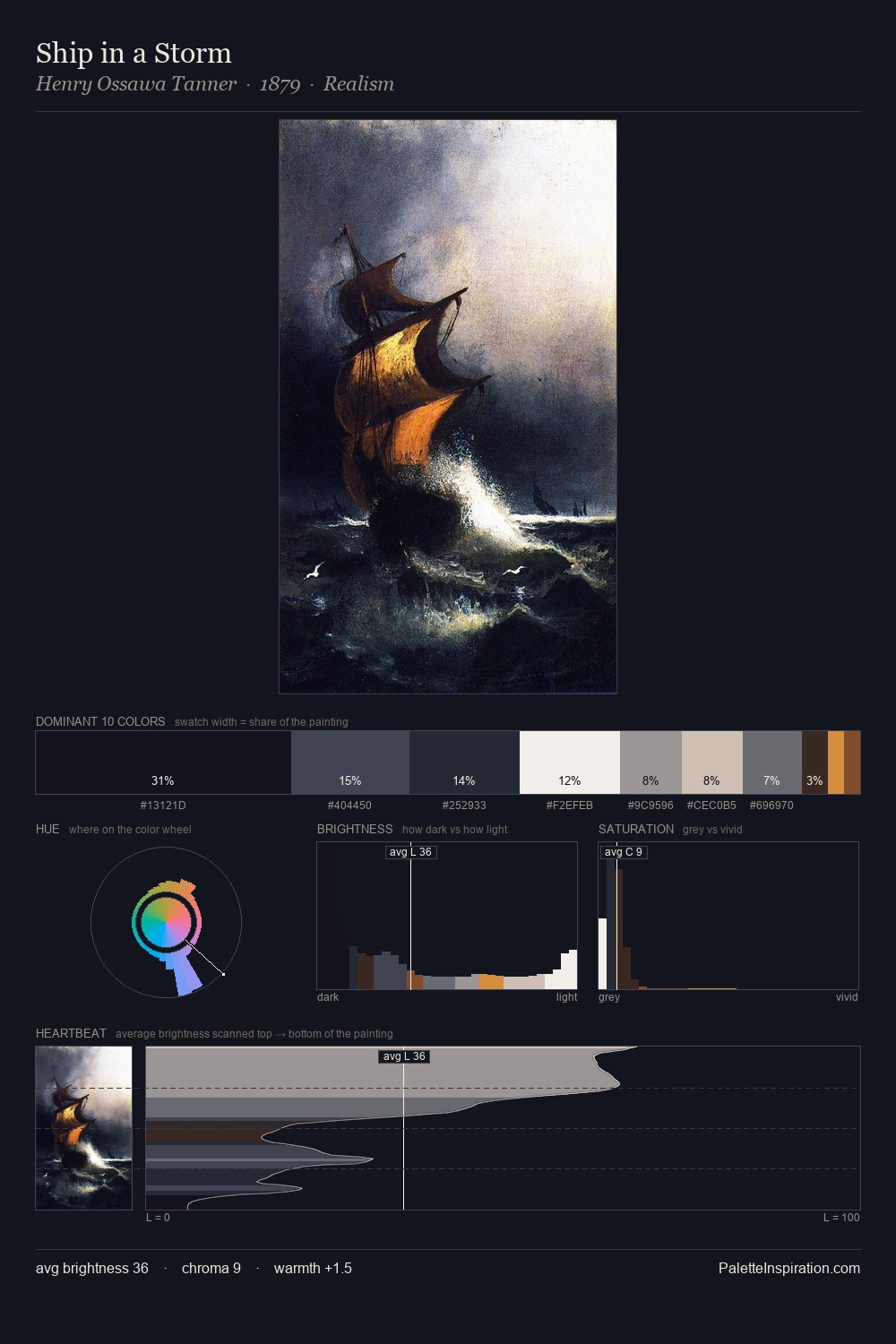
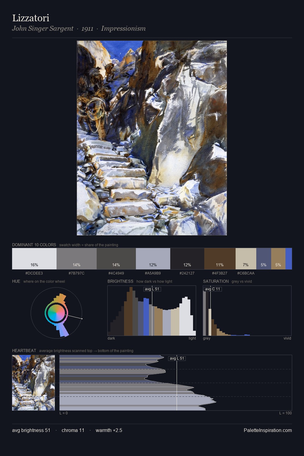
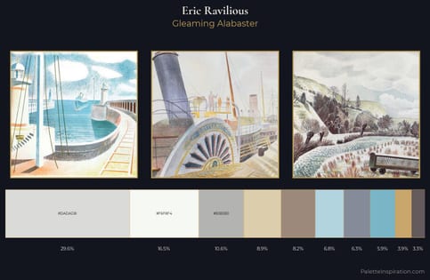
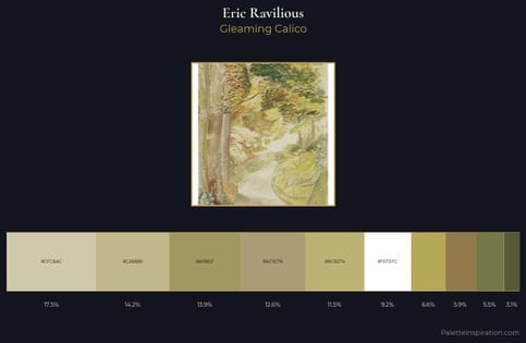
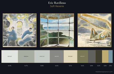
Eric Ravilious occupies the comfortable middle of the value scale, avoiding both extremes to hold the eye in a sustained middle grey. Eric Ravilious tilts toward cool - blues and silver-greys carry the structural weight. Chroma hovers near zero; colour declares itself through subtle shifts in hue rather than outright saturation. #100C10 claims 31.0% of the surface, functioning as the work's tonal foundation. The highest-chroma note - #1C1423 - appears at just 9.1%, deployed as a precision accent against the quieter ground. From deepest dark to palest light, the palette traverses 83 units of the value scale - a span that creates natural depth. The palette has the character of outdoor light: cool, mid-bright, with colour rendered faithfully rather than expressively. Eric Ravilious's palette 10 carries its own internal logic while remaining in conversation with the artist's broader colour intelligence.
Example use cases
- professional services
- specialty retail
- photography agencies
- tech products
- art galleries
I Love This!
Copy, export, or download for your project