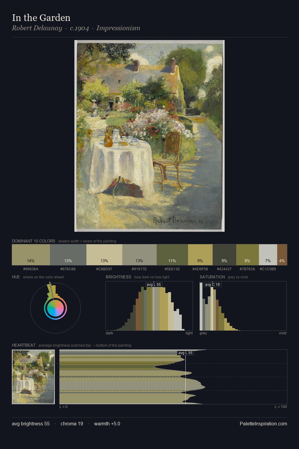
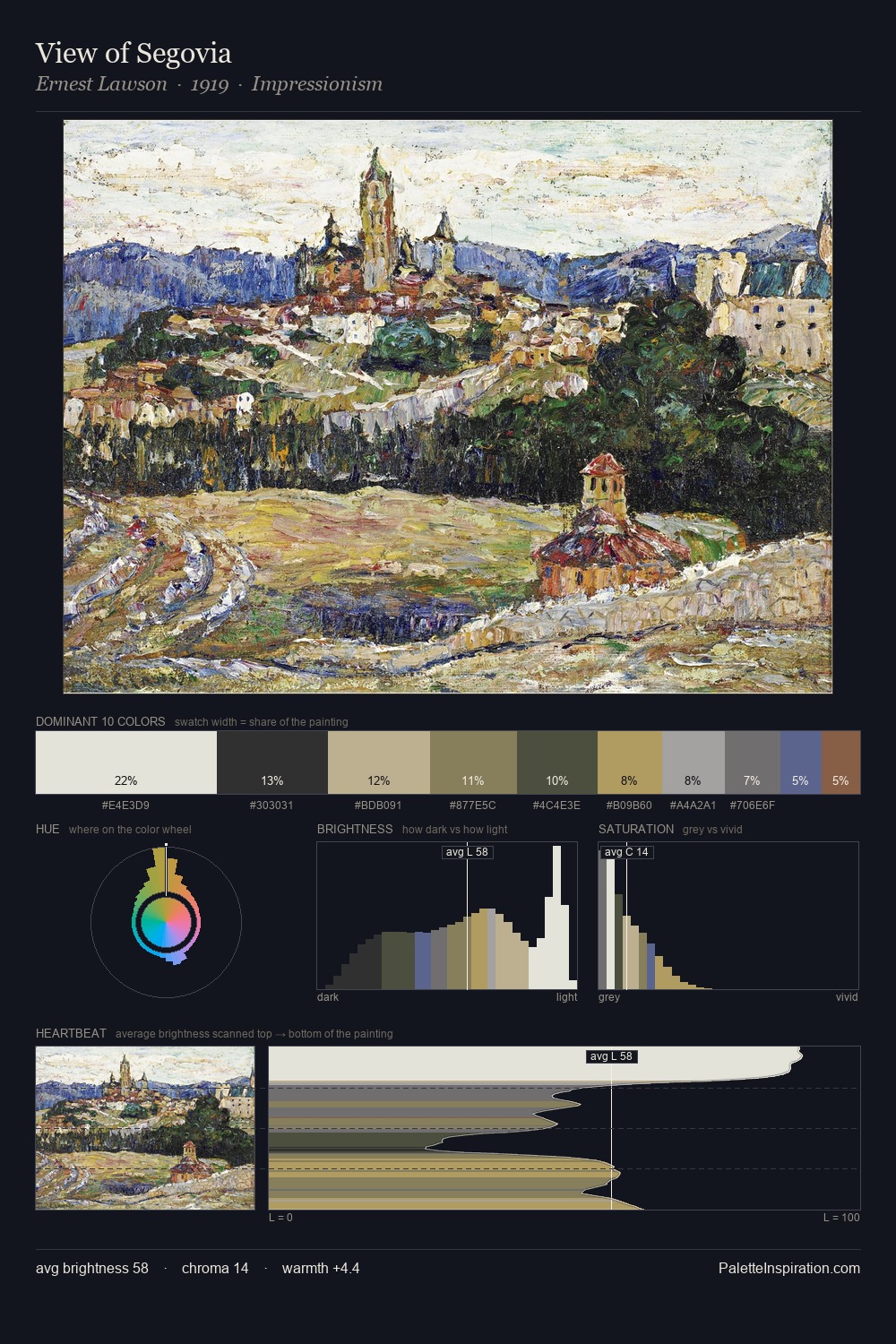
Claude Monet Palette 11

Palette Analysis
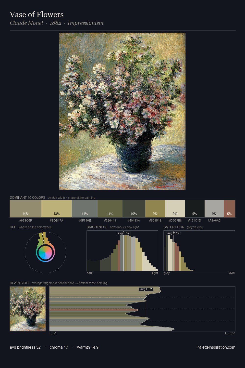
Values in Claude Monet tilt decisively toward white, giving the palette its luminous character. Claude Monet tilts toward cool - blues and silver-greys carry the structural weight. Chroma hovers near zero; colour declares itself through subtle shifts in hue rather than outright saturation. The highest-chroma note - #AB8E4A - appears at just 4.6%, deployed as a precision accent against the quieter ground. Value range is moderate at 51 units - enough contrast for legibility, not so much as to fragment the tonal unity. The mid-to-high key, cool bias, and moderate chroma point to outdoor observation - sky and diffused daylight as the dominant light source. Palette 11 sits within the larger chromatic argument that Claude Monet's complete body of work advances.
Example use cases
- exhibition design
- foundation branding
- estate management
- art education
- museums & galleries
I Love This!
Copy, export, or download for your project