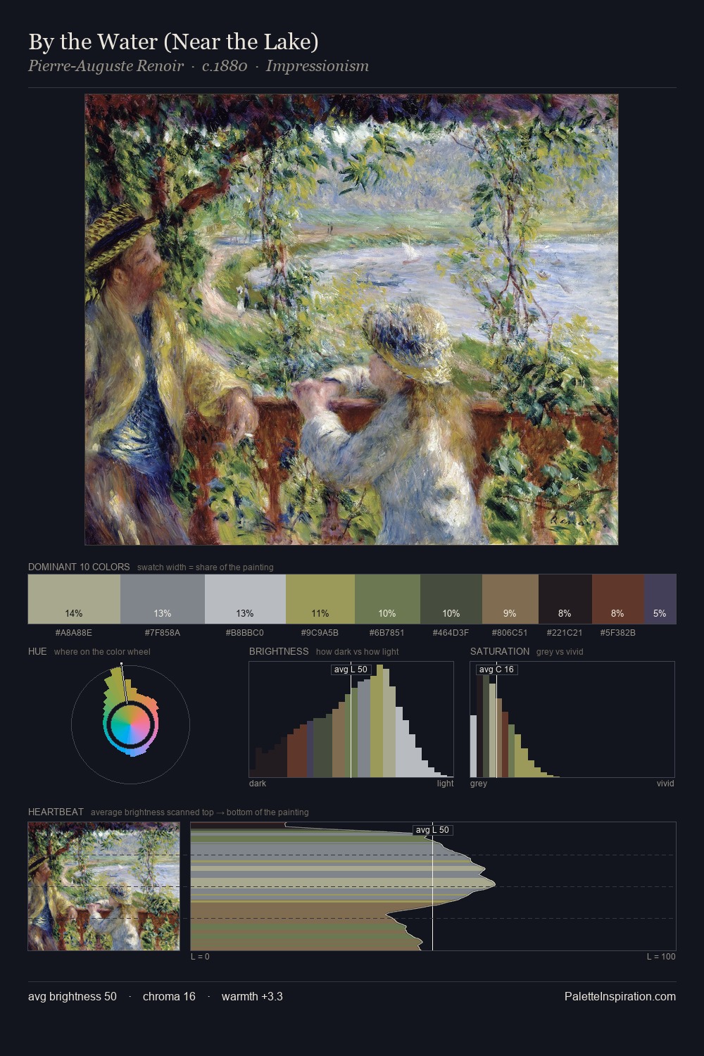
Claude Monet Palette 10

Palette Analysis
The high-key values of Claude Monet give it an effulgent, almost bleached quality. Cool tones set the register here - the blues and greens easily outweigh any warm accents. Every colour is desaturated; the palette proceeds through near-neutrals and gently-coloured greys. The dominant colour, #C9CED5, takes 26.9% of the total area, establishing the overall mood before any other hue is introduced. The most saturated colour, #767E3D, is reserved to 5.3% of the surface, where it acts as a focal punctuation. A value spread of 55 units gives the palette both depth and air - shadows are genuinely dark, lights genuinely light. The mid-to-high key, cool bias, and moderate chroma point to outdoor observation - sky and diffused daylight as the dominant light source. In the context of Claude Monet's full range of palettes, group 10 represents one movement in an ongoing chromatic dialogue.
Example use cases
- print magazines
- beauty brands
- real estate
- high-end packaging
- editorial design
I Love This!
Copy, export, or download for your project