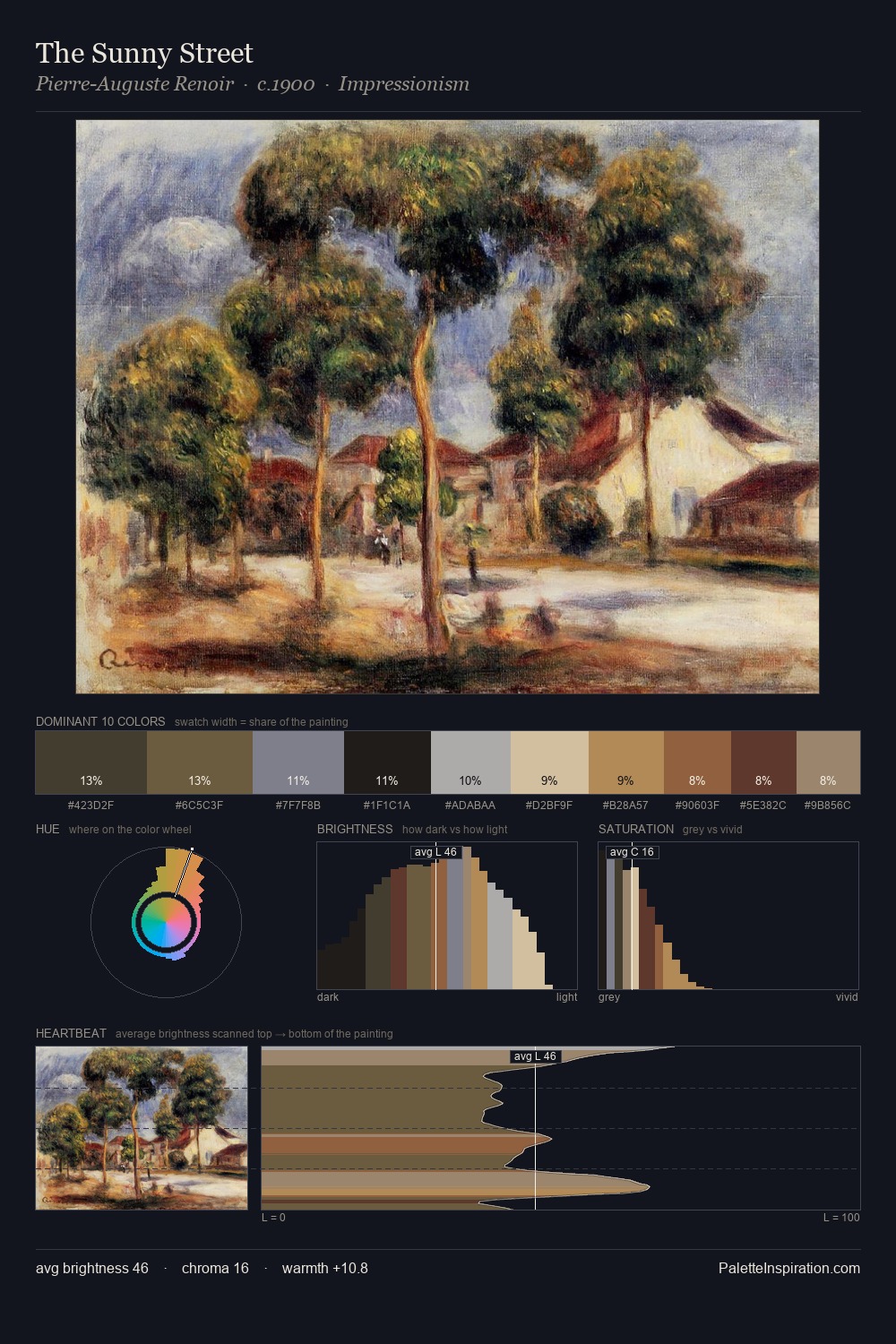
Claude Monet Palette 13
Soft Ecru
Soft Low-contrast, gentle chroma - mid-key values and low saturation, approachable and calm.
Ecru Unbleached linen - warm mid-neutral, slightly grayed, raw and natural.

Palette Analysis
Light floods Claude Monet; the palette keeps values pale and airy across its range. Warm and cool tones are held in careful balance - neither family dominates, creating tension and resolution simultaneously. Every colour is desaturated; the palette proceeds through near-neutrals and gently-coloured greys. #CBAC7C functions as the palette's exclamation mark: highest chroma, lowest percentage (9.7%). Spanning 40 units on the value axis, the palette achieves the balance between tonal flatness and fragmentation. Palette 13 sits within the larger chromatic argument that Claude Monet's complete body of work advances.
Example use cases
- exhibition design
- foundation branding
- estate management
- art education
- museums & galleries
I Love This!
Use This Palette
Copy, export, or download for your project
Copy, export, or download for your project
Copy:
Download:
Share: