Claude Monet Palette 20
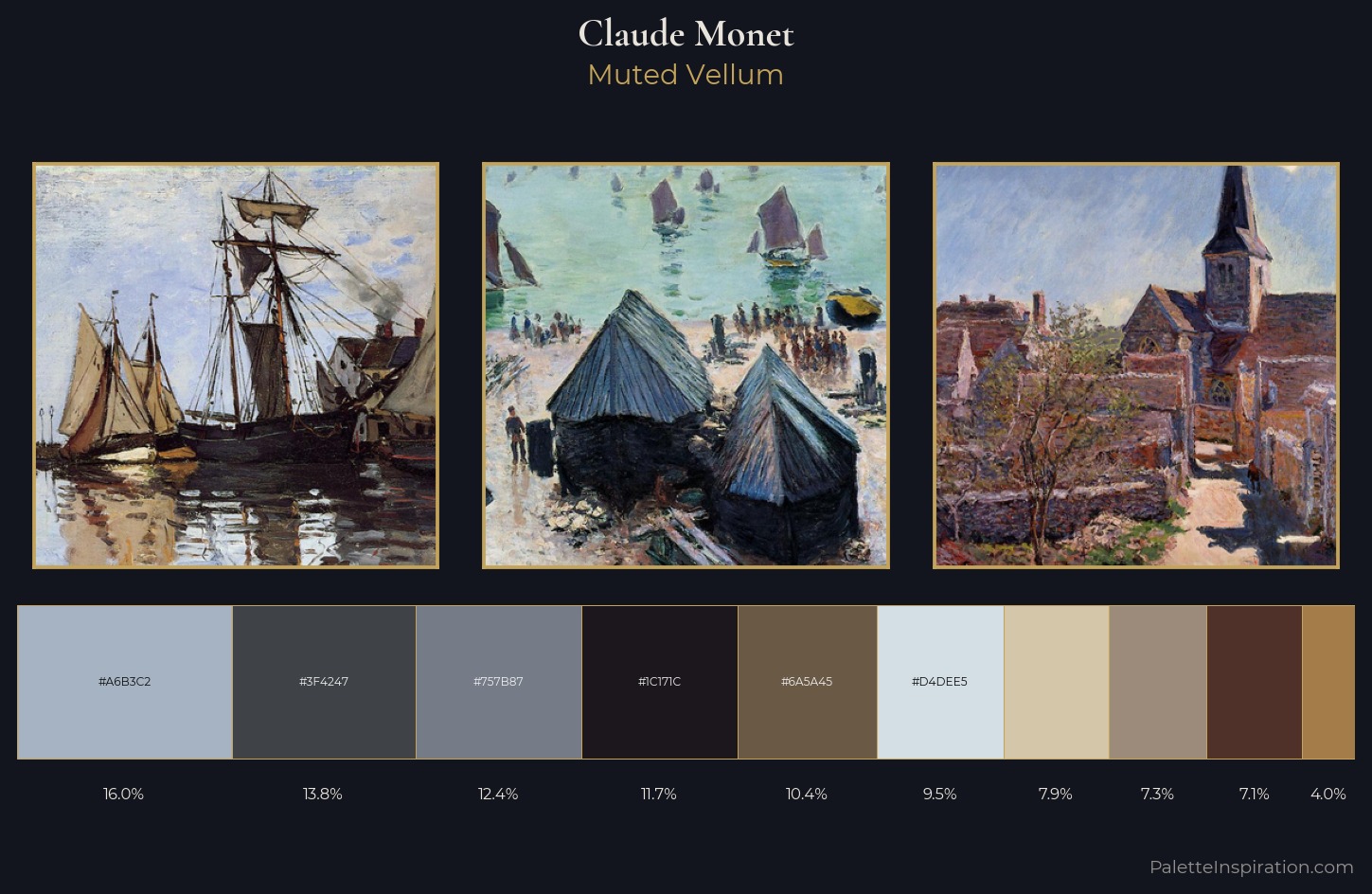
Palette Analysis
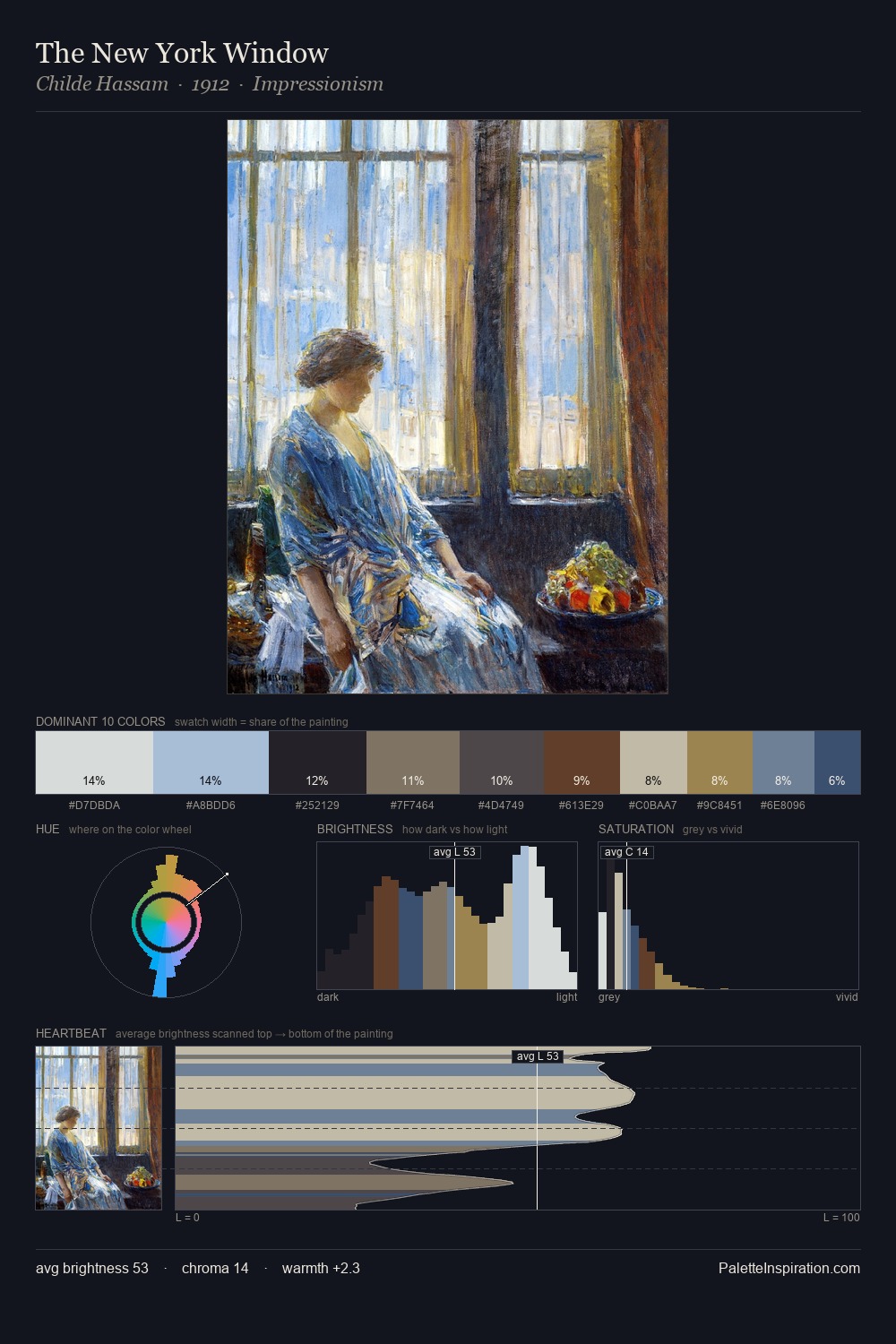
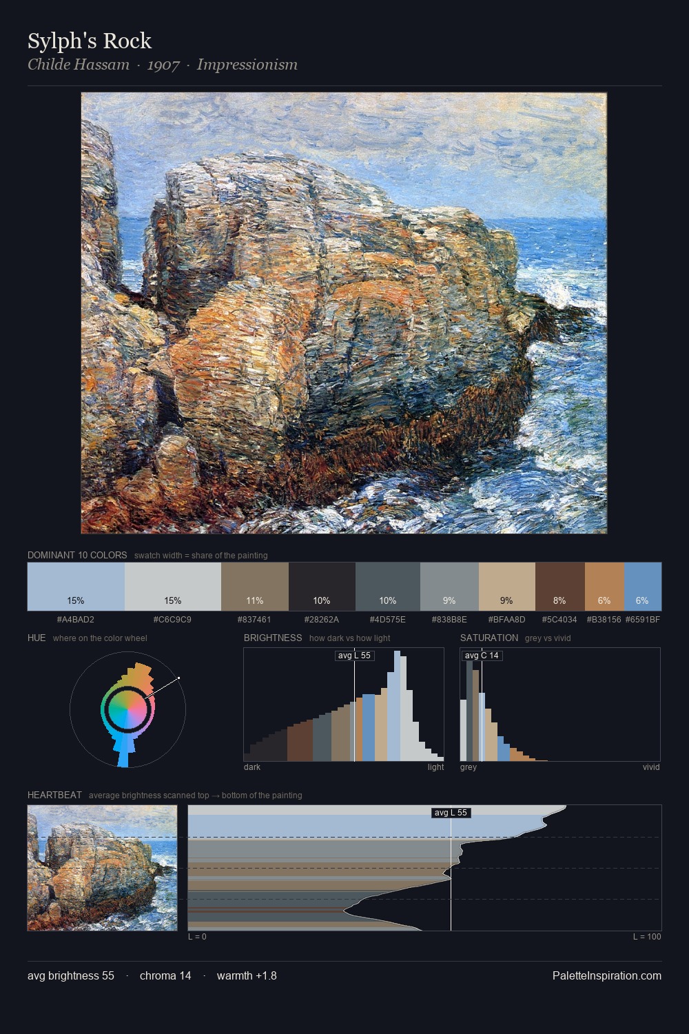
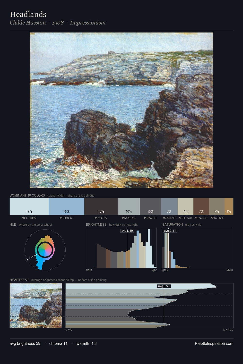
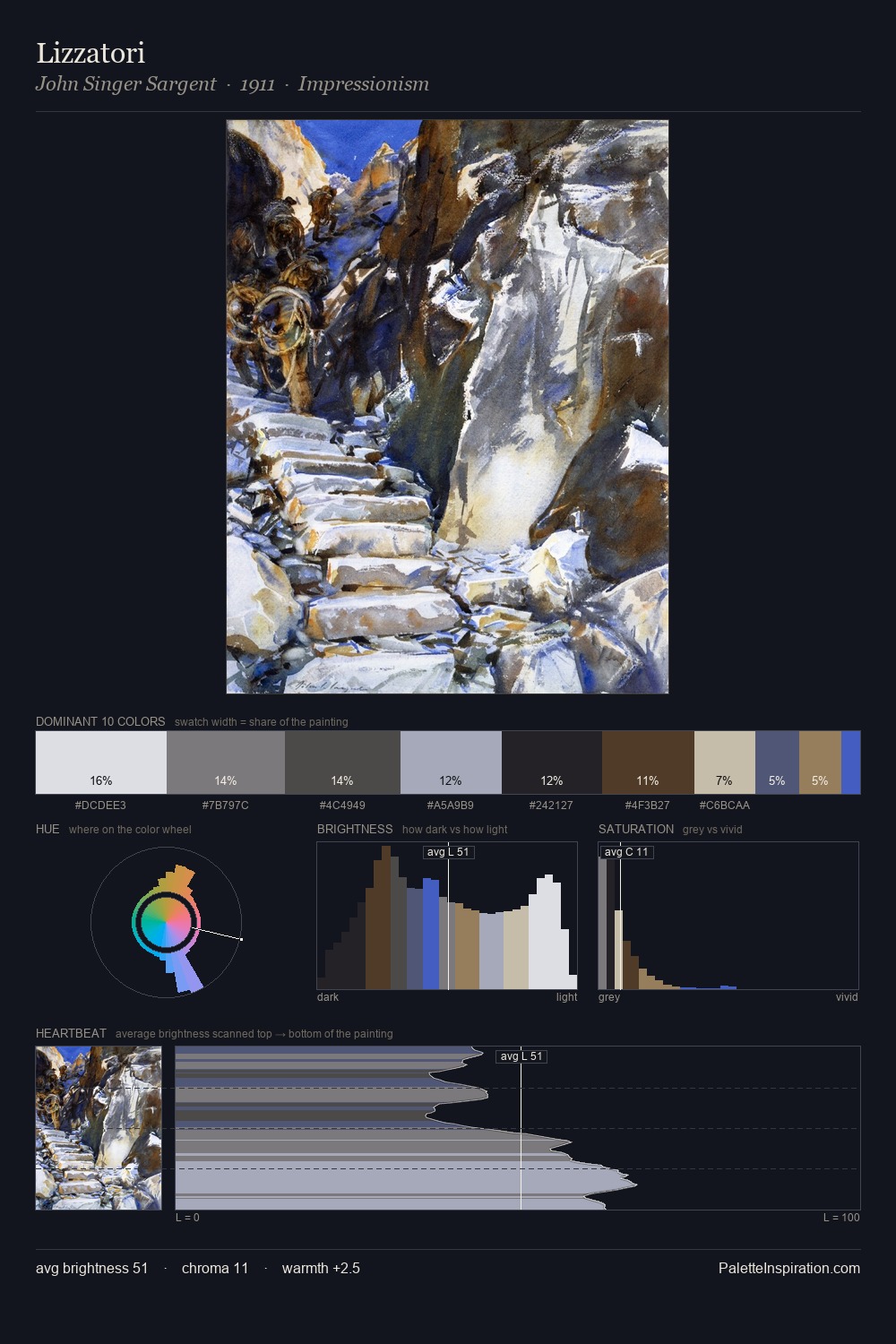
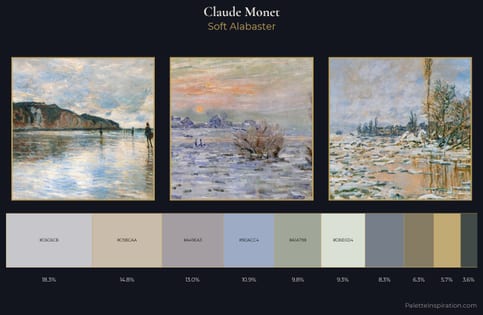
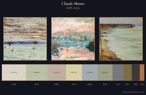
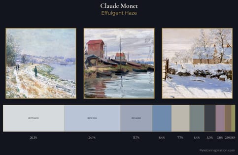
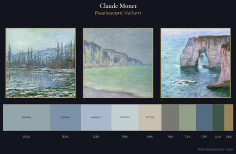
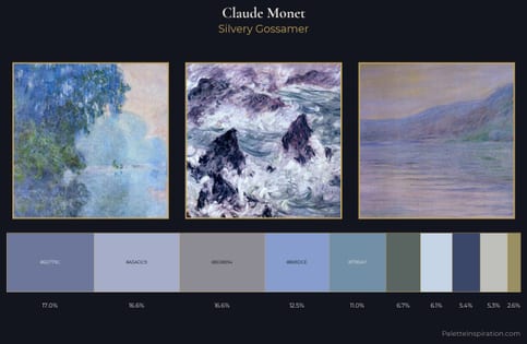
Claude Monet occupies the comfortable middle of the value scale, avoiding both extremes to hold the eye in a sustained middle grey. Cool tones set the register here - the blues and greens easily outweigh any warm accents. Saturation is deliberately withheld - the beauty here lies in the near-monochromatic gradations rather than colour difference. #A47C4A functions as the palette's exclamation mark: highest chroma, lowest percentage (4.0%). 69 units of value range underpin the palette's structural clarity: the eye always knows where light falls. The palette has the character of outdoor light: cool, mid-bright, with colour rendered faithfully rather than expressively. Palette 20 sits within the larger chromatic argument that Claude Monet's complete body of work advances.
Example use cases
- museums & galleries
- academic publishing
- heritage brands
- auction houses
- exhibition design
I Love This!
Copy, export, or download for your project