Vyacheslav Schwarz Palette 1

Palette Analysis
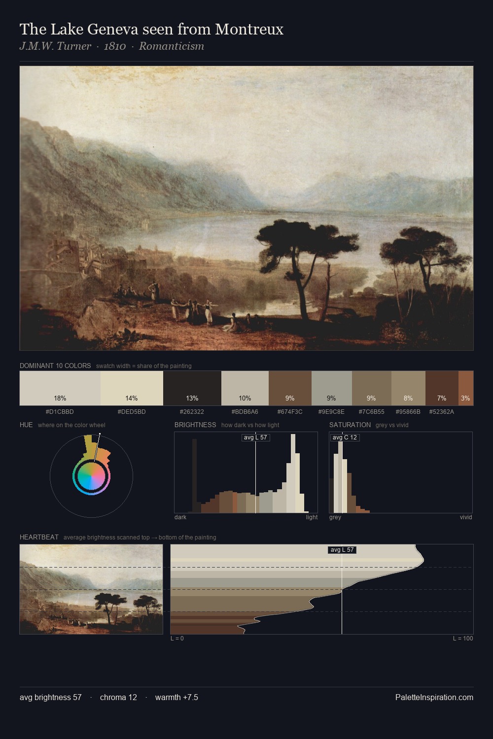
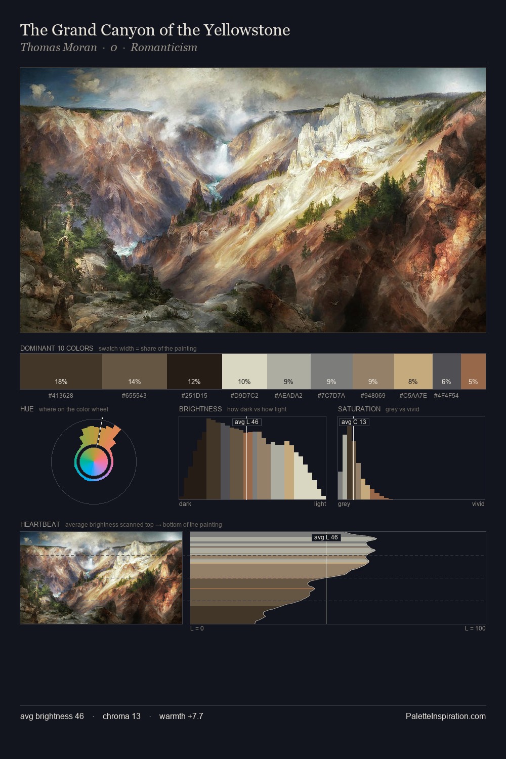
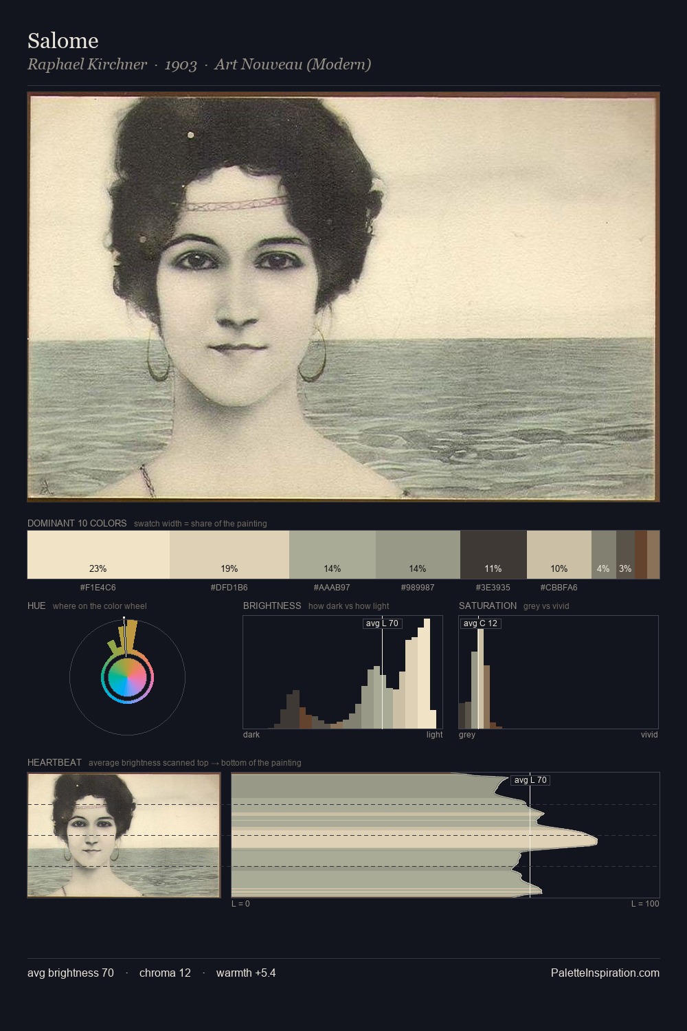
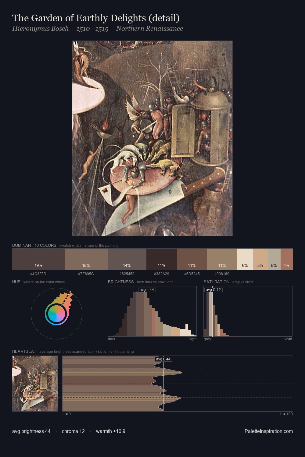
Vyacheslav Schwarz is strongly light-biased - shadow is suggested rather than declared. A distinctly cool atmosphere runs through this palette: sky, water, and mist given colour form. Chroma hovers near zero; colour declares itself through subtle shifts in hue rather than outright saturation. At 4.5%, #96694A carries the palette's sharpest chromatic charge: an accent that earns its place precisely because it is withheld. 59 units of value range underpin the palette's structural clarity: the eye always knows where light falls. The mid-to-high key, cool bias, and moderate chroma point to outdoor observation - sky and diffused daylight as the dominant light source. Palette 1 sits within the larger chromatic argument that Vyacheslav Schwarz's complete body of work advances.
Example use cases
- exhibition design
- foundation branding
- estate management
- art education
- museums & galleries
I Love This!
Copy, export, or download for your project