Carolus-Duran Palette 9

Palette Analysis
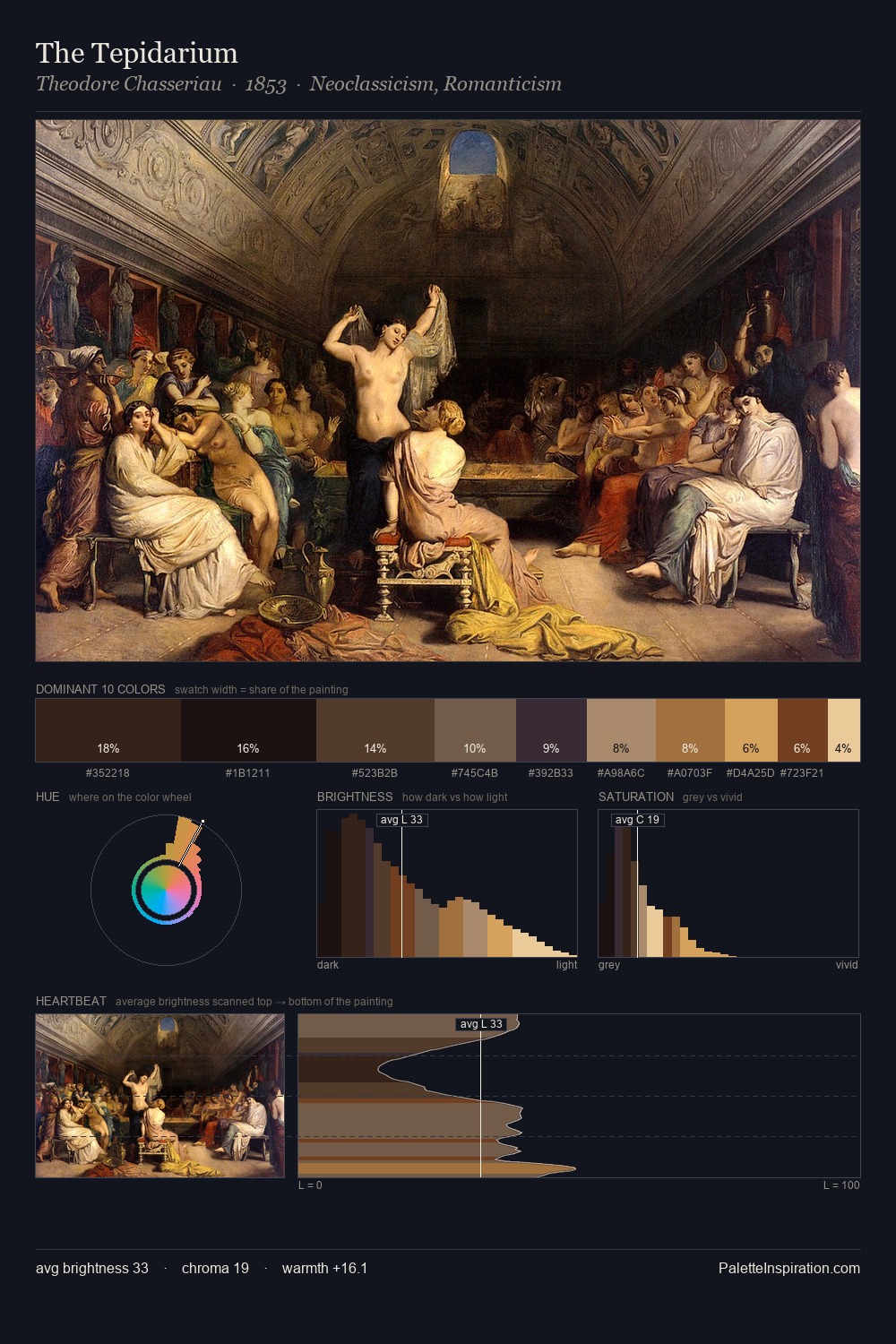
Carolus-Duran is built on dark foundations, with values clustered toward shadow. Temperature reads distinctly warm: the reds and earth tones from Carolus-Duran carry the compositional weight. All colours lean toward grey, building depth through value rather than colour punch. Carolus-Duran gives 37.2% of the composition to a single #161110 - a decisive chromatic anchor. The highest-chroma note - #E2CAA6 - appears at just 2.5%, deployed as a precision accent against the quieter ground. 67 units of value range underpin the palette's structural clarity: the eye always knows where light falls. This tonal restraint is characteristic of the Carolus-Duran approach: colour serves light, not the reverse. Palette 9 sits within the larger chromatic argument that Carolus-Duran's complete body of work advances.
Example use cases
- theater design
- jewelry brands
- tobacco-adjacent retail
- event branding
- film & entertainment
I Love This!
Copy, export, or download for your project