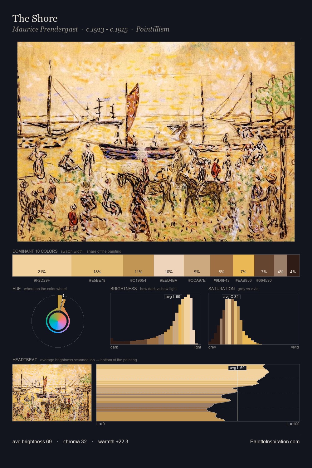
Camille Pissarro Palette 3
Soft Apricot
Soft Low-contrast, gentle chroma - mid-key values and low saturation, approachable and calm.
Apricot Soft warm orange - peach-adjacent, the color of ripe stone fruit.

Palette Analysis
Camille Pissarro is high in key: pale, luminous, and filled with optical air. Camille Pissarro orchestrates warmth above all else - reds, ambers, and siennas take the lead. Chroma is kept low across all colours, producing the soft, enveloping quality that characterises tonal painting. Only 5.7% is devoted to #9A6535, yet that small allocation delivers the palette's entire chromatic tension. At 61 units of value range, the palette has the tonal breadth to sustain complex spatial readings. This is palette 3 of Camille Pissarro's sequence - a single chapter in a chromatic story told across many works.
Example use cases
- ceramics & pottery
- boutique hospitality
- menswear
- heritage food brands
- craft & artisan brands
I Love This!
Use This Palette
Copy, export, or download for your project
Copy, export, or download for your project
Copy:
Download:
Share: