Mikhail Vrubel Palette 3

Palette Analysis
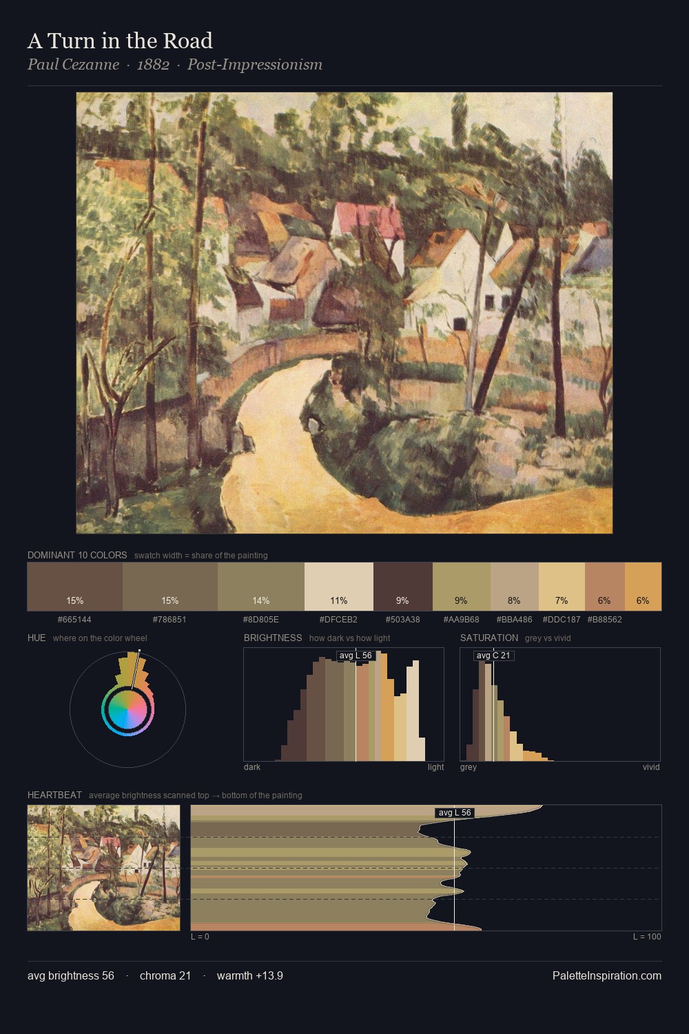
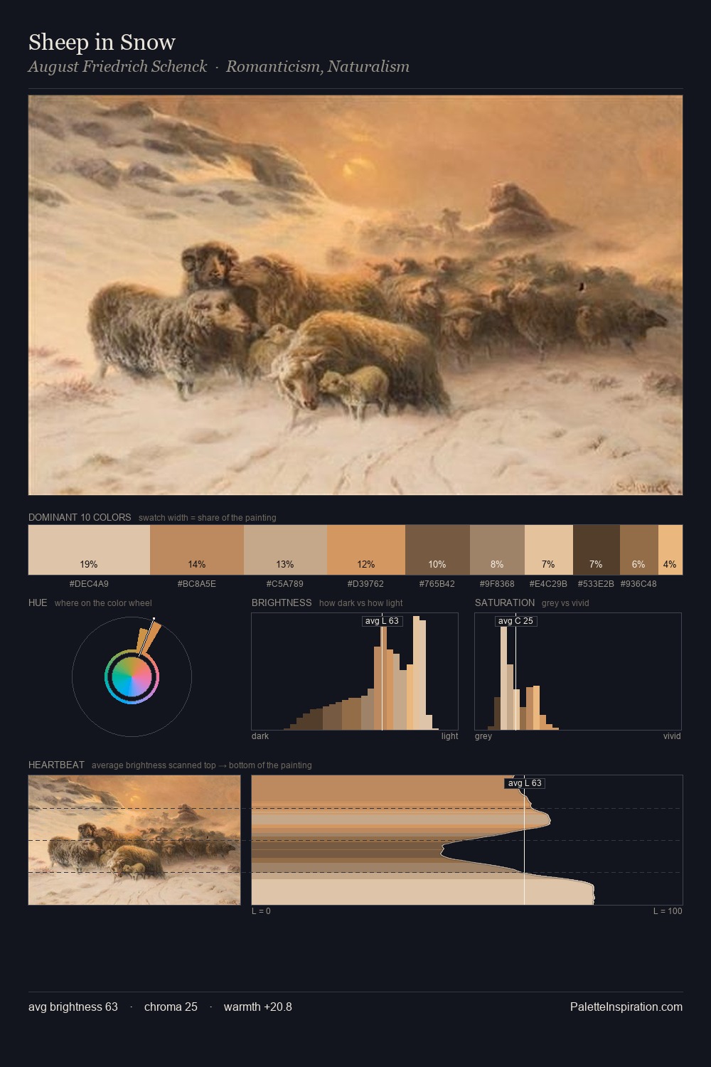
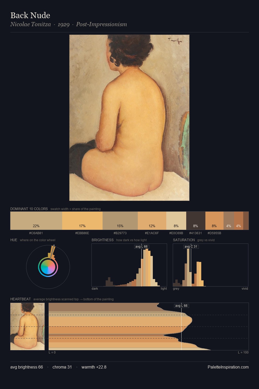
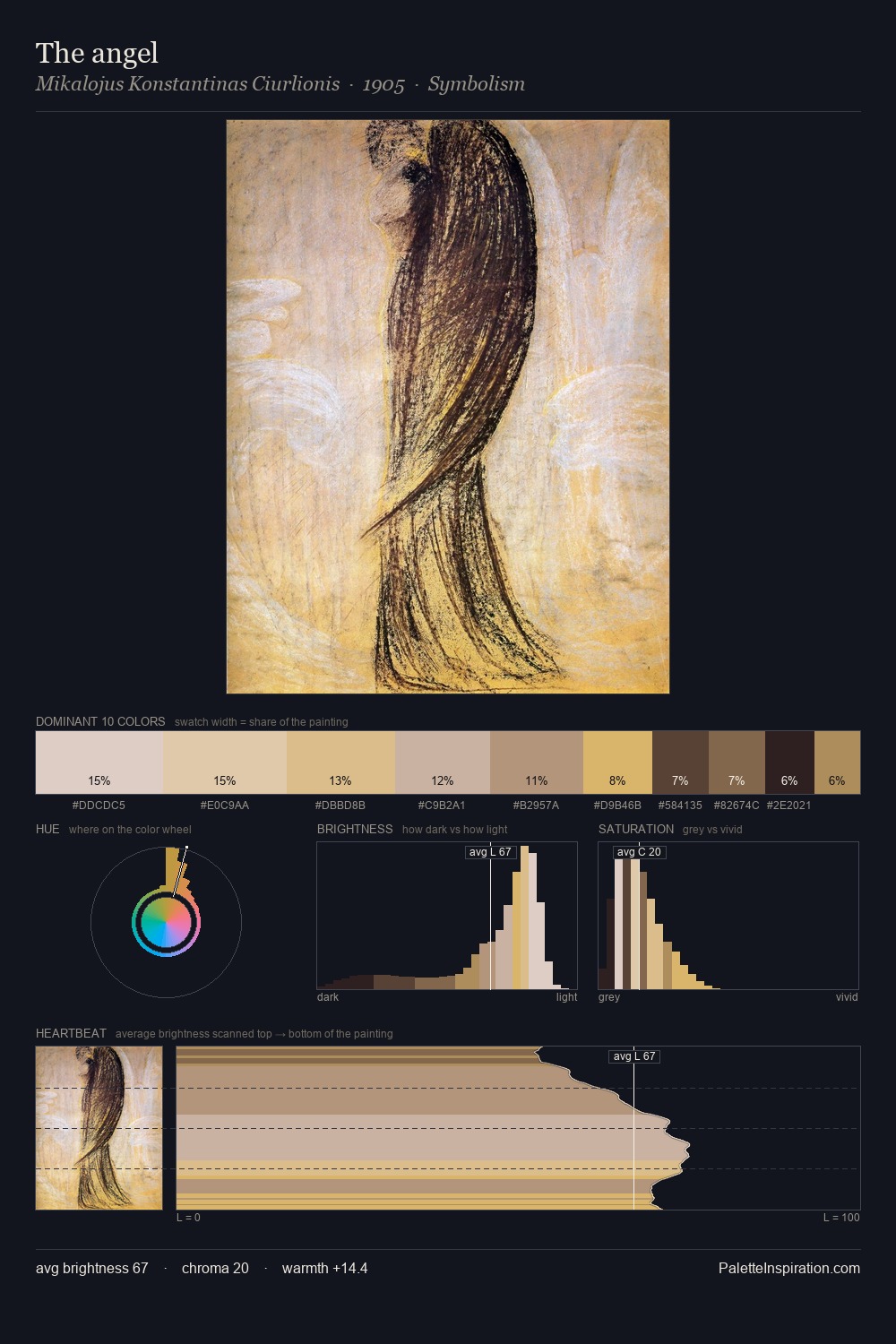
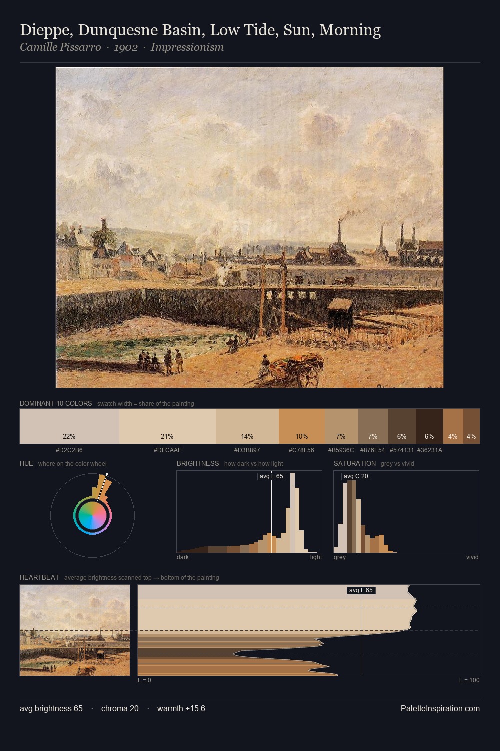
Values in Mikhail Vrubel tilt decisively toward white, giving the palette its luminous character. Mikhail Vrubel keeps warm and cool in parity, a balance that lends the work a perceptual shimmer. Chroma is held at a comfortable level - distinct colours, but no single hue is allowed to overwhelm. The most saturated colour, #BA8F68, is reserved to 11.9% of the surface, where it acts as a focal punctuation. Value range is moderate at 45 units - enough contrast for legibility, not so much as to fragment the tonal unity. The palette reads as an Impressionist one - light-biased, chromatically direct, and built on temperature contrast rather than value opposition. In the context of Mikhail Vrubel's full range of palettes, group 3 represents one movement in an ongoing chromatic dialogue.
Example use cases
- ceramics & pottery
- boutique hospitality
- menswear
- heritage food brands
- craft & artisan brands
I Love This!
Copy, export, or download for your project