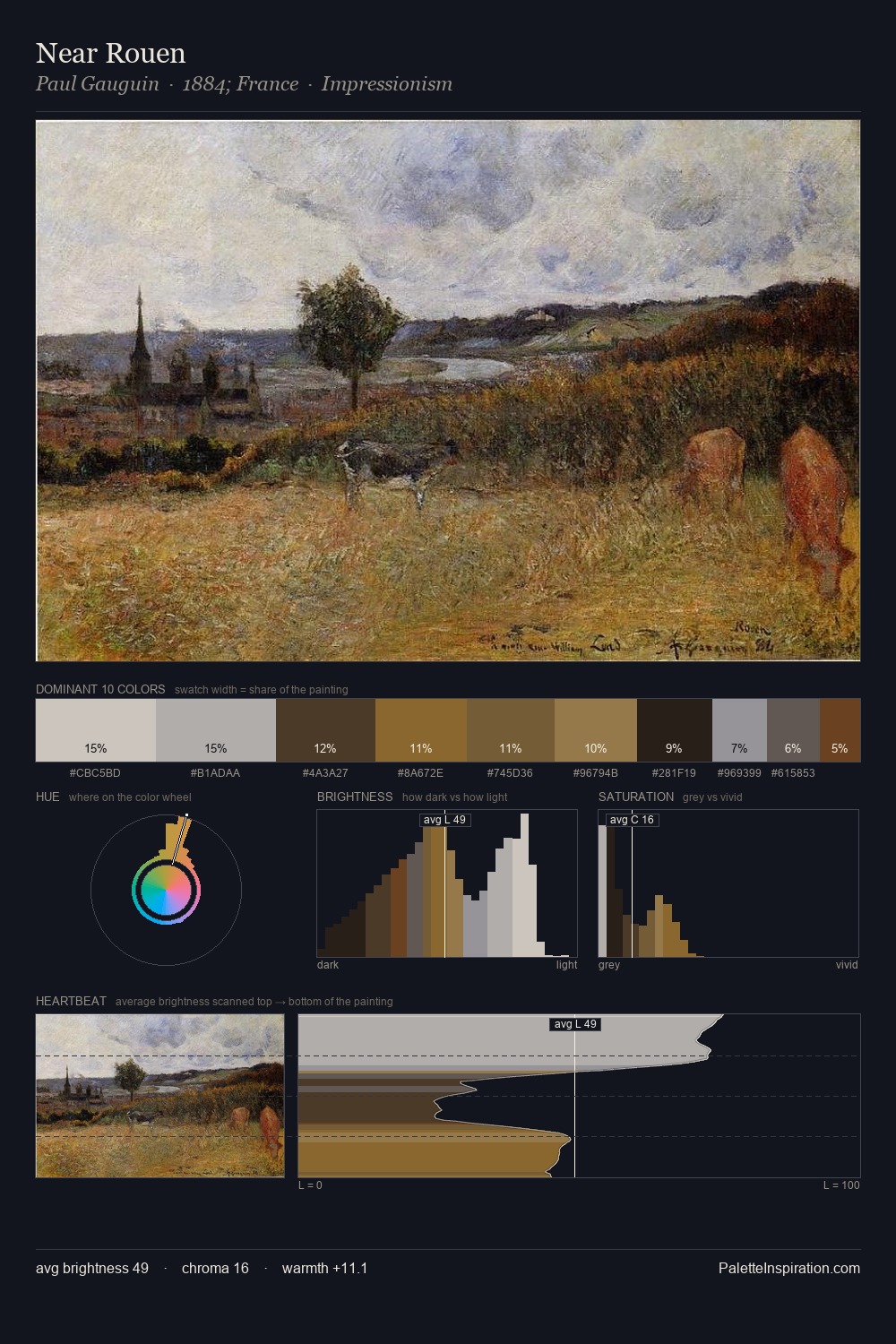
Camille Pissarro Palette 23
Muted Parchment
Muted Deliberately desaturated - chroma pulled toward gray, the restraint of tonal painting.
Parchment Aged warm neutral - the color of old manuscript parchment, tan and slightly yellowed.

Palette Analysis
Camille Pissarro keeps values measured and balanced, a hallmark of tonal restraint. Camille Pissarro orchestrates warmth above all else - reds, ambers, and siennas take the lead. Chroma is kept low across all colours, producing the soft, enveloping quality that characterises tonal painting. The saturated accent, #67662E, registers at 5.0% - sparse enough to feel like a deliberate surprise. 61 units of value range underpin the palette's structural clarity: the eye always knows where light falls. Camille Pissarro's palette 23 carries its own internal logic while remaining in conversation with the artist's broader colour intelligence.
Example use cases
- exhibition design
- foundation branding
- estate management
- art education
- museums & galleries
I Love This!
Use This Palette
Copy, export, or download for your project
Copy, export, or download for your project
Copy:
Download:
Share: