Camille Pissarro Palette 20

Palette Analysis
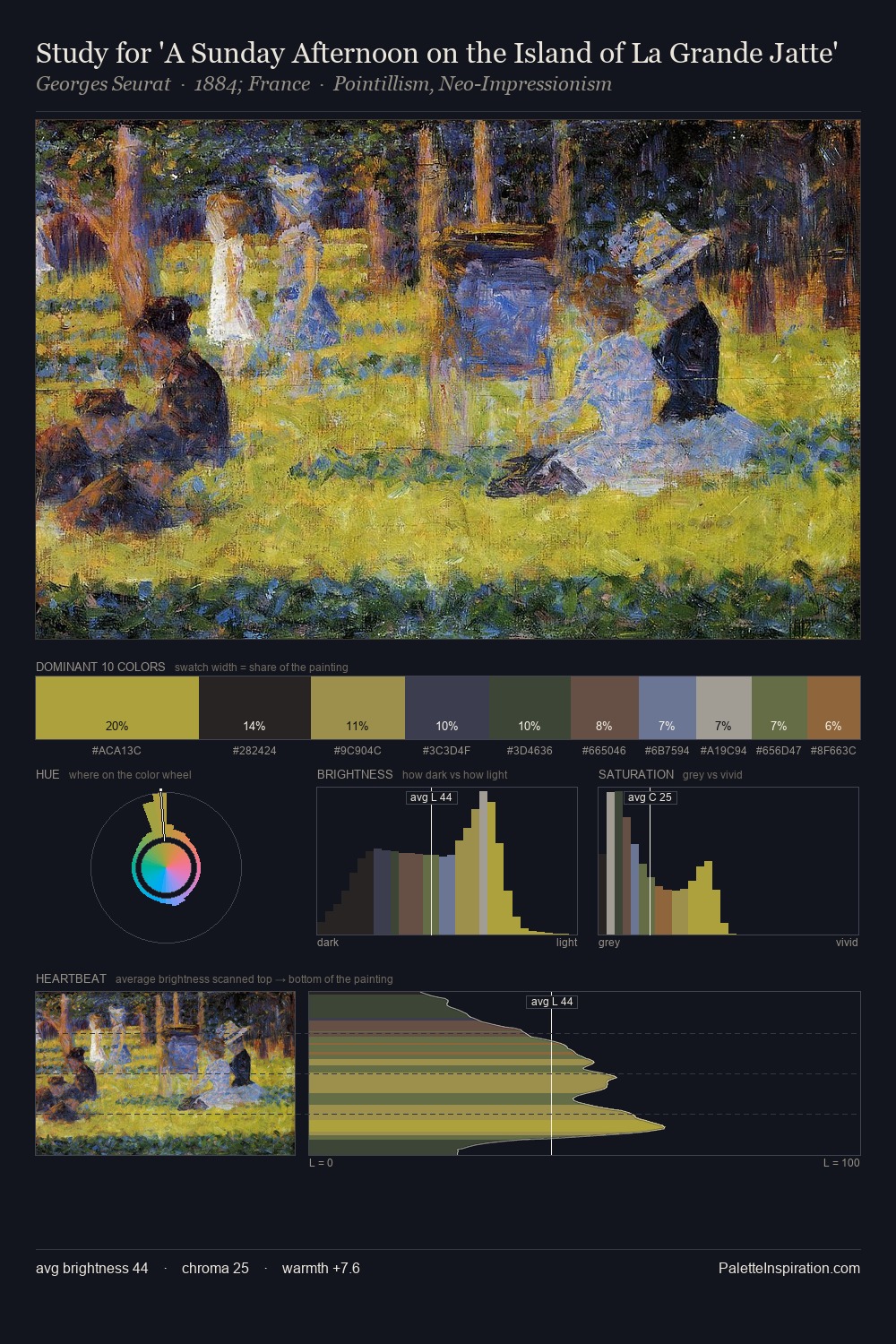
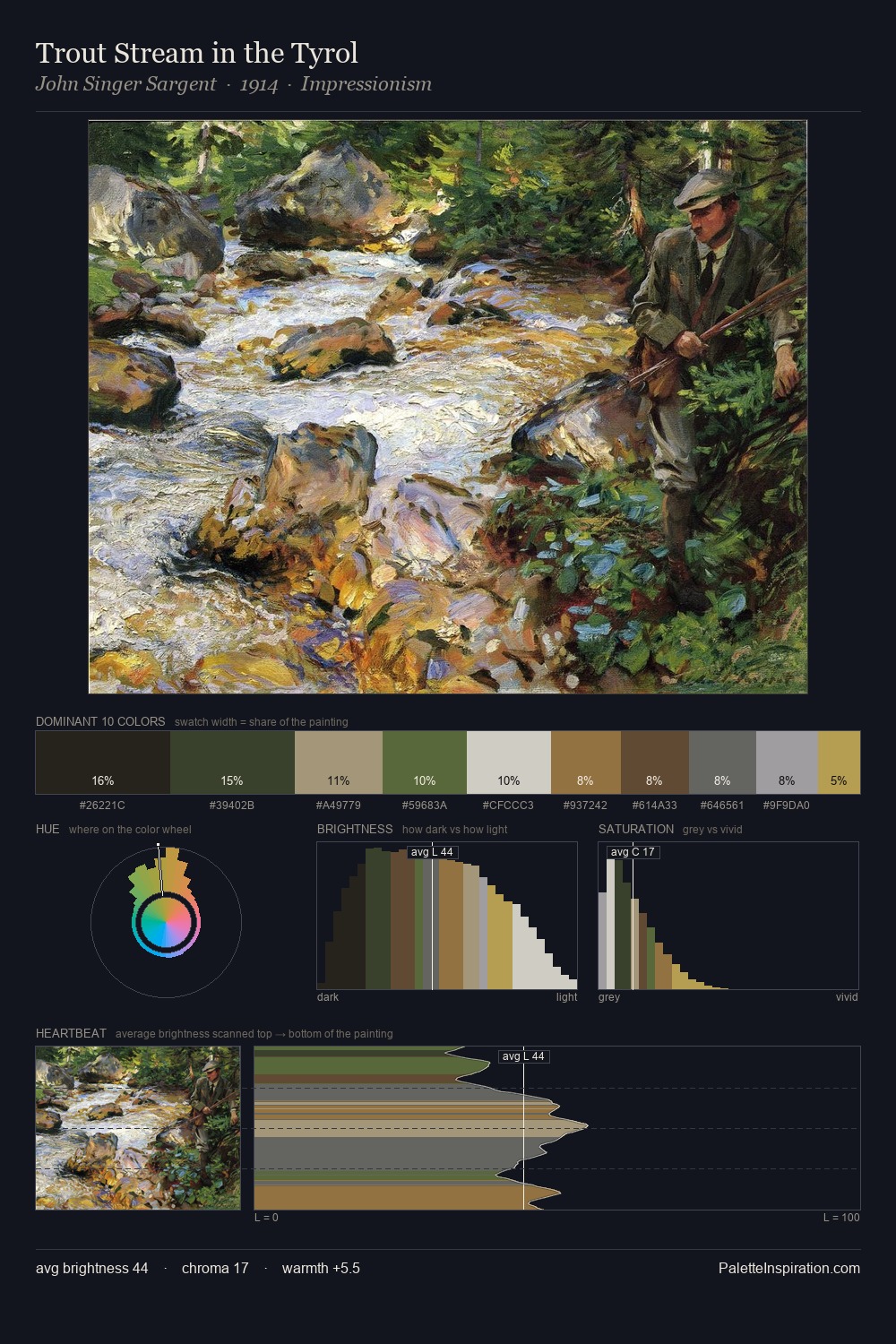
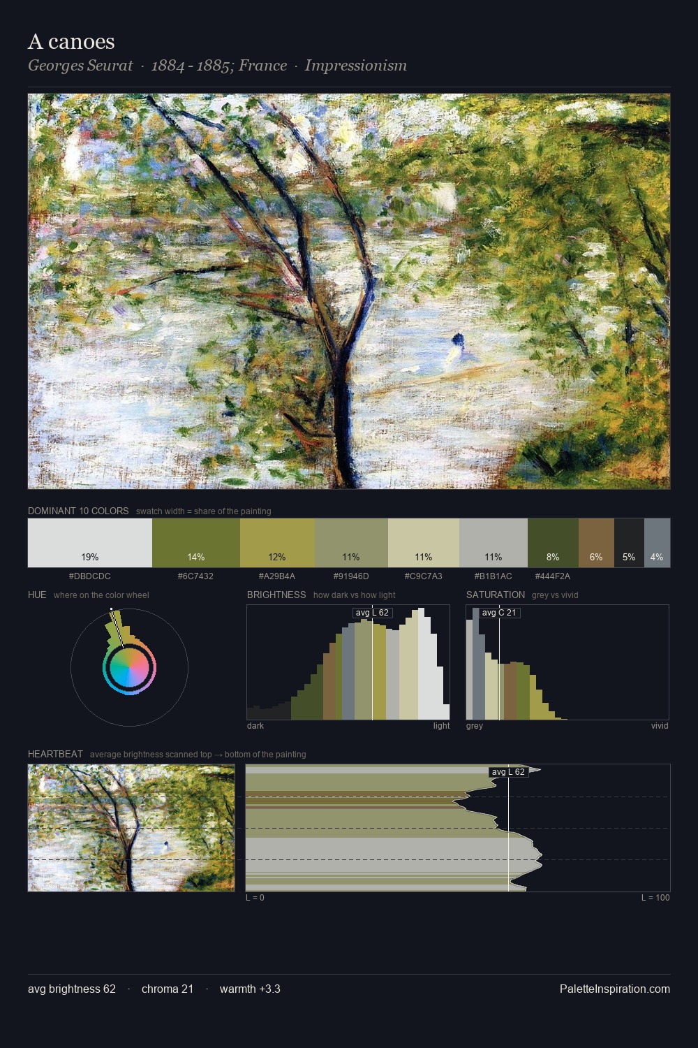
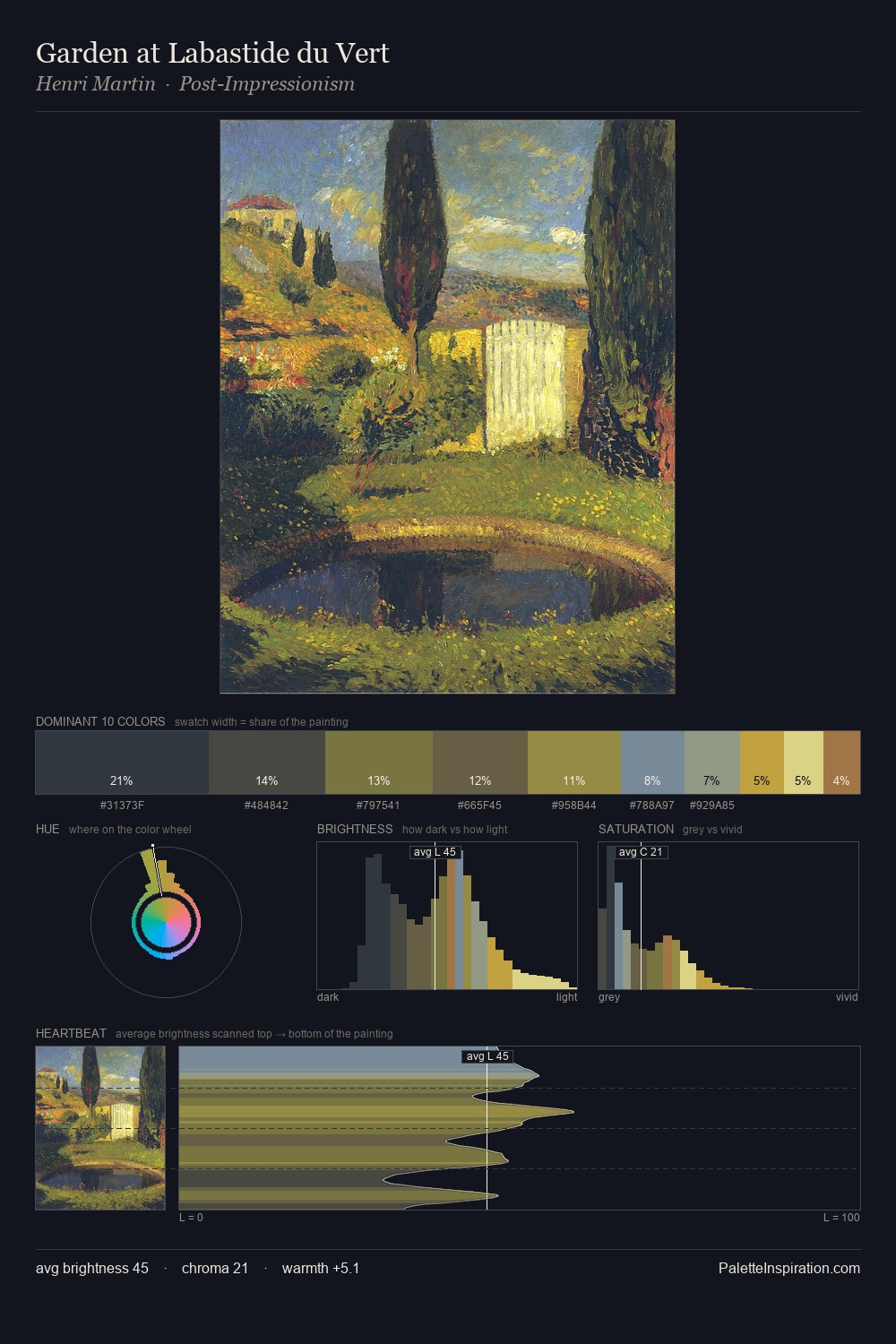
Mid-key values give Camille Pissarro its characteristic quietness - nothing blazes, nothing disappears. Cool hues prevail: blues, greens, and greys anchor the palette's emotional temperature. Chroma is held at a comfortable level - distinct colours, but no single hue is allowed to overwhelm. The most saturated colour, #5C692A, covers 10.4% of the surface: too much to call an accent, too strong to ignore. Spanning 52 units on the value axis, the palette achieves the balance between tonal flatness and fragmentation. The palette has the character of outdoor light: cool, mid-bright, with colour rendered faithfully rather than expressively. Palette 20 sits within the larger chromatic argument that Camille Pissarro's complete body of work advances.
Example use cases
- publishing
- corporate identity
- consumer apps
- hospitality
- design agencies
I Love This!
Copy, export, or download for your project