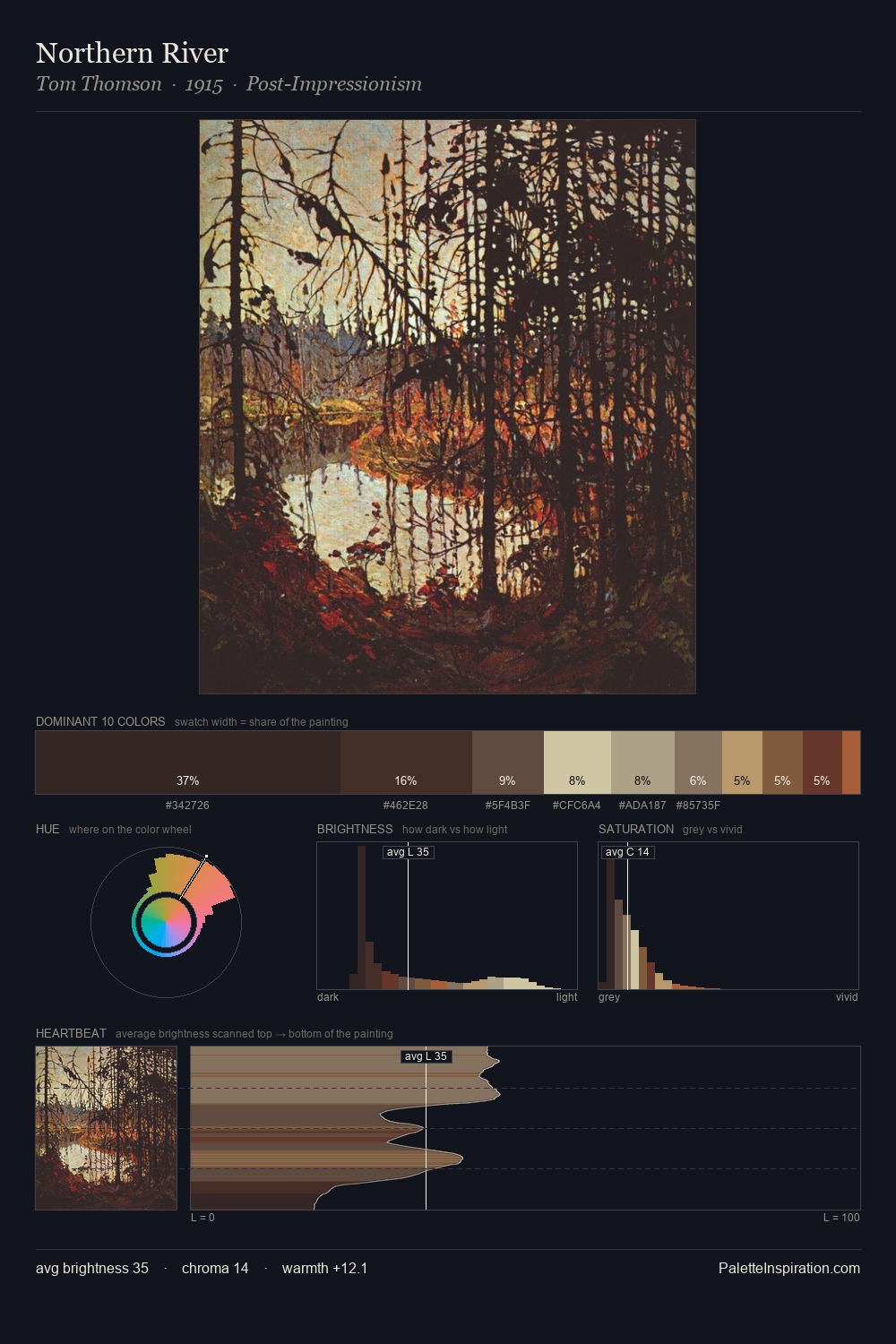
Camille Pissarro Palette 16
Muted Gamboge
Muted Deliberately desaturated - chroma pulled toward gray, the restraint of tonal painting.
Gamboge Deep golden yellow - a traditional warm pigment, rich amber-gold.

Palette Analysis
Camille Pissarro occupies the comfortable middle of the value scale, avoiding both extremes to hold the eye in a sustained middle grey. Yellow, ochre, sienna: warm hues that Camille Pissarro deploys as the palette's primary energy. The absence of saturated colour is itself an expressive choice: this is a palette of restraint and atmosphere. The saturated accent, #B38D5F, registers at 9.1% - sparse enough to feel like a deliberate surprise. The value range of 54 units sits in the comfortable middle: enough depth, enough light, neither extreme. Palette 16 sits within the larger chromatic argument that Camille Pissarro's complete body of work advances.
Example use cases
- food packaging
- leather accessories
- travel & outdoor
- natural cosmetics
- interior design
I Love This!
Use This Palette
Copy, export, or download for your project
Copy, export, or download for your project
Copy:
Download:
Share: