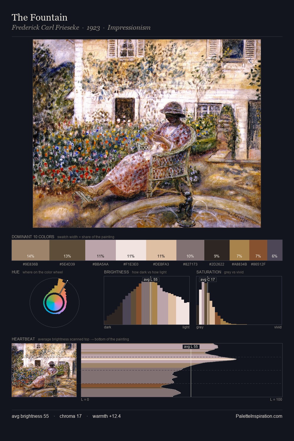
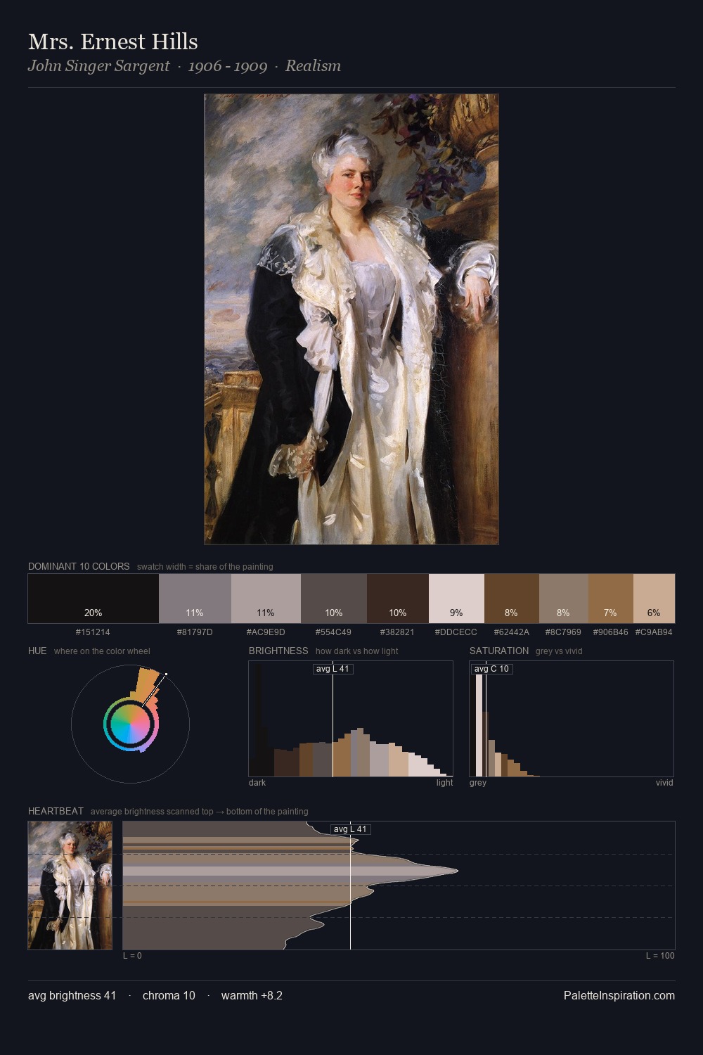
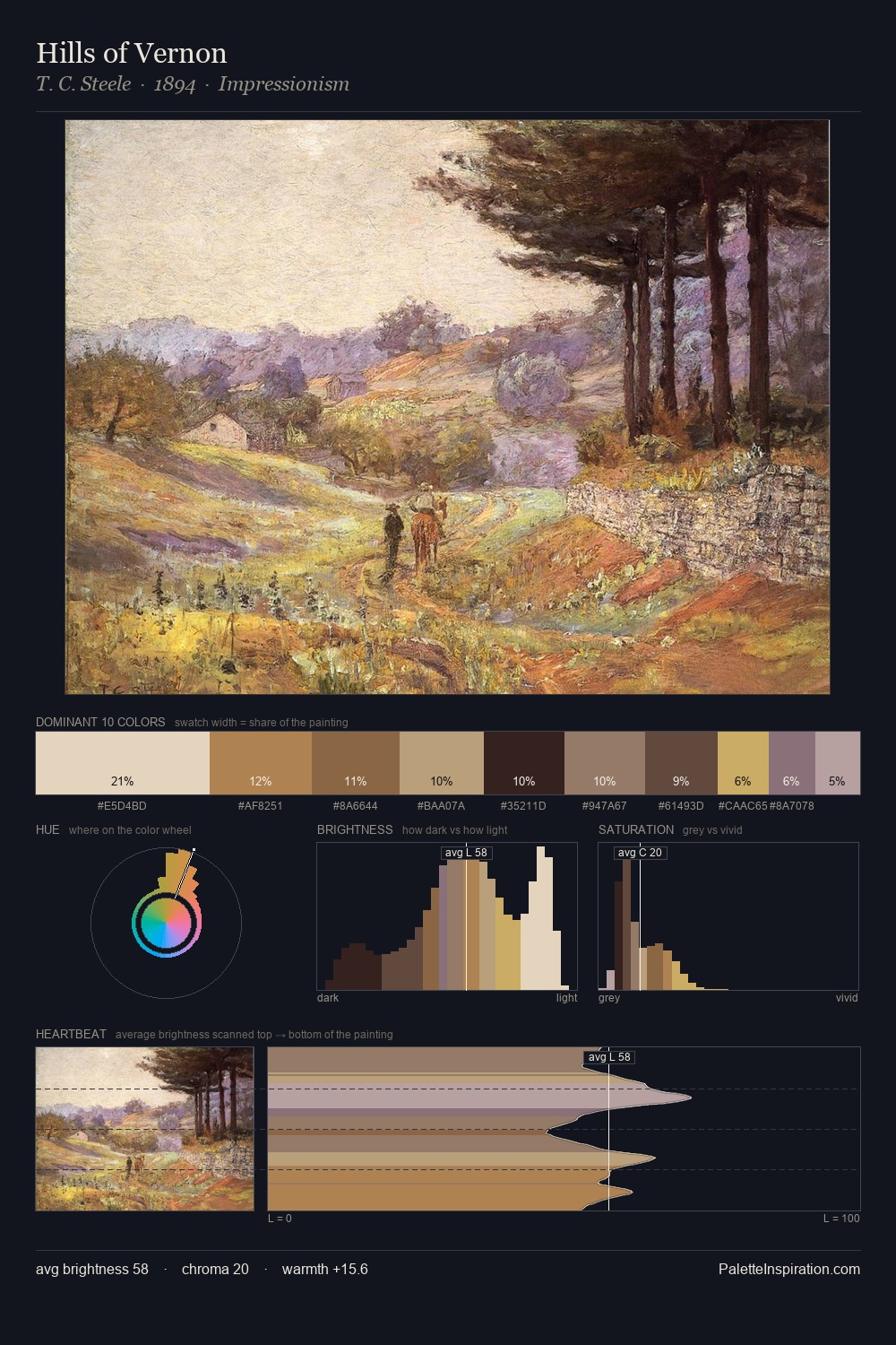
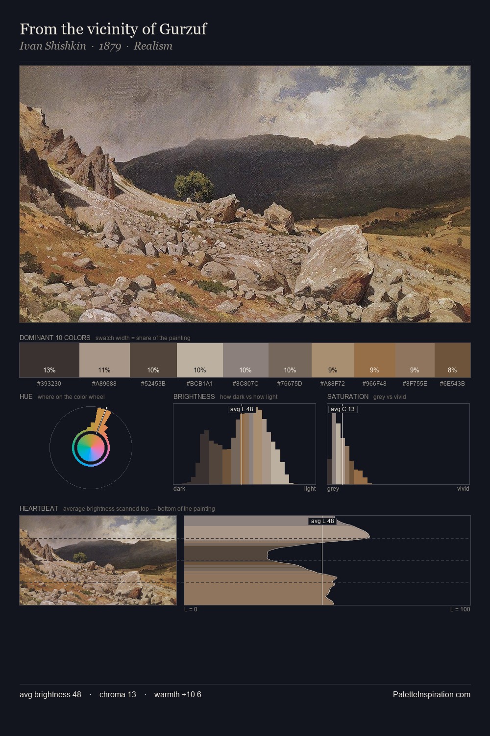
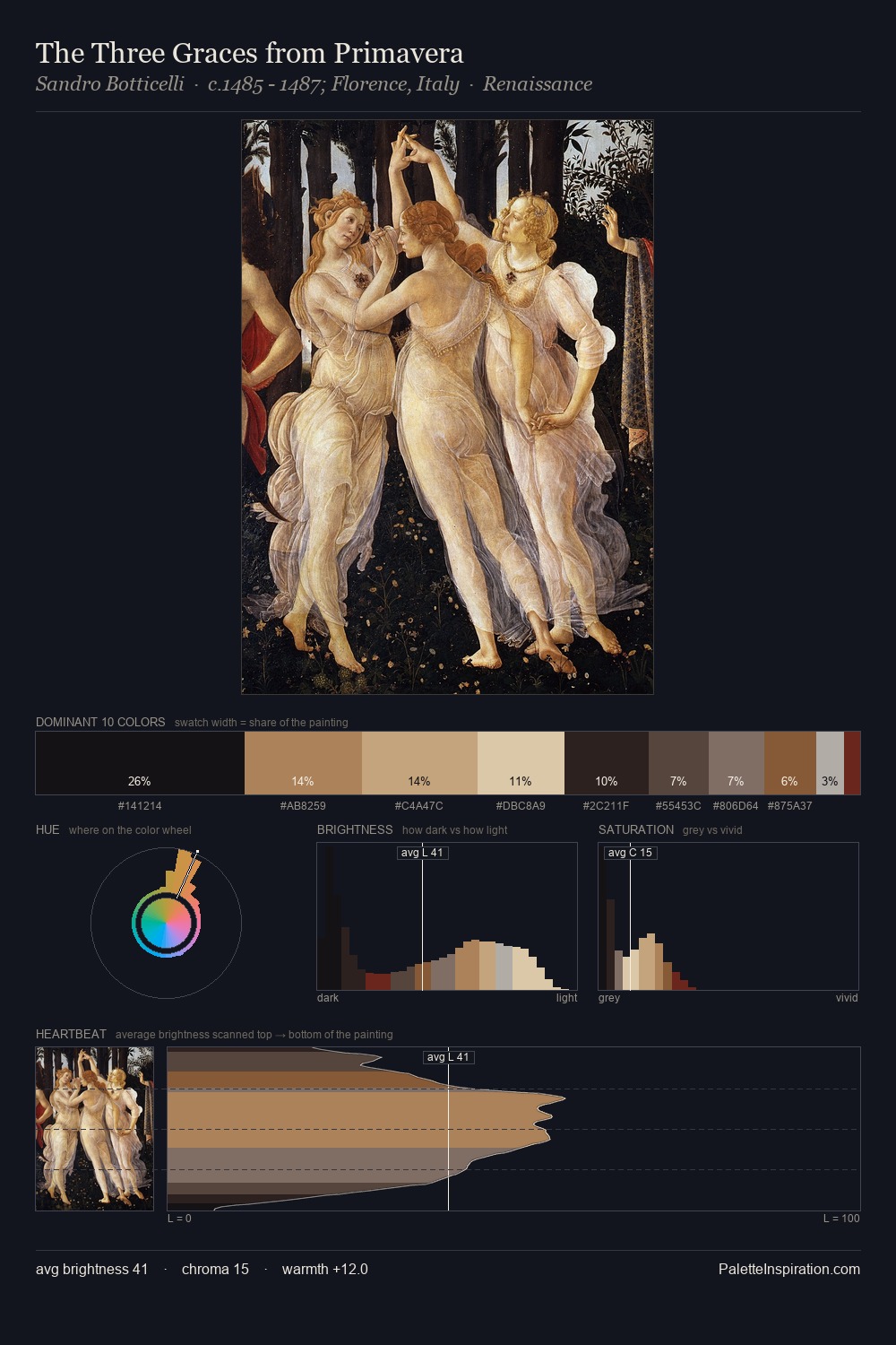
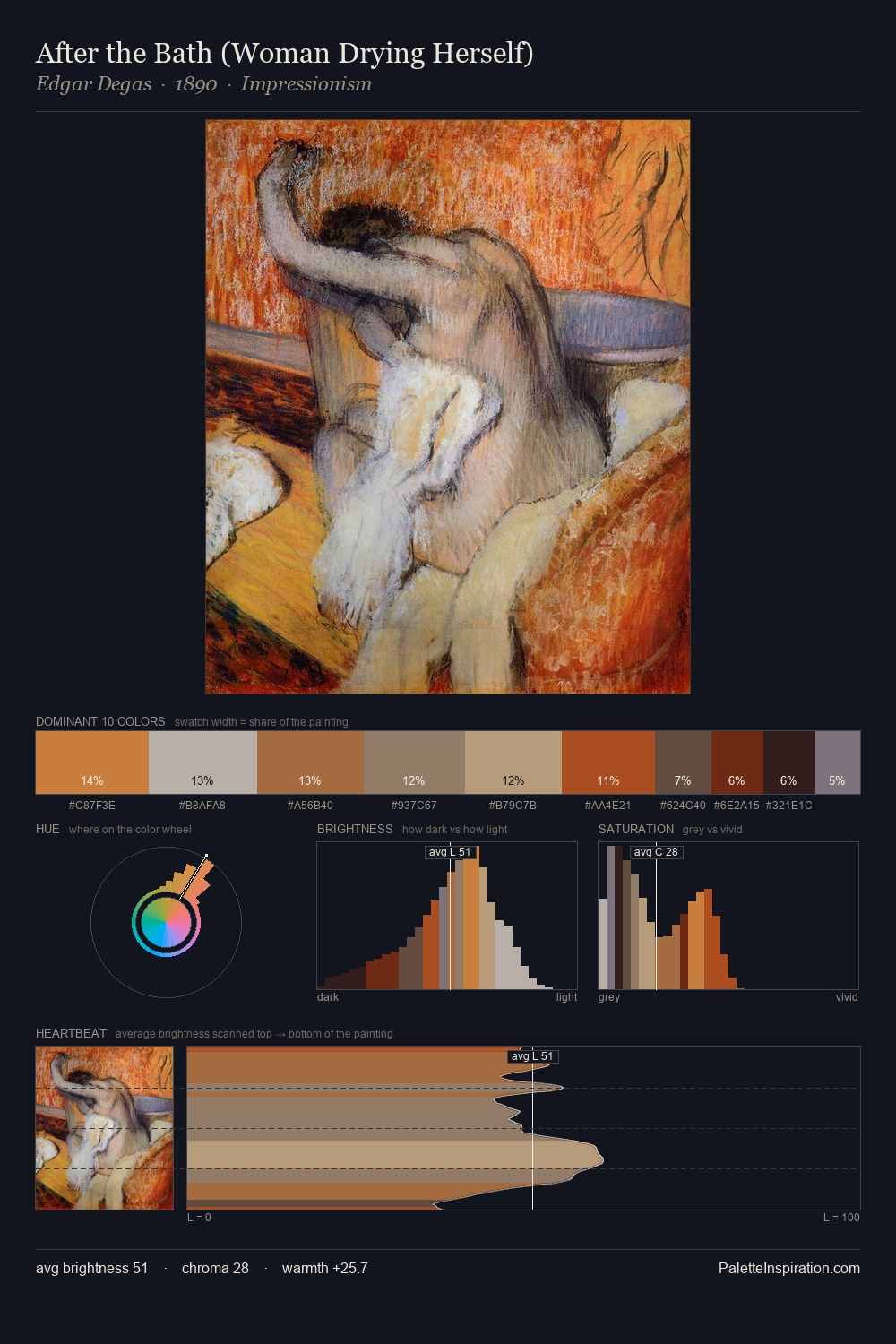
Camille Pissarro Palette 17
Muted Tawny
Muted Deliberately desaturated - chroma pulled toward gray, the restraint of tonal painting.
Tawny Warm orange-brown - a traditional term for the color of tanned leather or lion fur.

Palette Analysis
Camille Pissarro distributes its values across the middle register, creating harmony without high contrast. Warmth dominates - the palette of Camille Pissarro leans heavily on the yellow-orange-red arc of the colour wheel. Every colour is desaturated; the palette proceeds through near-neutrals and gently-coloured greys. Only 6.3% is devoted to #9C7A46, yet that small allocation delivers the palette's entire chromatic tension. The value range of 52 units sits in the comfortable middle: enough depth, enough light, neither extreme. Camille Pissarro's palette 17 carries its own internal logic while remaining in conversation with the artist's broader colour intelligence.
Example use cases
- archival print
- university identity
- rare books
- cultural institutions
- nonprofit identity
I Love This!
Use This Palette
Copy, export, or download for your project
Copy, export, or download for your project
Copy:
Download:
Share: