Giuseppe Costantini Palette 1

Palette Analysis
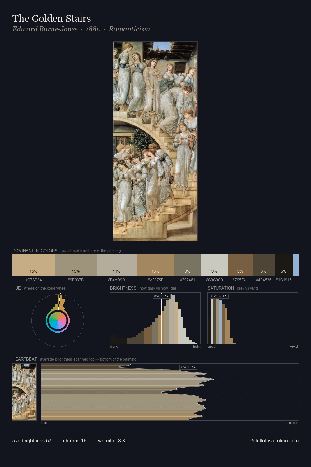
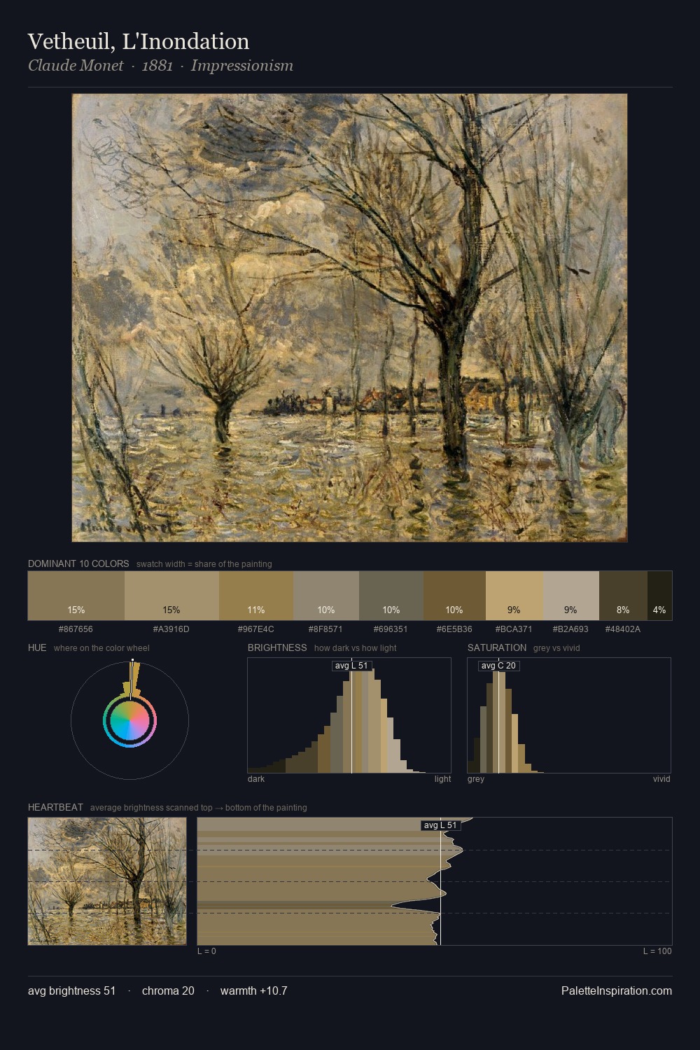
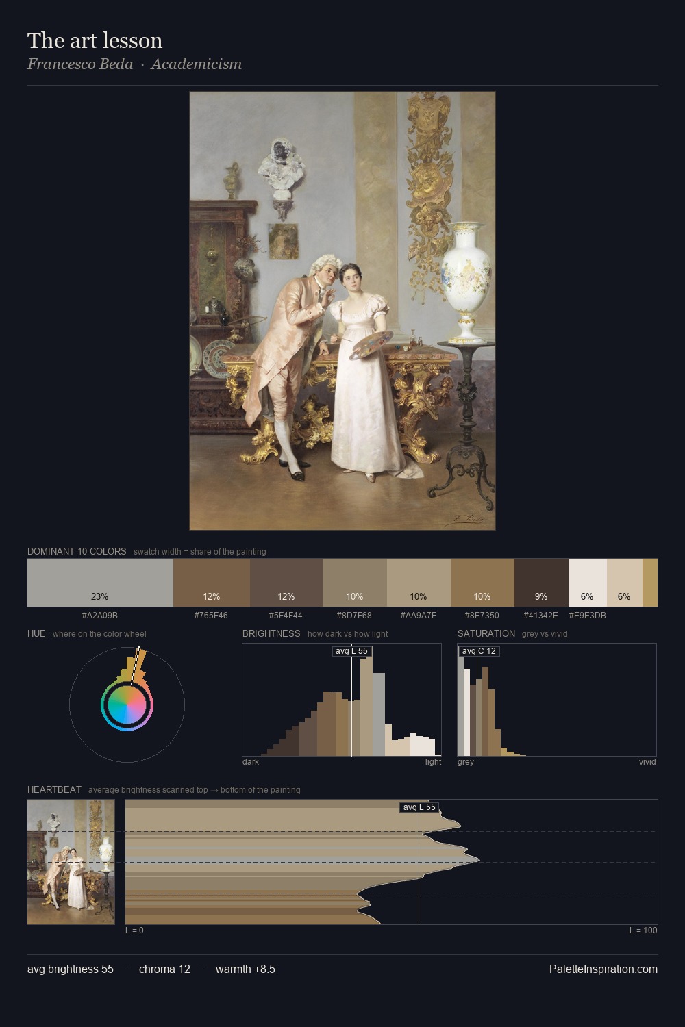
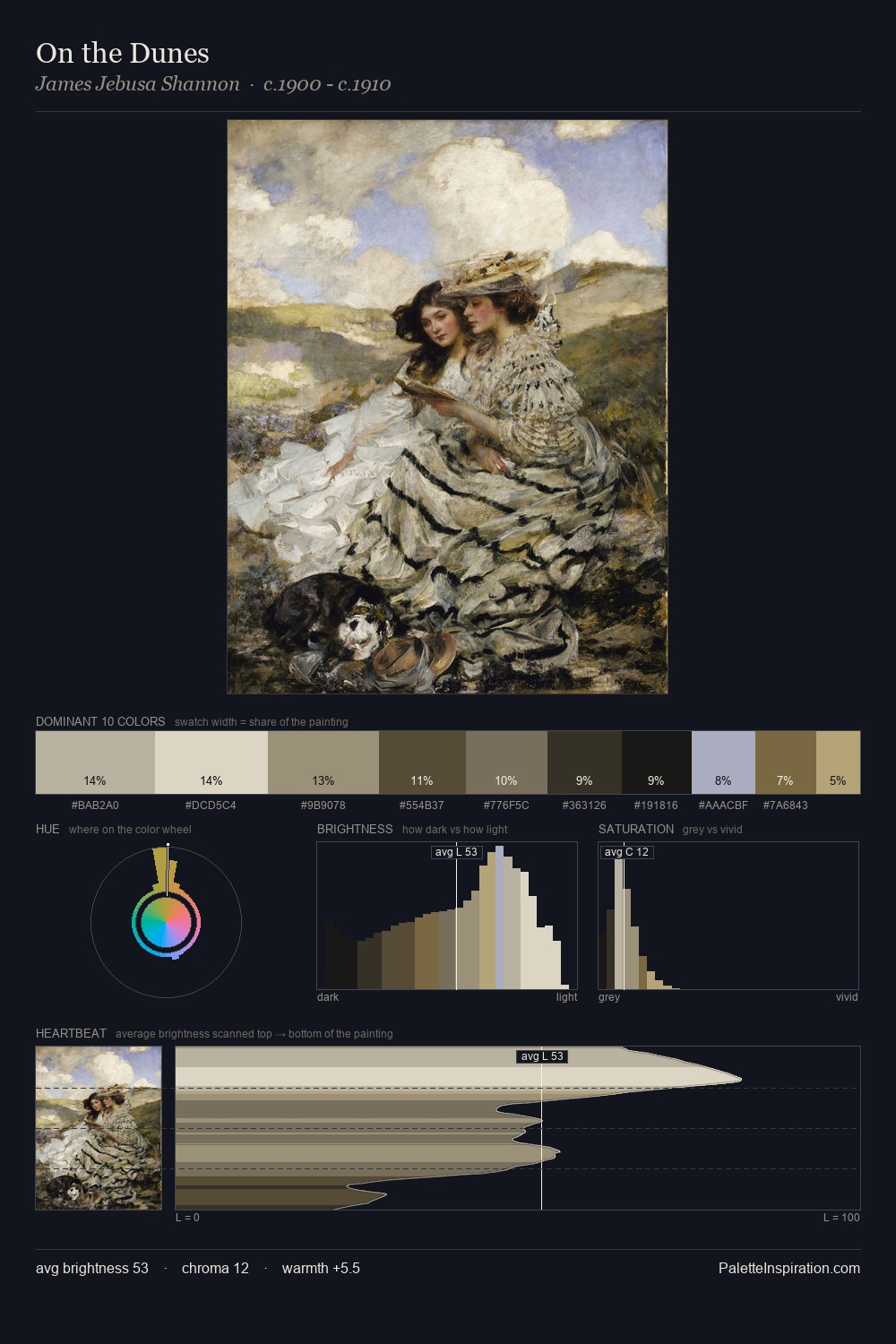
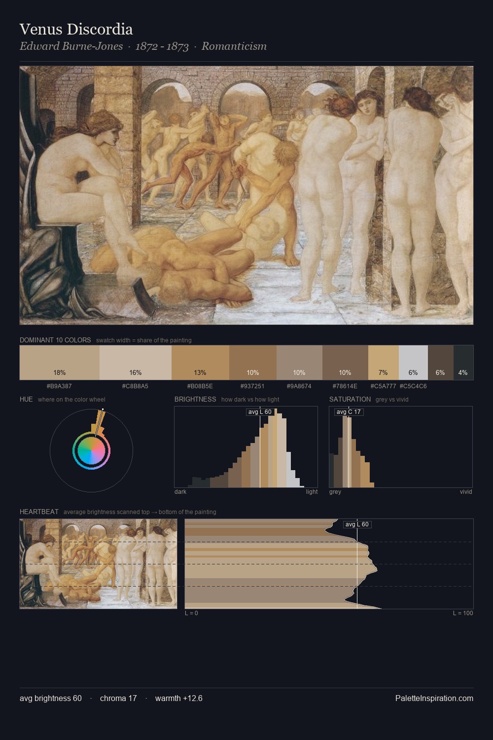
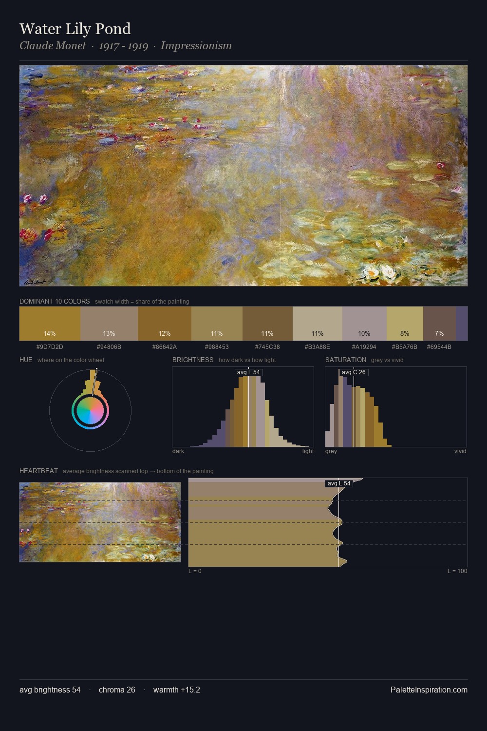
Values in Giuseppe Costantini rest in the mid-range - neither dramatically lit nor steeped in shadow. Giuseppe Costantini builds on cool foundations: the palette favours the blue-cyan-green arc. Chroma hovers near zero; colour declares itself through subtle shifts in hue rather than outright saturation. The most saturated colour, #6A5738, is reserved to 3.9% of the surface, where it acts as a focal punctuation. Value range is moderate at 35 units - enough contrast for legibility, not so much as to fragment the tonal unity. High luminosity and cool temperature suggest the plein-air condition: unfiltered daylight and open sky. In the context of Giuseppe Costantini's full range of palettes, group 1 represents one movement in an ongoing chromatic dialogue.
Example use cases
- museums & galleries
- academic publishing
- heritage brands
- auction houses
- exhibition design
I Love This!
Copy, export, or download for your project