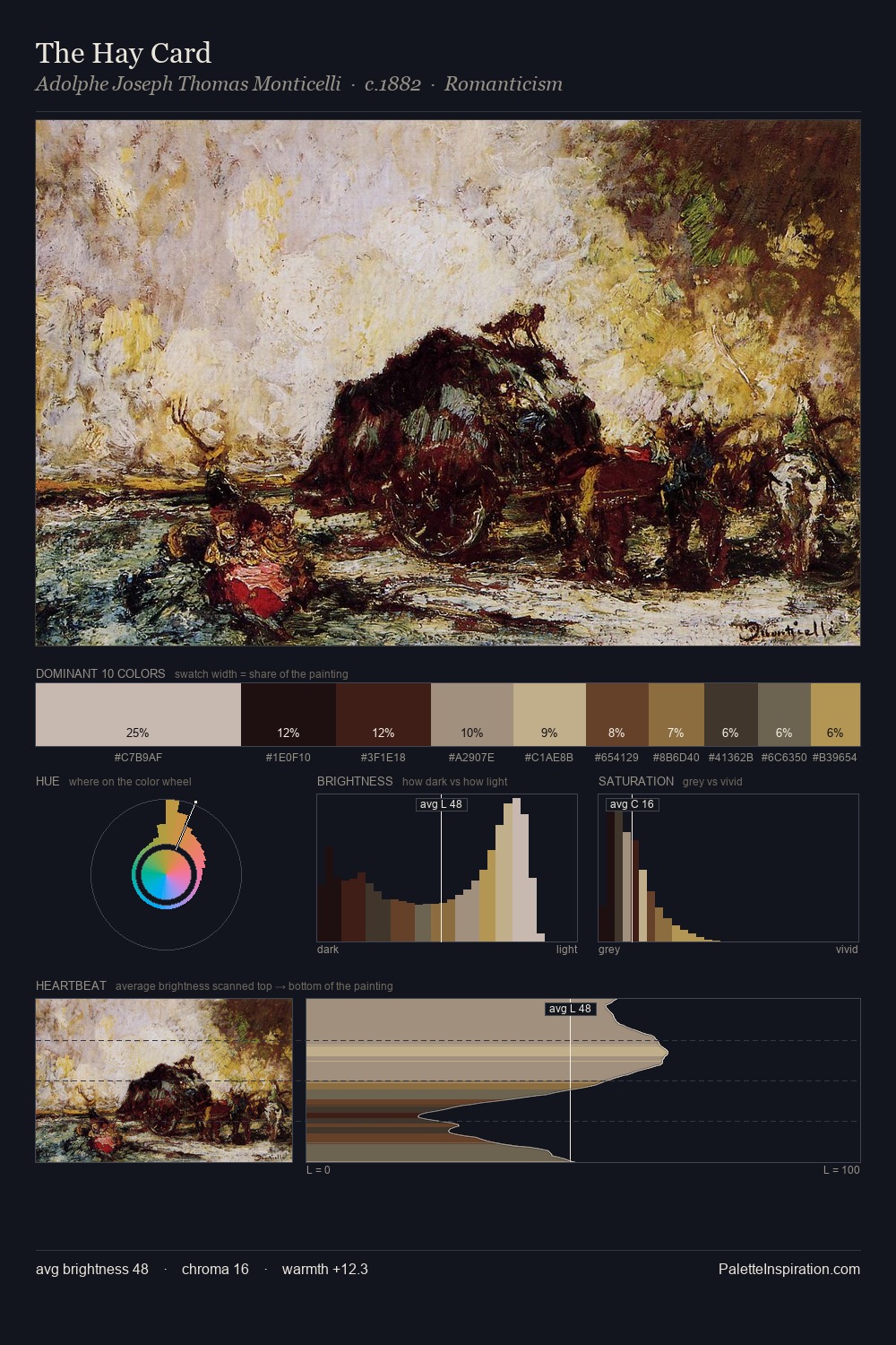
Baroque Master Palette

Palette Analysis
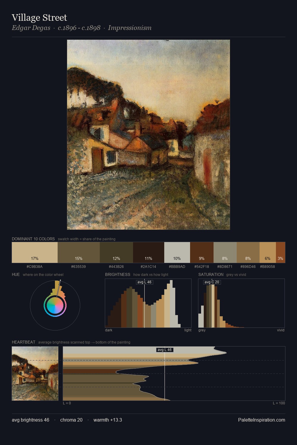
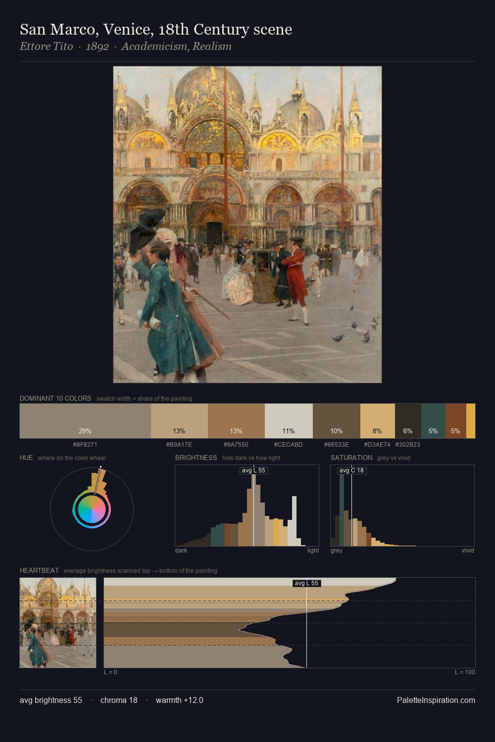
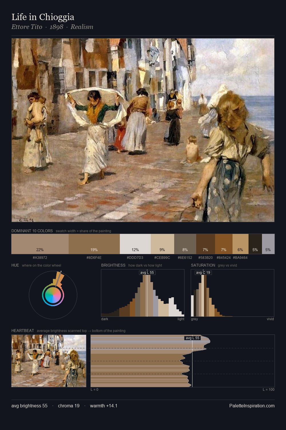
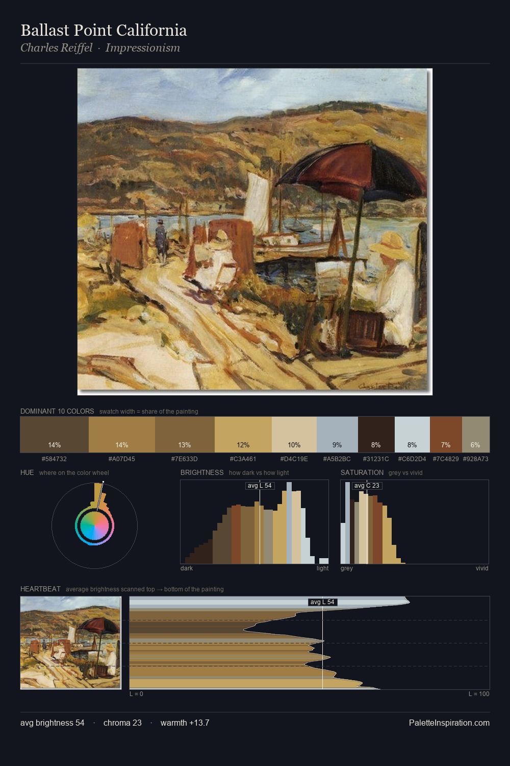
What unites the Baroque movement is as much chromatic as stylistic; this palette traces that unspoken agreement. Baroque sits in the centre of the value range, lending the palette a sense of even, sustained light. Warmth dominates - the palette leans heavily on the yellow-orange-red arc of the colour wheel. The absence of saturated colour is itself an expressive choice: this is a palette of restraint and atmosphere. 28.3% of the palette belongs to #1D1816, a concentration that makes it the unmistakable visual centre. #C29A61 functions as the palette's exclamation mark: highest chroma, lowest percentage (4.5%). From deepest dark to palest light, the palette traverses 62 units of the value scale - a span that creates natural depth. Any work aspiring to the Baroque sensibility would find reliable footing in these values.
Example use cases
- music labels
- luxury hospitality
- editorial photography
- leather goods
- premium streaming
I Love This!
Copy, export, or download for your project