Baroque Palette 17
Shadowed Bister
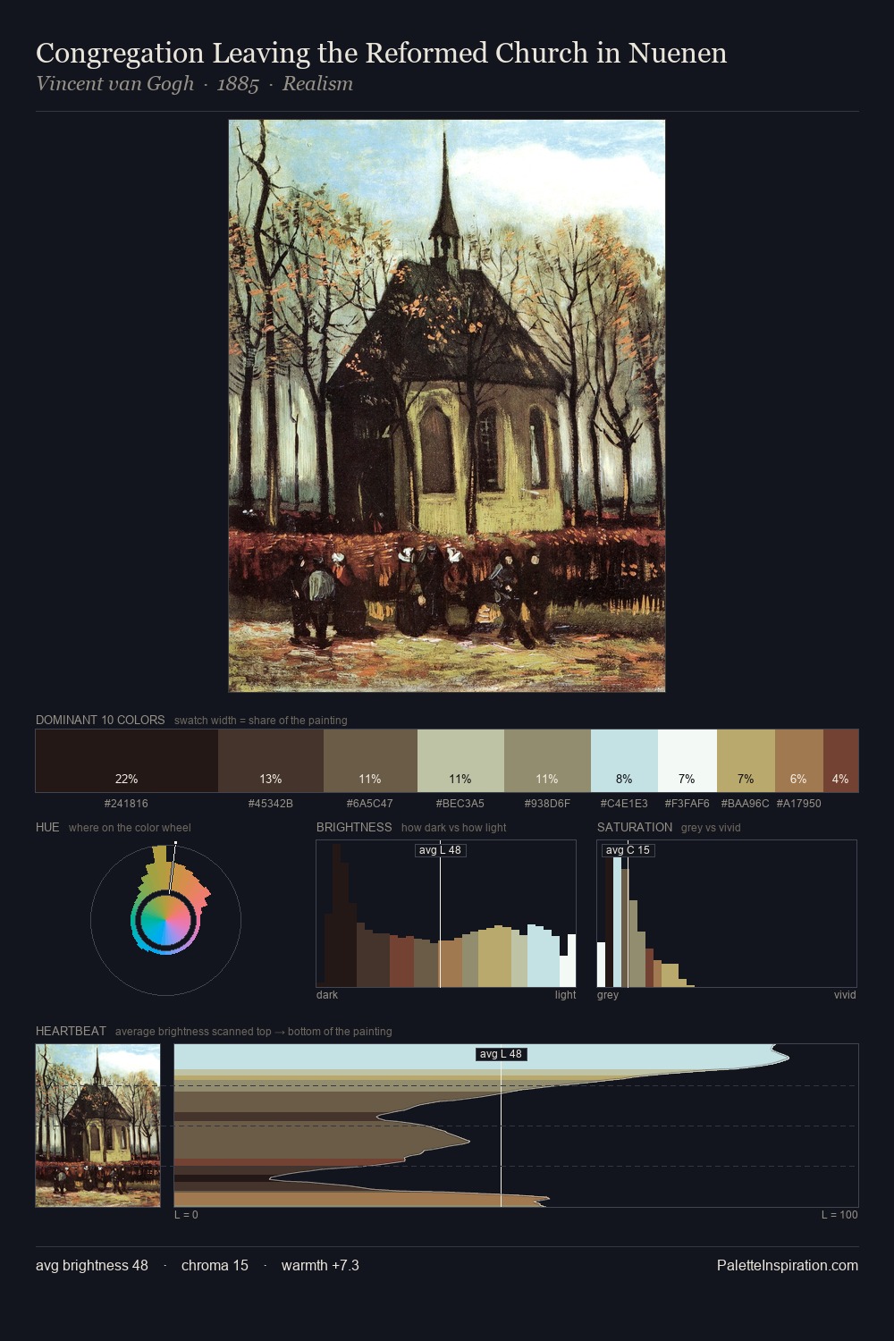
Shadowed Low-key - values weighted toward shadow, the palette of dim interiors and overcast skies.
Bister Dark warm brown - a traditional ink and wash pigment made from wood soot.

Palette Analysis
Baroque occupies the comfortable middle of the value scale, avoiding both extremes to hold the eye in a sustained middle grey. Warm hues command this palette; it favours the reds, oranges, and yellows of firelight and earth. Muted throughout, the palette achieves its effects through value and temperature rather than chromatic force. #1C1816 at 30.0% of the palette: an overwhelming presence that pulls all other colours into its gravitational field. The most saturated colour, #C6A26B, is reserved to 3.6% of the surface, where it acts as a focal punctuation. 78 units of value range underpin the palette's structural clarity: the eye always knows where light falls.
Example use cases
- premium streaming
- cocktail bars
- fashion campaigns
- book covers
- music labels
I Love This!
Use This Palette
Copy, export, or download for your project
Copy, export, or download for your project
Copy:
Download:
Share: