Baroque Palette 4
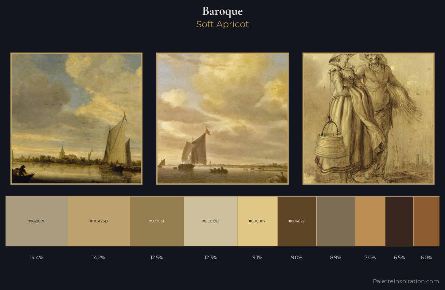
Soft Apricot
Soft Low-contrast, gentle chroma - mid-key values and low saturation, approachable and calm.
Apricot Soft warm orange - peach-adjacent, the color of ripe stone fruit.
Palette Analysis
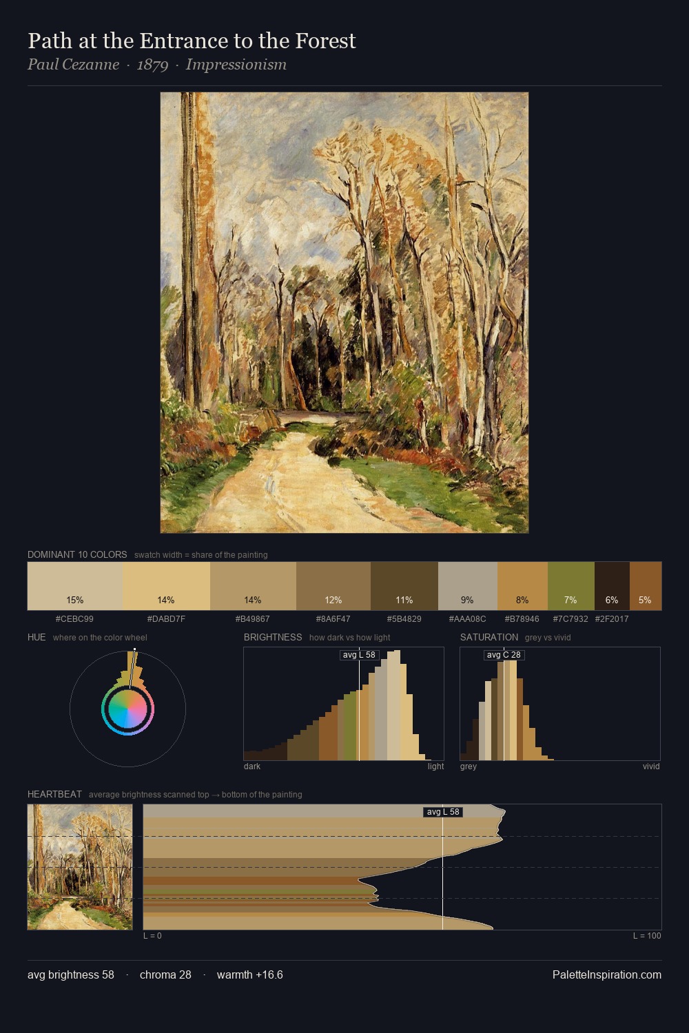
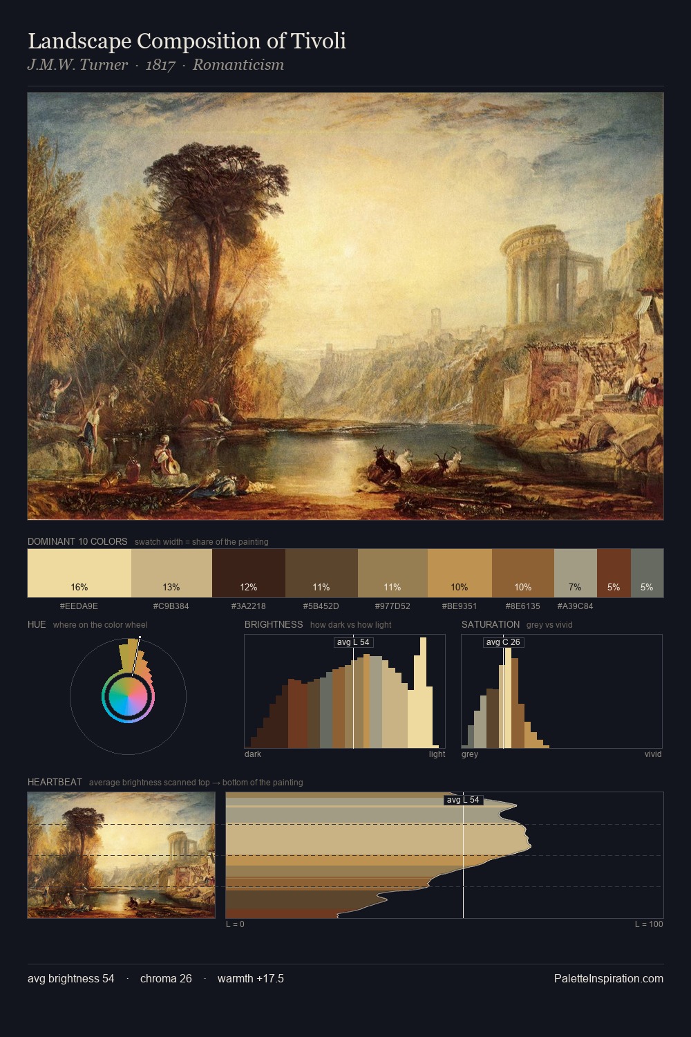
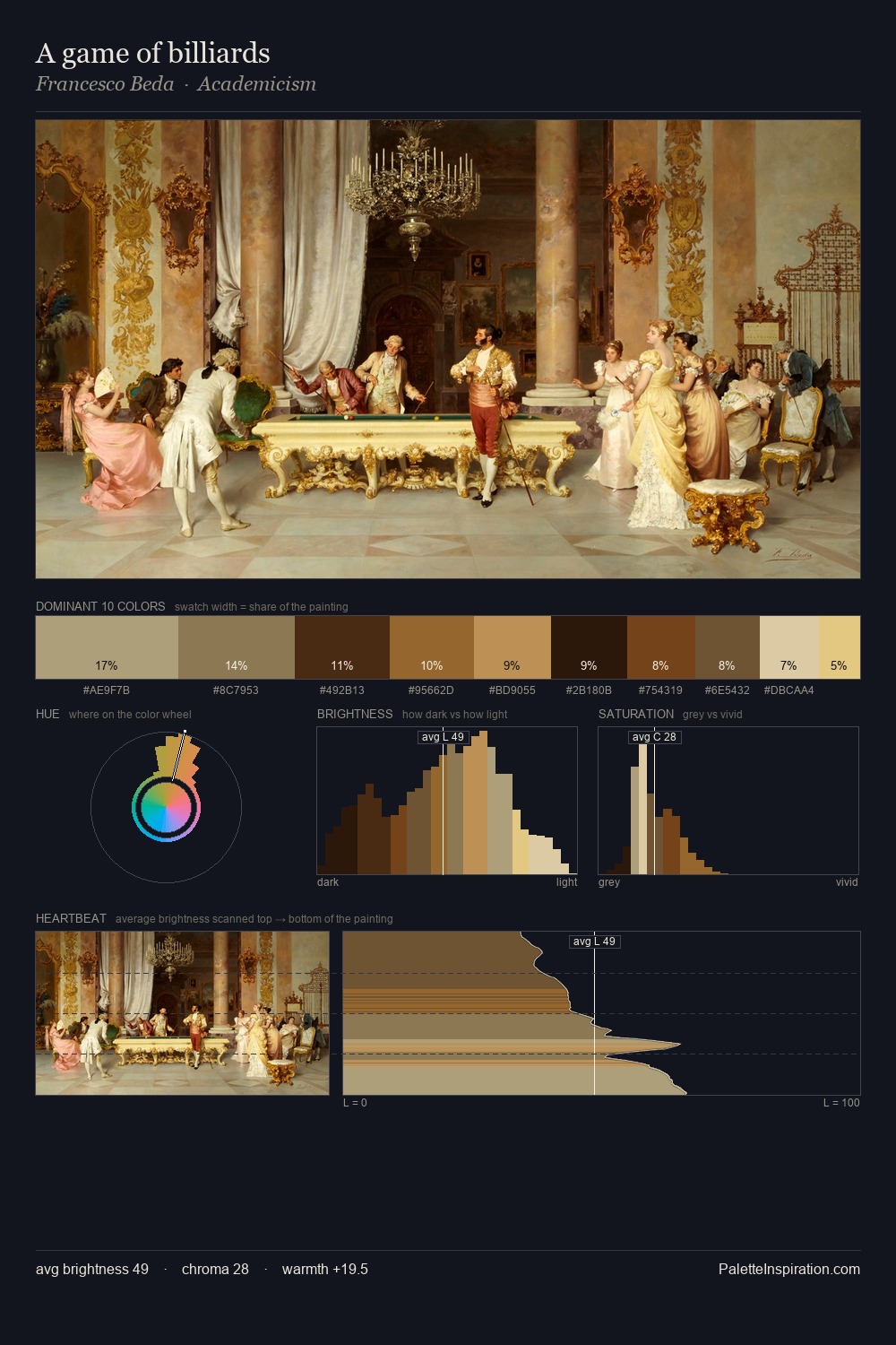
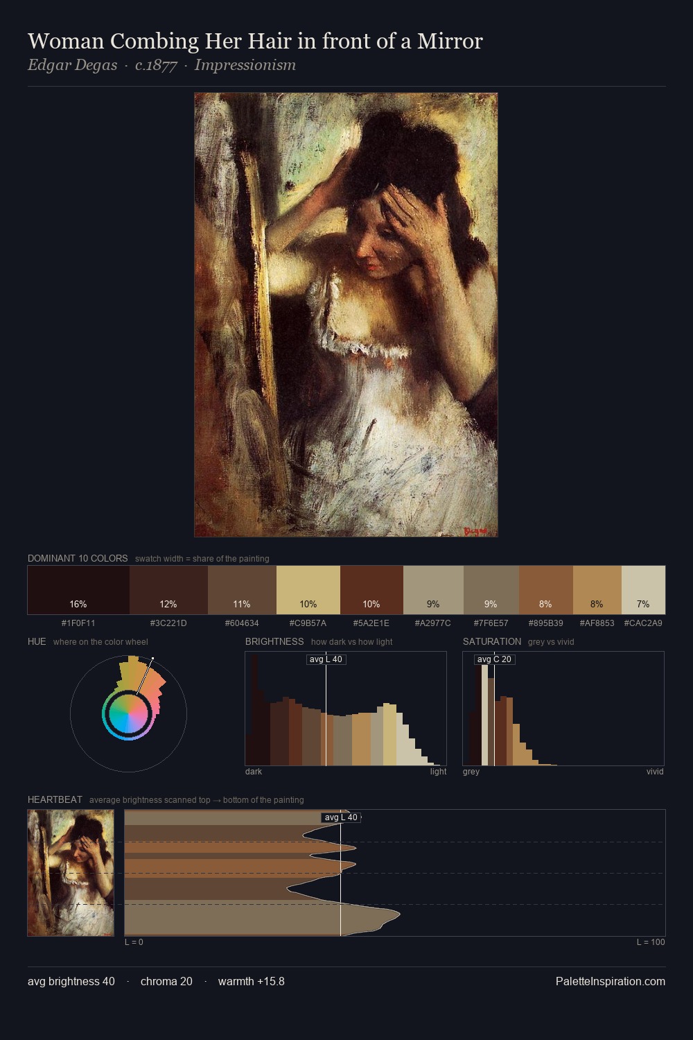
Baroque occupies the comfortable middle of the value scale, avoiding both extremes to hold the eye in a sustained middle grey. Cool hues prevail: blues, greens, and greys anchor the palette's emotional temperature. Chroma is held at a comfortable level - distinct colours, but no single hue is allowed to overwhelm. #BB8E51 delivers the chromatic peak at only 7.0% - a small shot of colour with outsized visual impact. 55 units of value range underpin the palette's structural clarity: the eye always knows where light falls. High luminosity and cool temperature suggest the plein-air condition: unfiltered daylight and open sky.
Example use cases
- ceramics & pottery
- boutique hospitality
- menswear
- heritage food brands
- craft & artisan brands
I Love This!
Use This Palette
Copy, export, or download for your project
Copy, export, or download for your project
Copy:
Download:
Share: