Baroque Palette 46
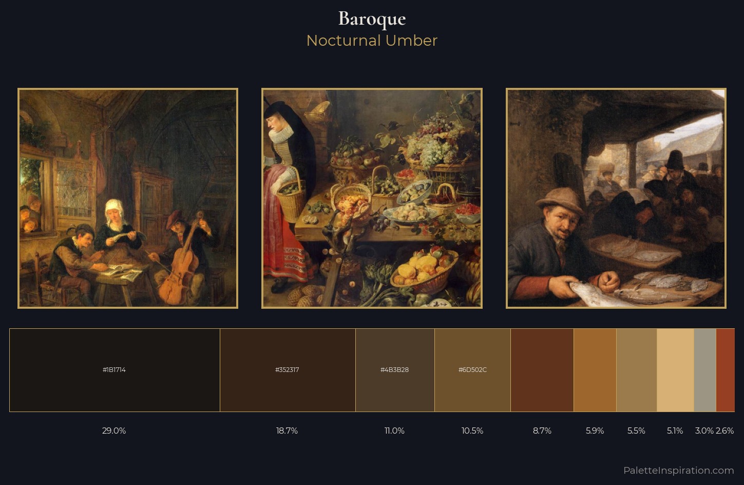
Nocturnal Umber
Nocturnal Night-register palette - very low values, the world after dark.
Umber Dark earthy brown - raw or burnt umber, a foundational old-master earth pigment.
Palette Analysis
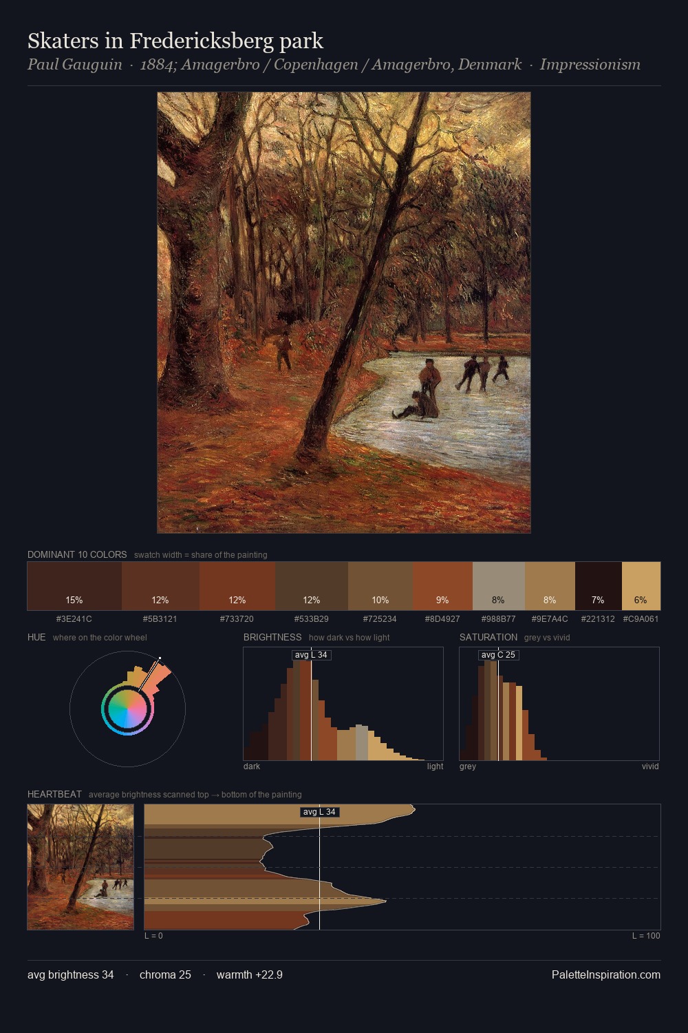
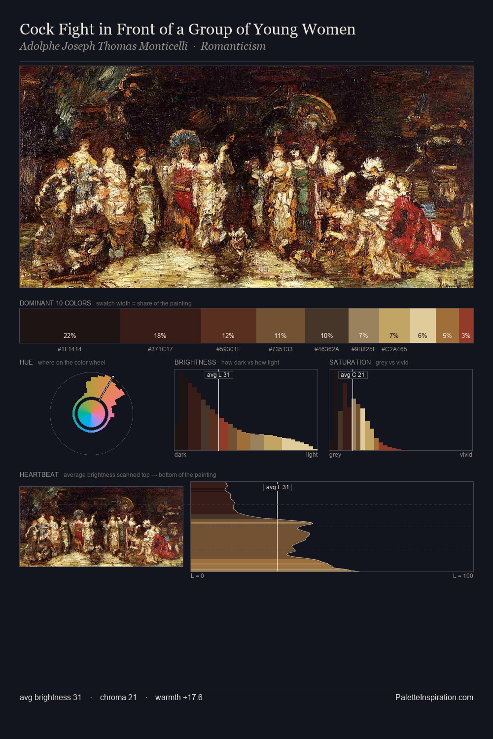
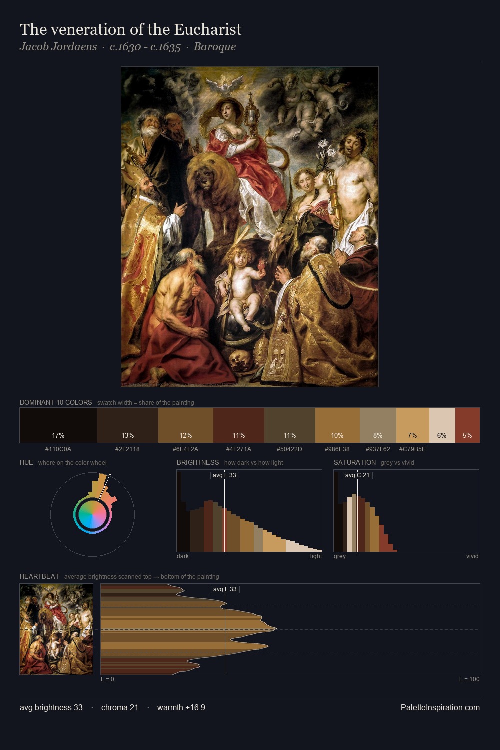
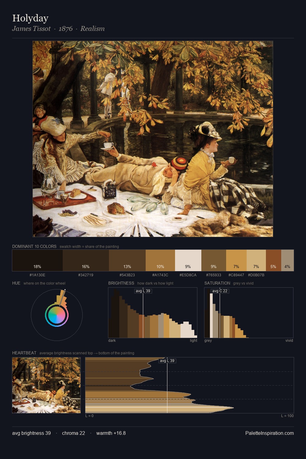
Baroque occupies the comfortable middle of the value scale, avoiding both extremes to hold the eye in a sustained middle grey. The dominant temperature is warm, with earth tones and fire-hues setting the emotional key. Every colour is desaturated; the palette proceeds through near-neutrals and gently-coloured greys. The dominant colour, #1B1714, takes 29.0% of the total area, establishing the overall mood before any other hue is introduced. The highest-chroma note - #5F331C - appears at just 8.7%, deployed as a precision accent against the quieter ground. 57 units of value range underpin the palette's structural clarity: the eye always knows where light falls.
Example use cases
- premium streaming
- cocktail bars
- fashion campaigns
- book covers
- music labels
I Love This!
Use This Palette
Copy, export, or download for your project
Copy, export, or download for your project
Copy:
Download:
Share: