Baroque Palette 9
Penumbral Tawny
Penumbral Partial shadow - the transitional zone between light and full dark, soft-edged.
Tawny Warm orange-brown - a traditional term for the color of tanned leather or lion fur.

Palette Analysis
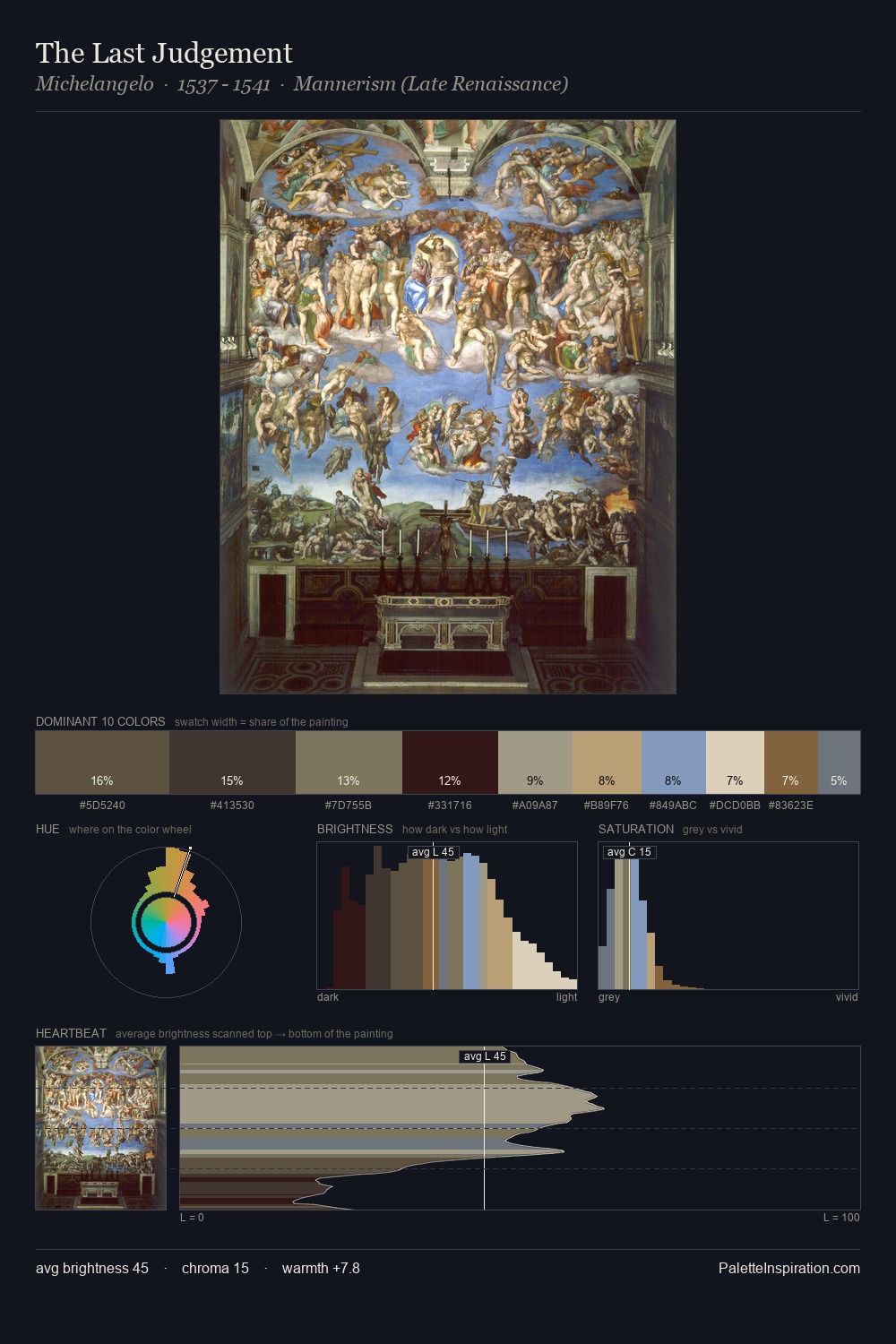
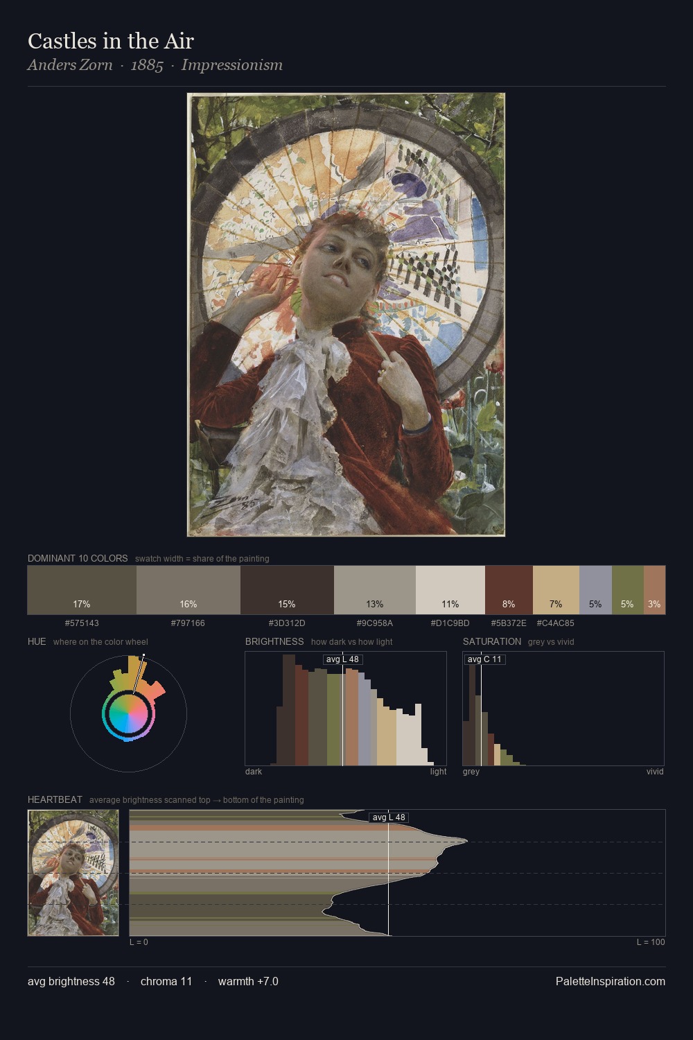
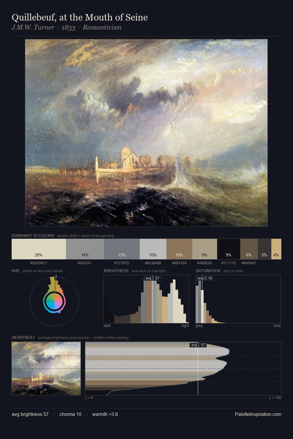
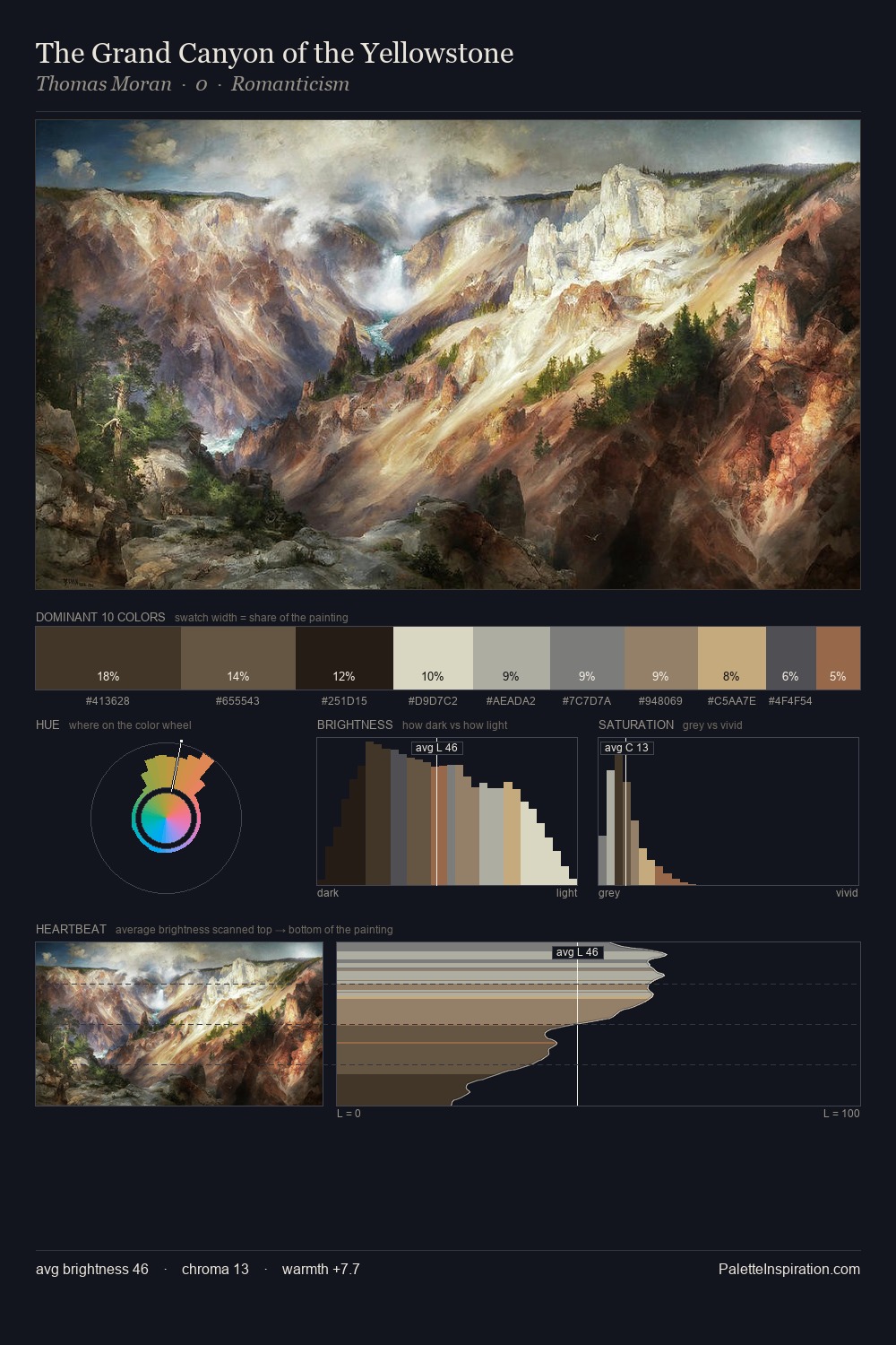
Baroque occupies the comfortable middle of the value scale, avoiding both extremes to hold the eye in a sustained middle grey. The artist keeps warm and cool in parity, a balance that lends the work a perceptual shimmer. Chroma hovers near zero; colour declares itself through subtle shifts in hue rather than outright saturation. At 8.1%, #8F6D49 carries the palette's sharpest chromatic charge: an accent that earns its place precisely because it is withheld. 57 units of value range underpin the palette's structural clarity: the eye always knows where light falls.
Example use cases
- theater design
- jewelry brands
- tobacco-adjacent retail
- event branding
- film & entertainment
I Love This!
Use This Palette
Copy, export, or download for your project
Copy, export, or download for your project
Copy:
Download:
Share: