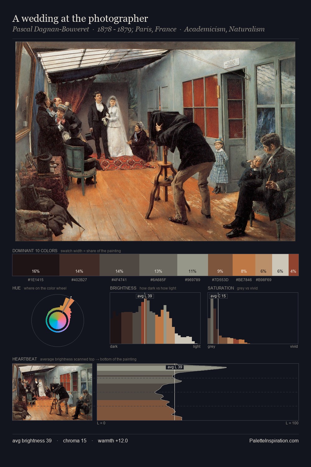
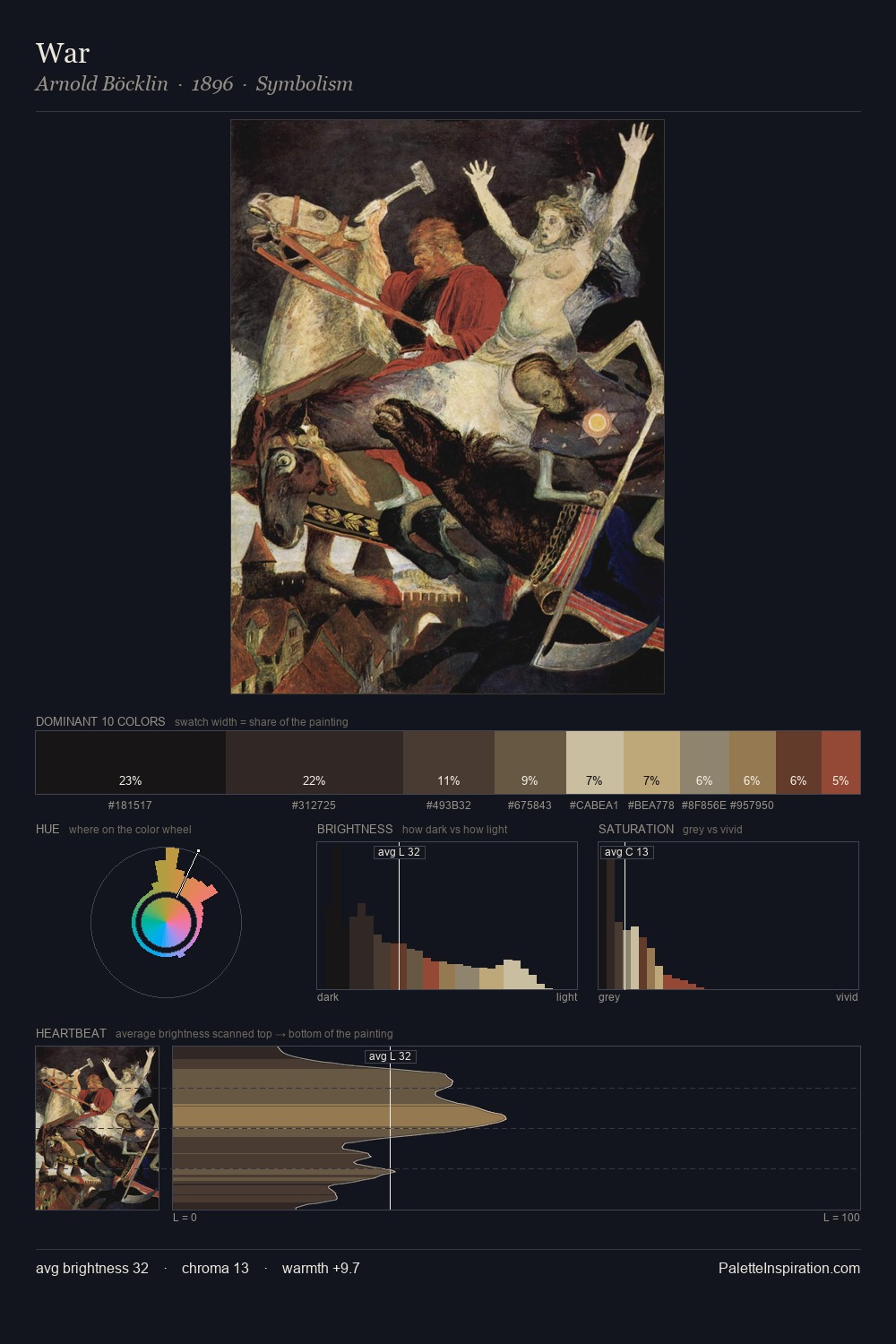
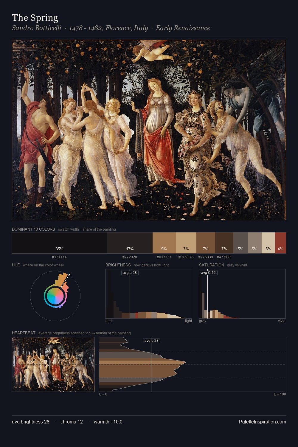
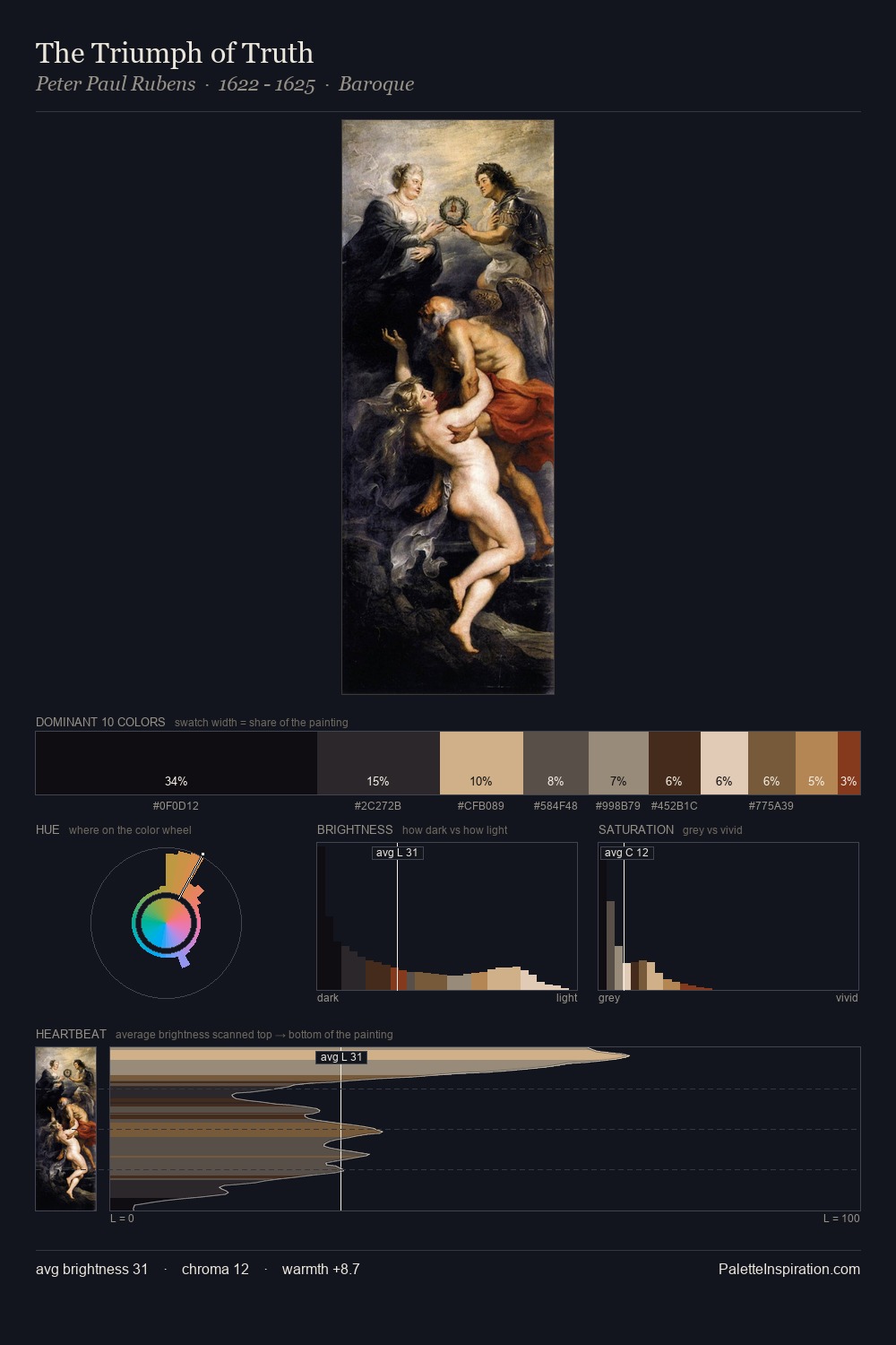
Baroque Palette 44
Nocturnal Sienna
Nocturnal Night-register palette - very low values, the world after dark.
Sienna Warm red-brown earth - named after the Sienese pigment, a fundamental artist earth color.

Palette Analysis
Baroque sits in the centre of the value range, lending the palette a sense of even, sustained light. Warm hues command this palette; it favours the reds, oranges, and yellows of firelight and earth. Chroma hovers near zero; colour declares itself through subtle shifts in hue rather than outright saturation. The dominant colour, #171514, takes 30.8% of the total area, establishing the overall mood before any other hue is introduced. The highest-chroma note - #6E4D36 - appears at just 6.9%, deployed as a precision accent against the quieter ground. At 64 units of value range, the palette has the tonal breadth to sustain complex spatial readings.
Example use cases
- theater design
- jewelry brands
- tobacco-adjacent retail
- event branding
- film & entertainment
I Love This!
Use This Palette
Copy, export, or download for your project
Copy, export, or download for your project
Copy:
Download:
Share: