Baroque Palette 18
Muted Tawny
Muted Deliberately desaturated - chroma pulled toward gray, the restraint of tonal painting.
Tawny Warm orange-brown - a traditional term for the color of tanned leather or lion fur.

Palette Analysis
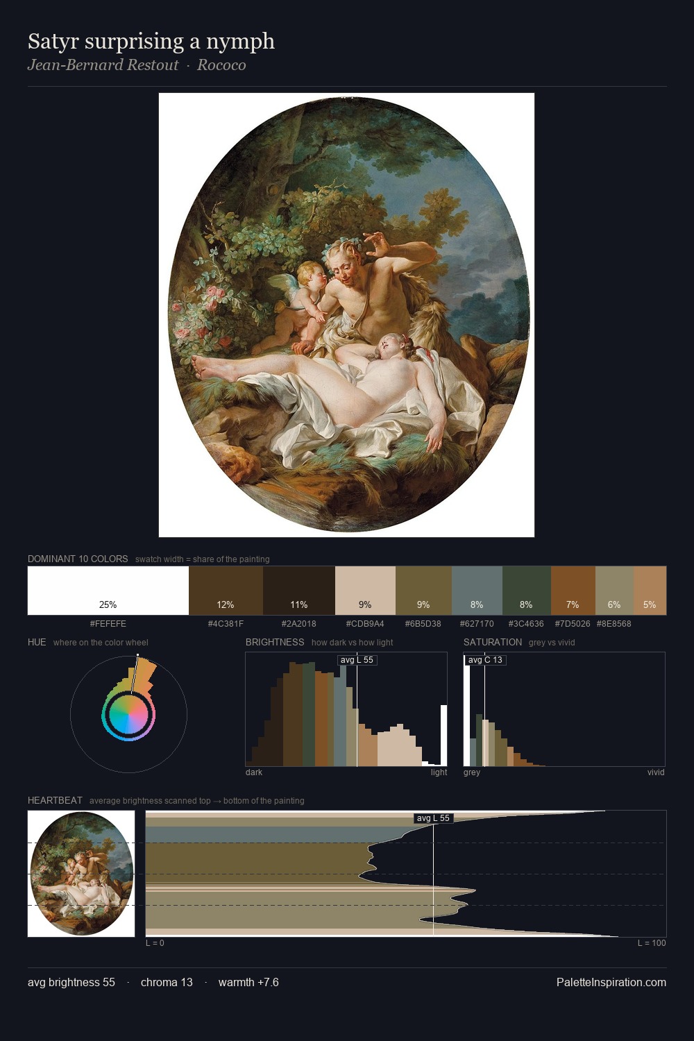
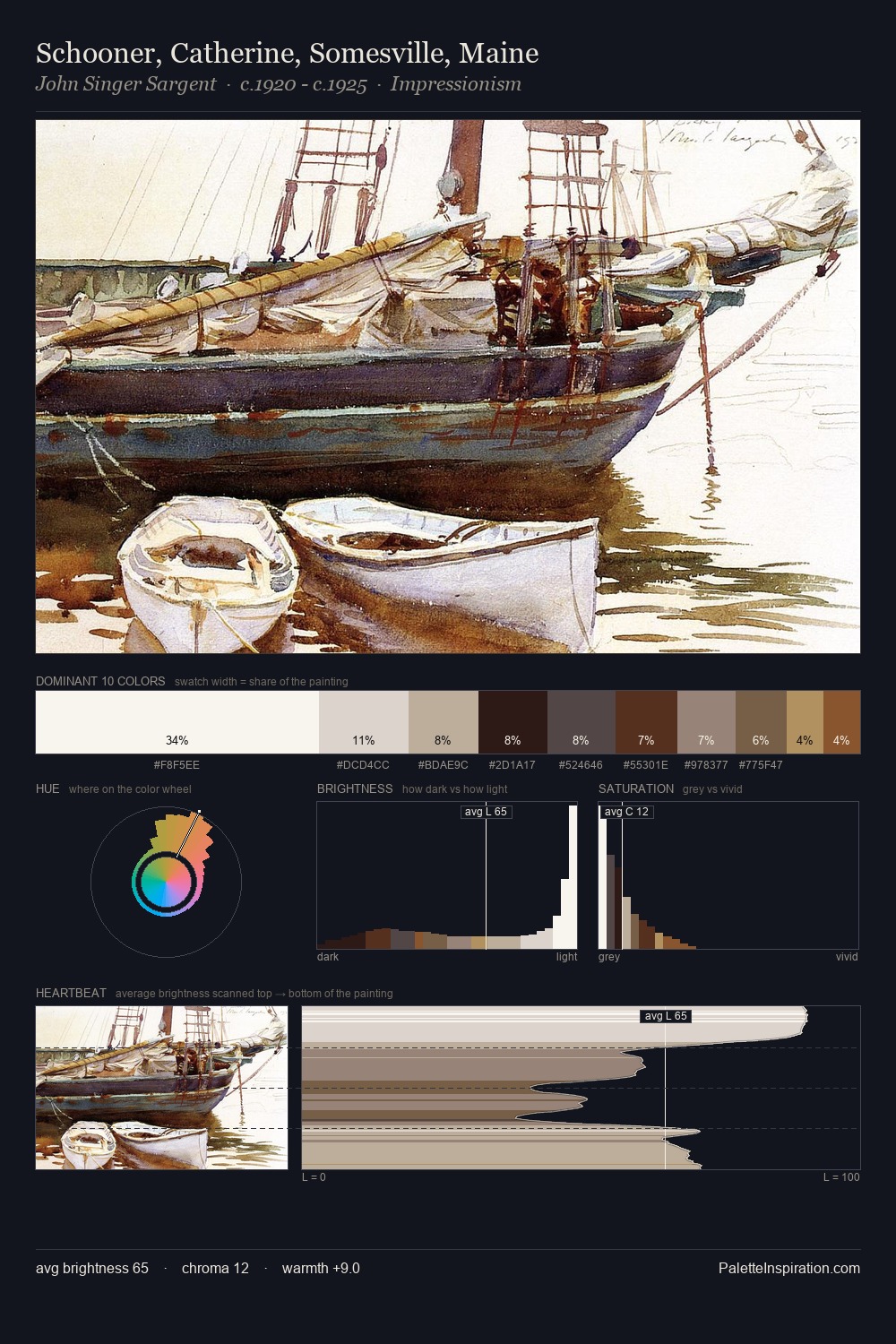
Baroque distributes its values across the middle register, creating harmony without high contrast. Warm and cool tones are held in careful balance - neither family dominates, creating tension and resolution simultaneously. Saturation is deliberately withheld - the beauty here lies in the near-monochromatic gradations rather than colour difference. At 29.6%, #FEFEFE functions less as a colour accent and more as a complete atmospheric environment. The highest-chroma note - #C09763 - appears at just 4.0%, deployed as a precision accent against the quieter ground. 77 units of value range underpin the palette's structural clarity: the eye always knows where light falls.
Example use cases
- exhibition design
- foundation branding
- estate management
- art education
- museums & galleries
I Love This!
Use This Palette
Copy, export, or download for your project
Copy, export, or download for your project
Copy:
Download:
Share: