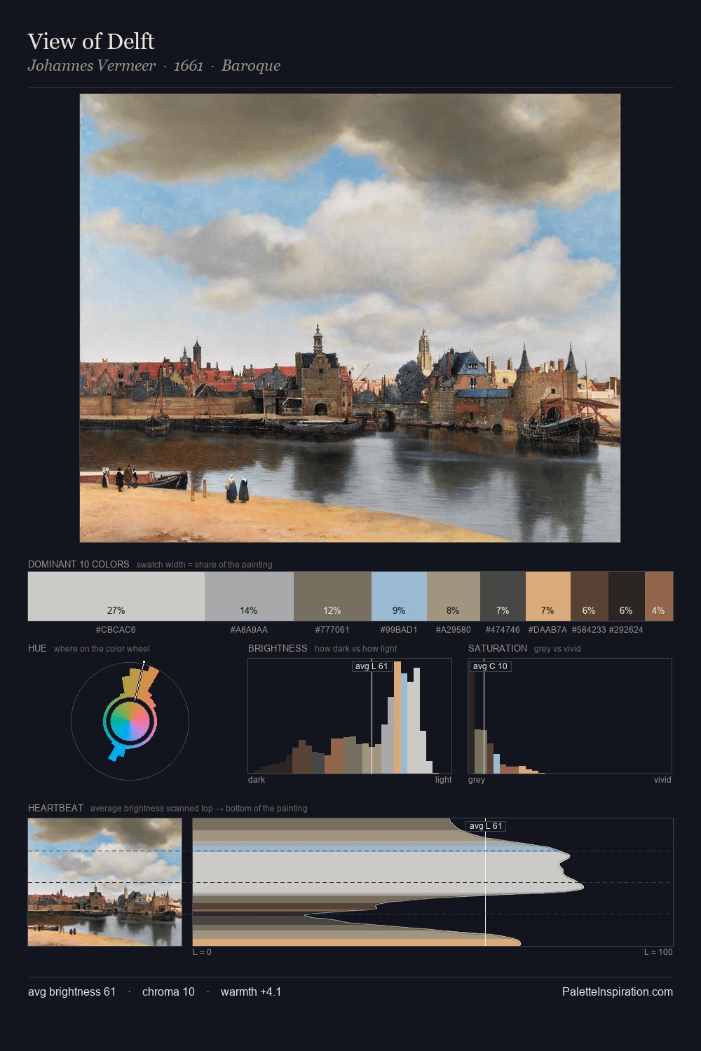
Willem van de Velde the Younger Palette 1
Soft Alabaster
Soft Low-contrast, gentle chroma - mid-key values and low saturation, approachable and calm.
Alabaster Warm off-white - creamy stone white, luminous and slightly translucent.

Palette Analysis
Willem van de Velde the Younger is high in key: pale, luminous, and filled with optical air. Blues and teal-greys govern the palette, lending it an aquatic or atmospheric quality. Chroma is kept low across all colours, producing the soft, enveloping quality that characterises tonal painting. #634F3C delivers the chromatic peak at only 6.2% - a small shot of colour with outsized visual impact. At 54 units across the value scale, the palette keeps contrast readable without letting it dominate. High luminosity and cool temperature suggest the plein-air condition: unfiltered daylight and open sky. Palette 1 sits within the larger chromatic argument that Willem van de Velde the Younger's complete body of work advances.
Example use cases
- florist branding
- event design
- real estate
- jewelry retail
- hospitality branding
I Love This!
Use This Palette
Copy, export, or download for your project
Copy, export, or download for your project
Copy:
Download:
Share:
![[Unkown] palette card](/cards/0101032.jpg)