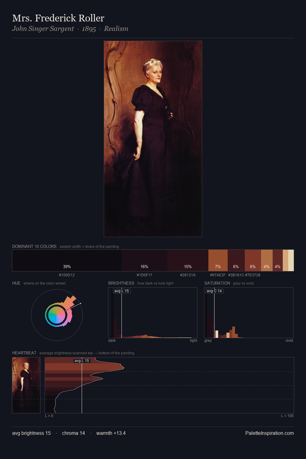
Wilhelm von Kaulbach Palette 6

Palette Analysis
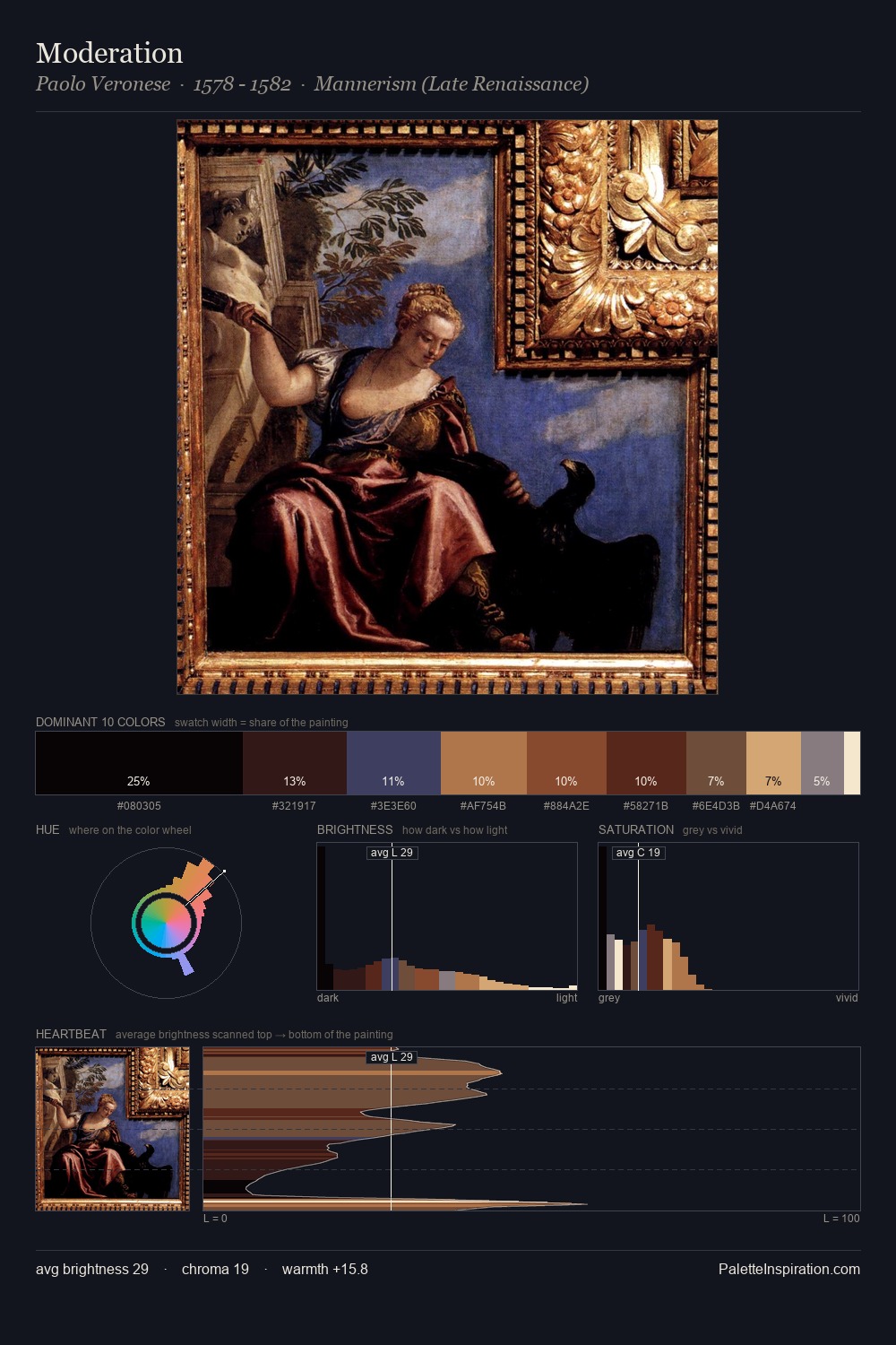
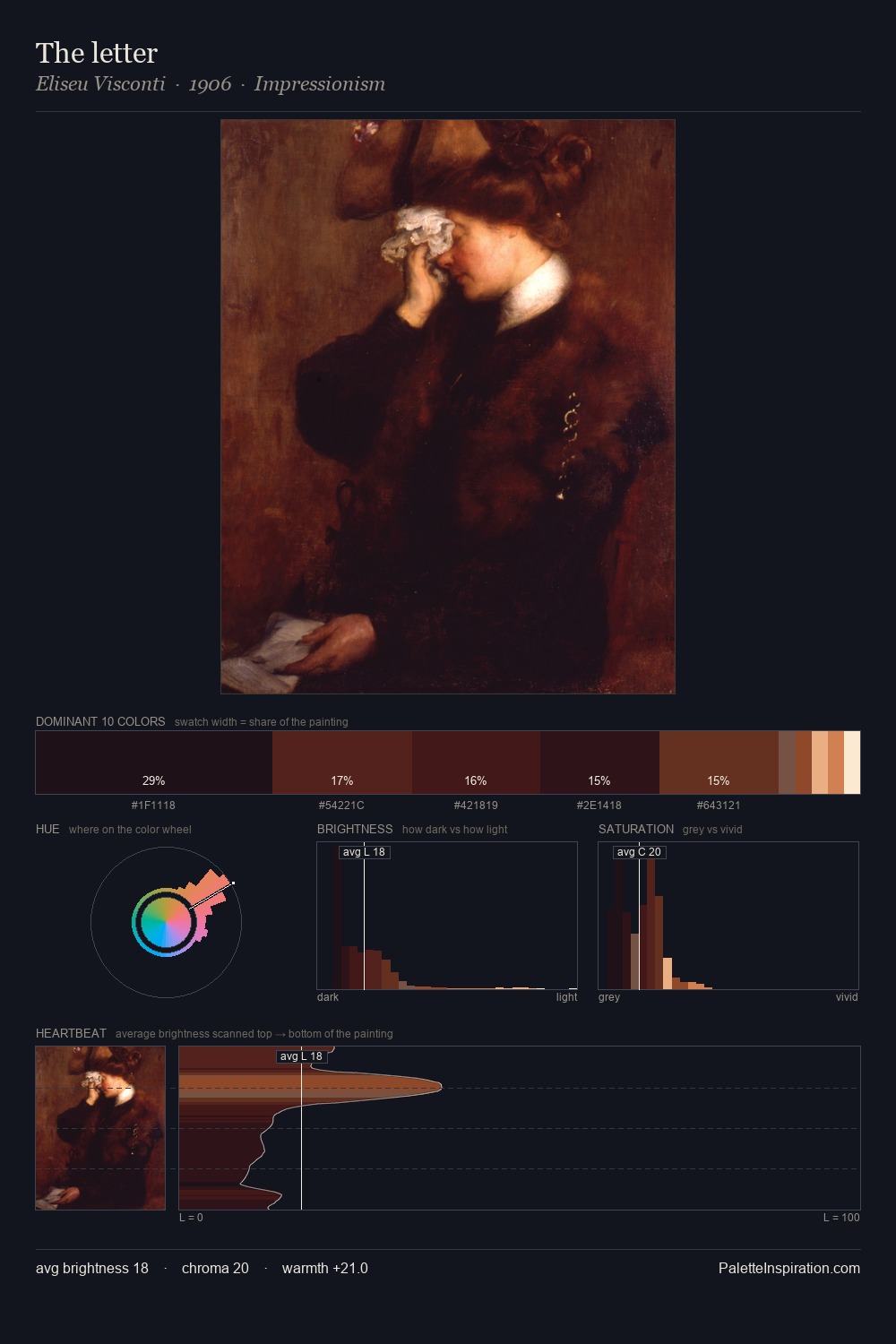
Wilhelm von Kaulbach occupies the comfortable middle of the value scale, avoiding both extremes to hold the eye in a sustained middle grey. Warm hues command this palette; Wilhelm von Kaulbach favours the reds, oranges, and yellows of firelight and earth. Chroma is held at a comfortable level - distinct colours, but no single hue is allowed to overwhelm. A single dominant - #D29560 at 25.6% - sets the character of the whole composition. #351012 is not a small accent - at 4.5% it qualifies as a major presence and gives the palette its chromatic identity. 73 units of value range underpin the palette's structural clarity: the eye always knows where light falls. In the context of Wilhelm von Kaulbach's full range of palettes, group 6 represents one movement in an ongoing chromatic dialogue.
Example use cases
- publishing
- corporate identity
- consumer apps
- hospitality
- design agencies
I Love This!
Copy, export, or download for your project