Wilhelm Trübner Palette 2
Palette Analysis
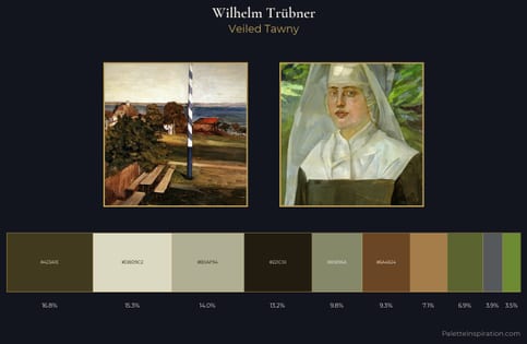
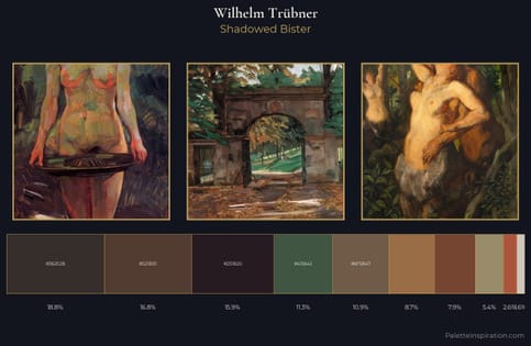
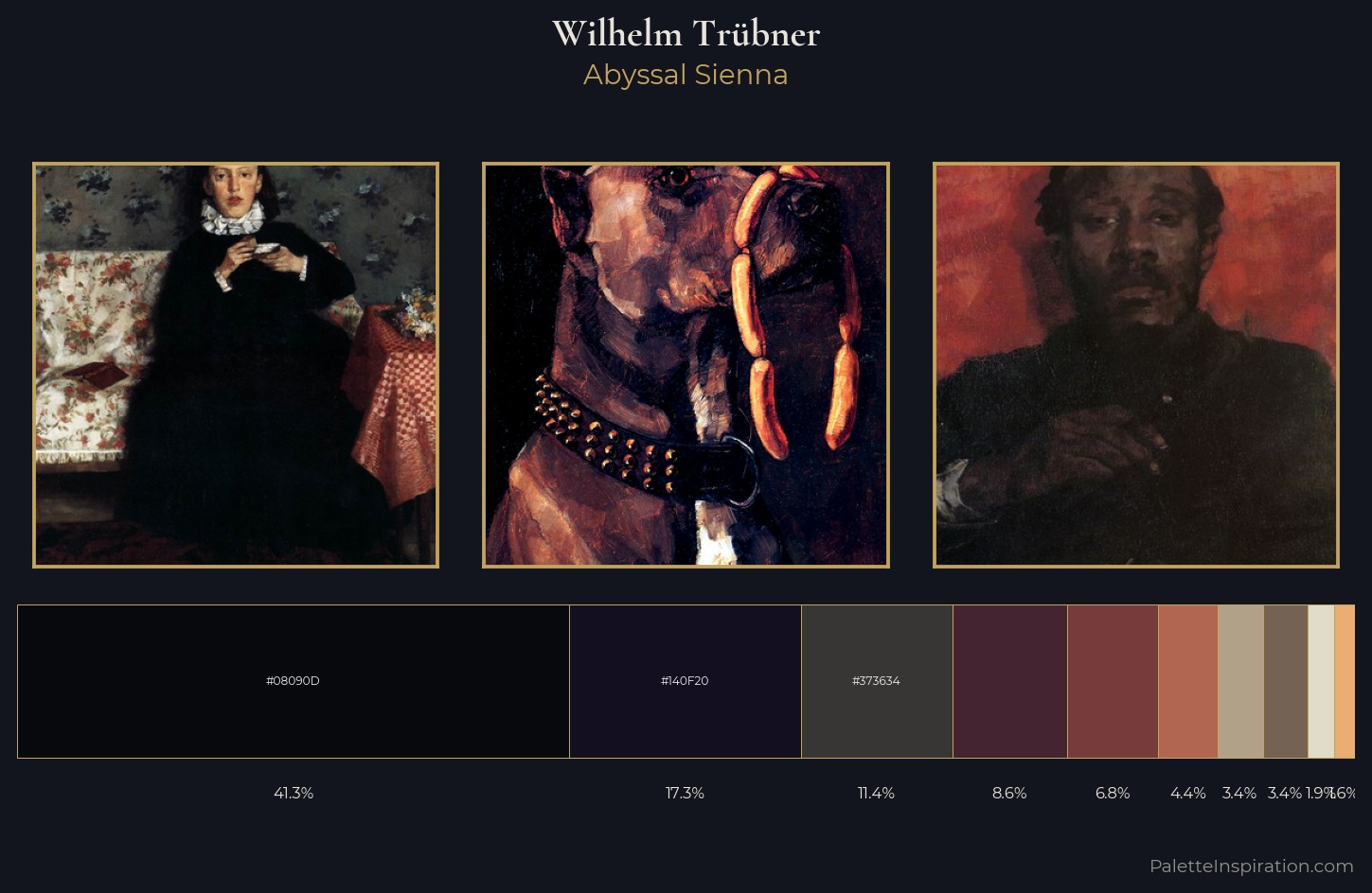
Wilhelm Trübner dwells firmly in the shadows, with no more than a whisper of light. Cool tones set the register here - the blues and greens easily outweigh any warm accents. Chroma hovers near zero; colour declares itself through subtle shifts in hue rather than outright saturation. #08090D at 41.3% of the palette: an overwhelming presence that pulls all other colours into its gravitational field. At 6.8%, #773B3B carries the palette's sharpest chromatic charge: an accent that earns its place precisely because it is withheld. At 75 units of value range, the palette has the tonal breadth to sustain complex spatial readings. This tonal restraint is characteristic of the Wilhelm Trübner approach: colour serves light, not the reverse. Palette 2 sits within the larger chromatic argument that Wilhelm Trübner's complete body of work advances.
Example use cases
- legal services
- corporate identity
- industrial design
- professional services
- fintech
I Love This!
Copy, export, or download for your project