Pieter Codde Palette 4

Palette Analysis
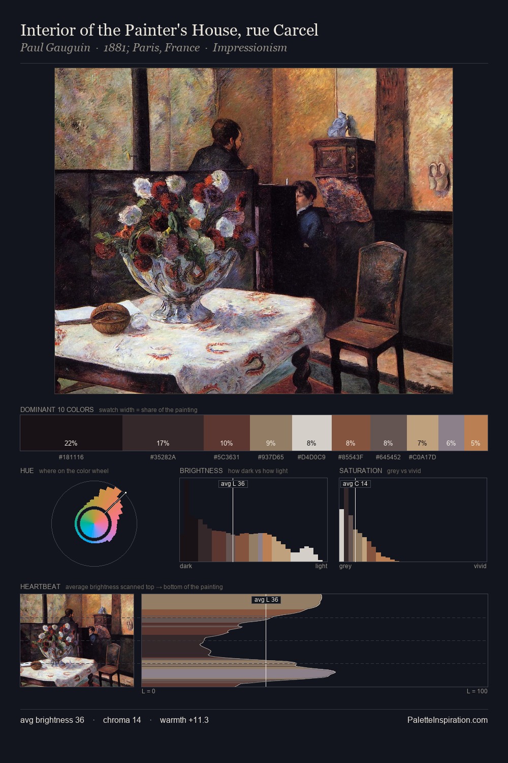
The palette of Pieter Codde sits in the lower register of the value scale - dense, contained, and weighted. Warm hues command this palette; Pieter Codde favours the reds, oranges, and yellows of firelight and earth. Saturation is deliberately withheld - the beauty here lies in the near-monochromatic gradations rather than colour difference. 27.0% of the palette belongs to #09080D, a concentration that makes it the unmistakable visual centre. #8B5240 delivers the chromatic peak at only 4.3% - a small shot of colour with outsized visual impact. The full value range is 75 units: broad enough to build convincing three-dimensional form. Together these qualities place Pieter Codde firmly in the tonal tradition - concerned with mood and atmosphere rather than chromatic display. This is palette 4 of Pieter Codde's sequence - a single chapter in a chromatic story told across many works.
Example use cases
- theater design
- jewelry brands
- tobacco-adjacent retail
- event branding
- film & entertainment
I Love This!
Copy, export, or download for your project