Giuseppe Maria Crespi Palette 7

Palette Analysis
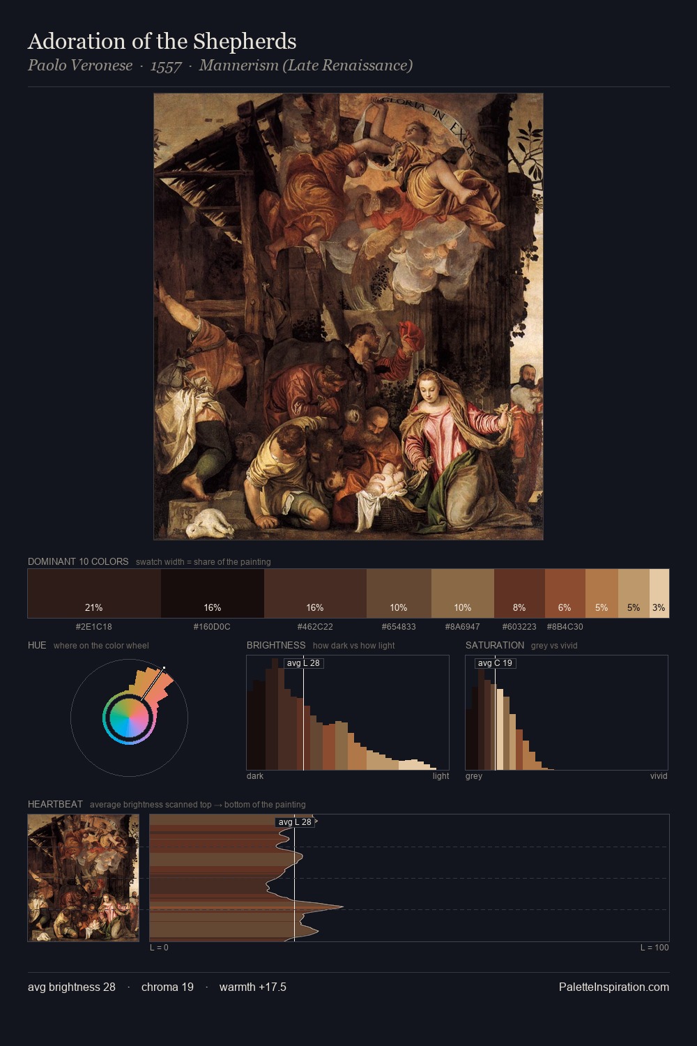
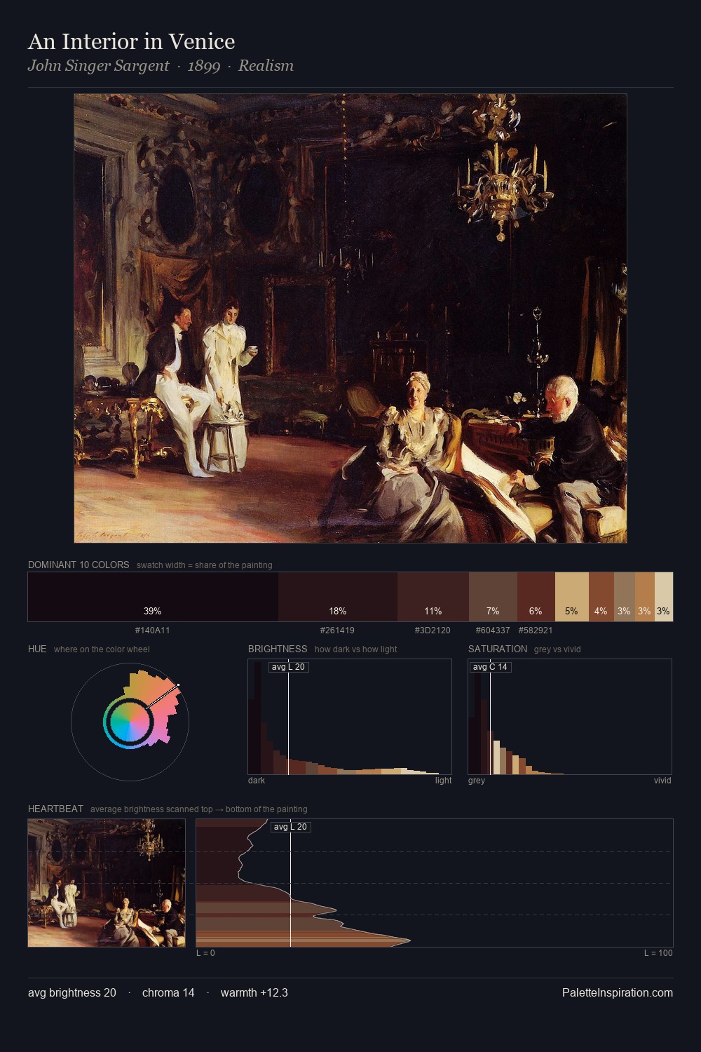
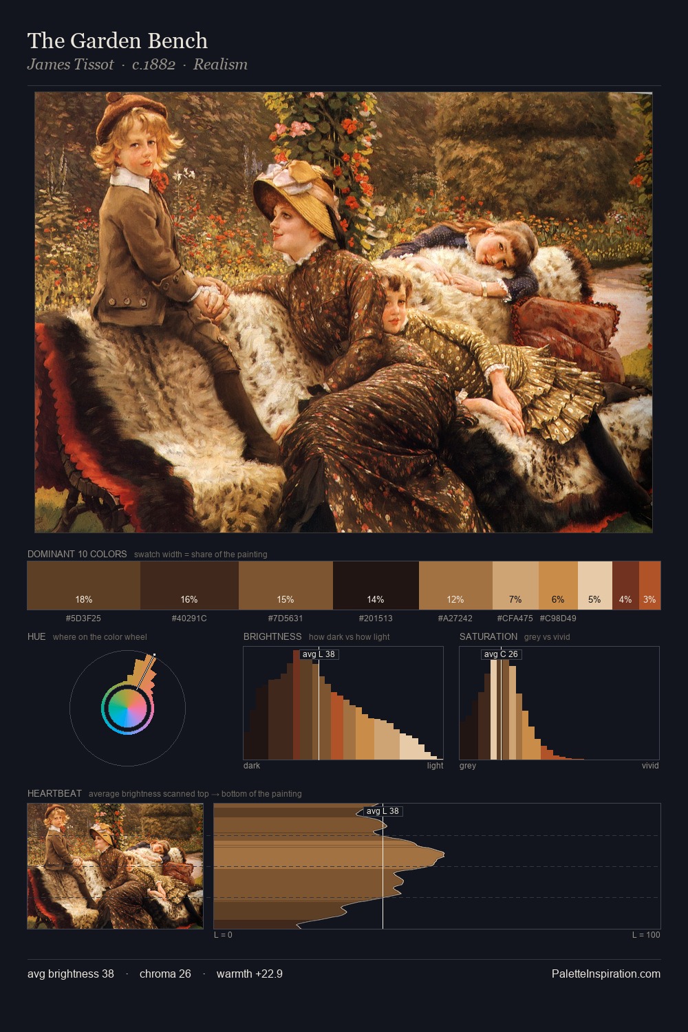
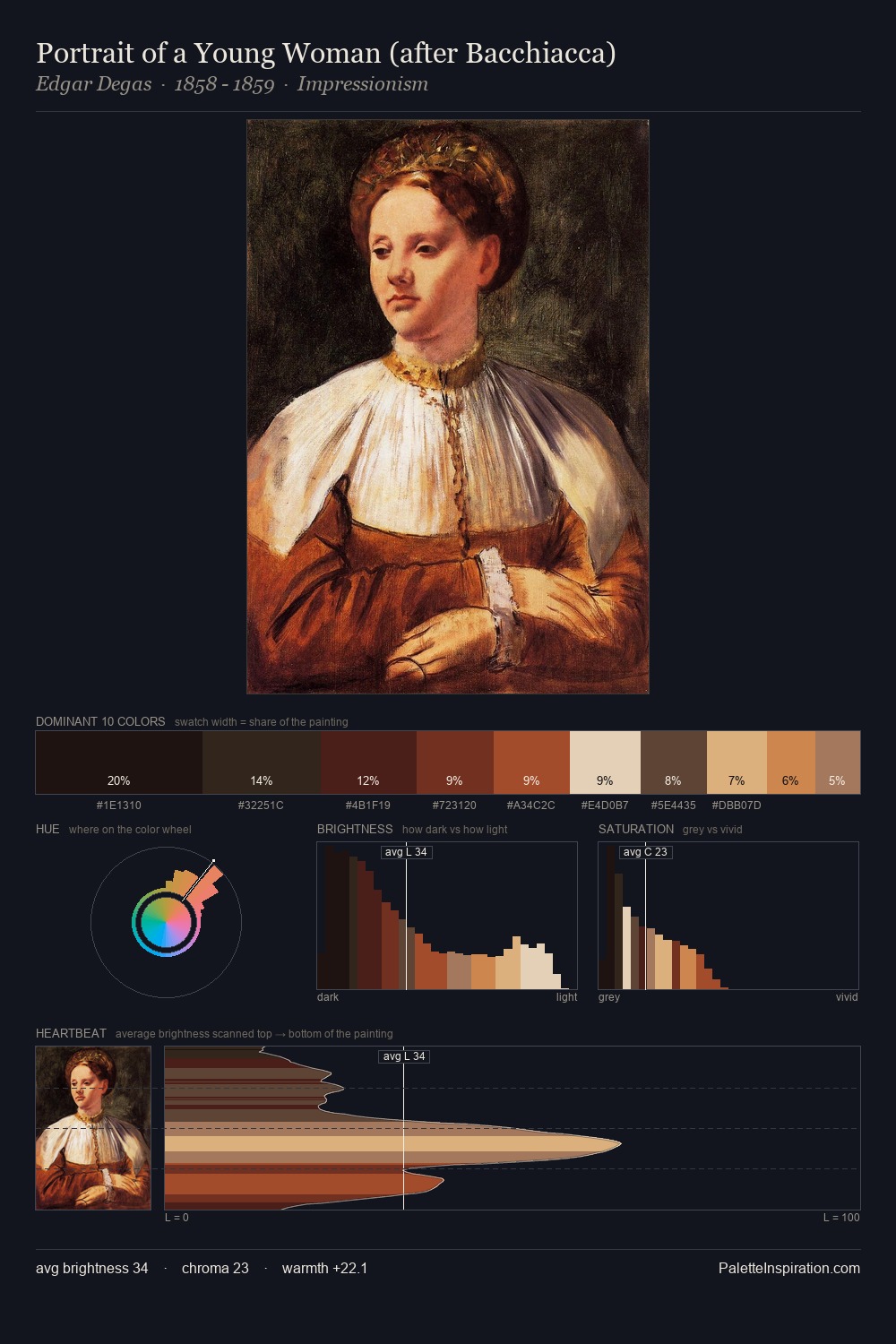
Giuseppe Maria Crespi works almost entirely in the lower half of the value scale, privileging depth over brilliance. Warmth dominates - the palette of Giuseppe Maria Crespi leans heavily on the yellow-orange-red arc of the colour wheel. The absence of saturated colour is itself an expressive choice: this is a palette of restraint and atmosphere. #100A0E at 38.3% of the palette: an overwhelming presence that pulls all other colours into its gravitational field. The highest-chroma note - #B87C3C - appears at just 1.5%, deployed as a precision accent against the quieter ground. From deepest dark to palest light, the palette traverses 72 units of the value scale - a span that creates natural depth. The combination of low values, muted chroma, and compressed range is the signature of the Tonalist mode - painting as atmosphere. Palette 7 sits within the larger chromatic argument that Giuseppe Maria Crespi's complete body of work advances.
Example use cases
- theater design
- jewelry brands
- tobacco-adjacent retail
- event branding
- film & entertainment
I Love This!
Copy, export, or download for your project