George Frederick Watts Palette 12

Palette Analysis
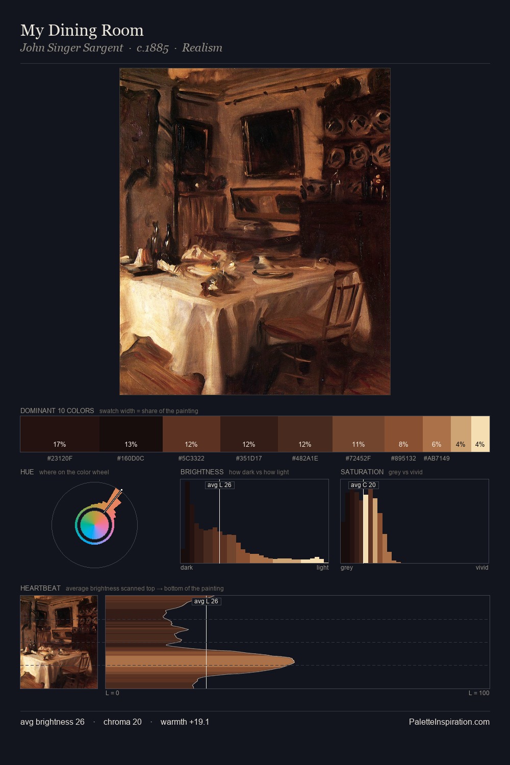
George Frederick Watts works almost entirely in the lower half of the value scale, privileging depth over brilliance. Yellow, ochre, sienna: warm hues that George Frederick Watts deploys as the palette's primary energy. Chroma hovers near zero; colour declares itself through subtle shifts in hue rather than outright saturation. At 42.5%, #140B0C functions less as a colour accent and more as a complete atmospheric environment. The most saturated colour, #2D1511, is reserved to 8.1% of the surface, where it acts as a focal punctuation. From deepest dark to palest light, the palette traverses 59 units of the value scale - a span that creates natural depth. Together these qualities place George Frederick Watts firmly in the tonal tradition - concerned with mood and atmosphere rather than chromatic display. This is palette 12 of George Frederick Watts's sequence - a single chapter in a chromatic story told across many works.
Example use cases
- theater design
- jewelry brands
- tobacco-adjacent retail
- event branding
- film & entertainment
I Love This!
Copy, export, or download for your project