George Frederick Watts Palette 11

Palette Analysis
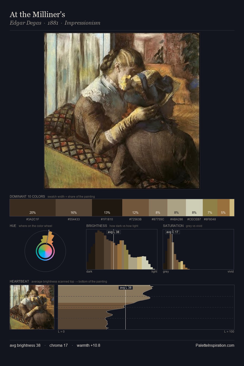
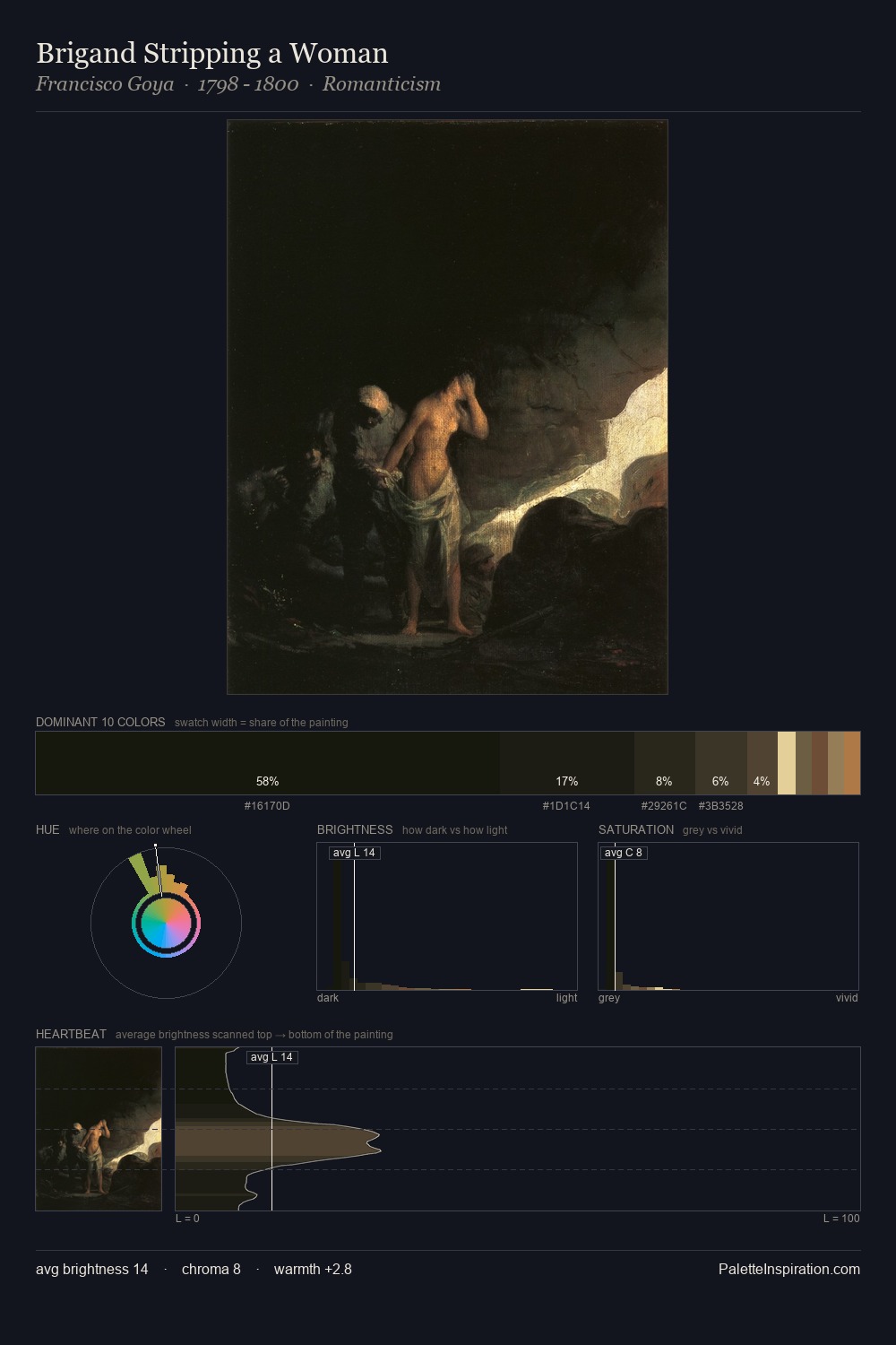
George Frederick Watts is low-key throughout, a quality associated with Tenebrous Bister - deep shadows dominate the composition. Yellow, ochre, sienna: warm hues that George Frederick Watts deploys as the palette's primary energy. Every colour is desaturated; the palette proceeds through near-neutrals and gently-coloured greys. Only 3.0% is devoted to #AC7A44, yet that small allocation delivers the palette's entire chromatic tension. 64 units of value range underpin the palette's structural clarity: the eye always knows where light falls. Together these qualities place George Frederick Watts firmly in the tonal tradition - concerned with mood and atmosphere rather than chromatic display. In the context of George Frederick Watts's full range of palettes, group 11 represents one movement in an ongoing chromatic dialogue.
Example use cases
- theater design
- jewelry brands
- tobacco-adjacent retail
- event branding
- film & entertainment
I Love This!
Copy, export, or download for your project