George Frederick Watts Palette 2

Palette Analysis
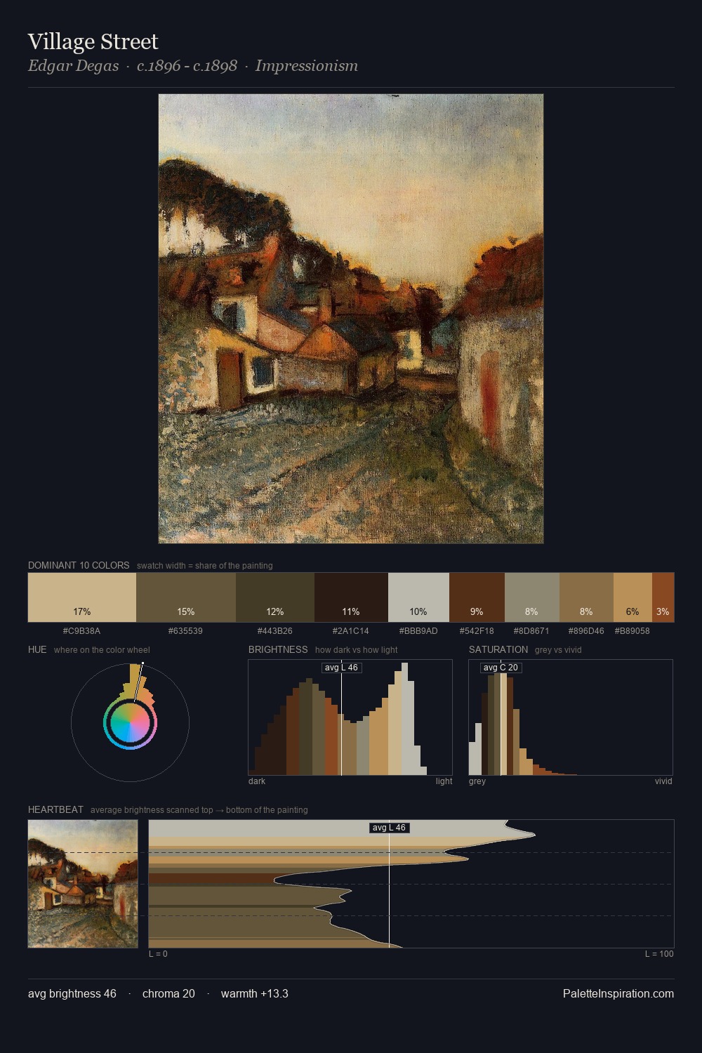
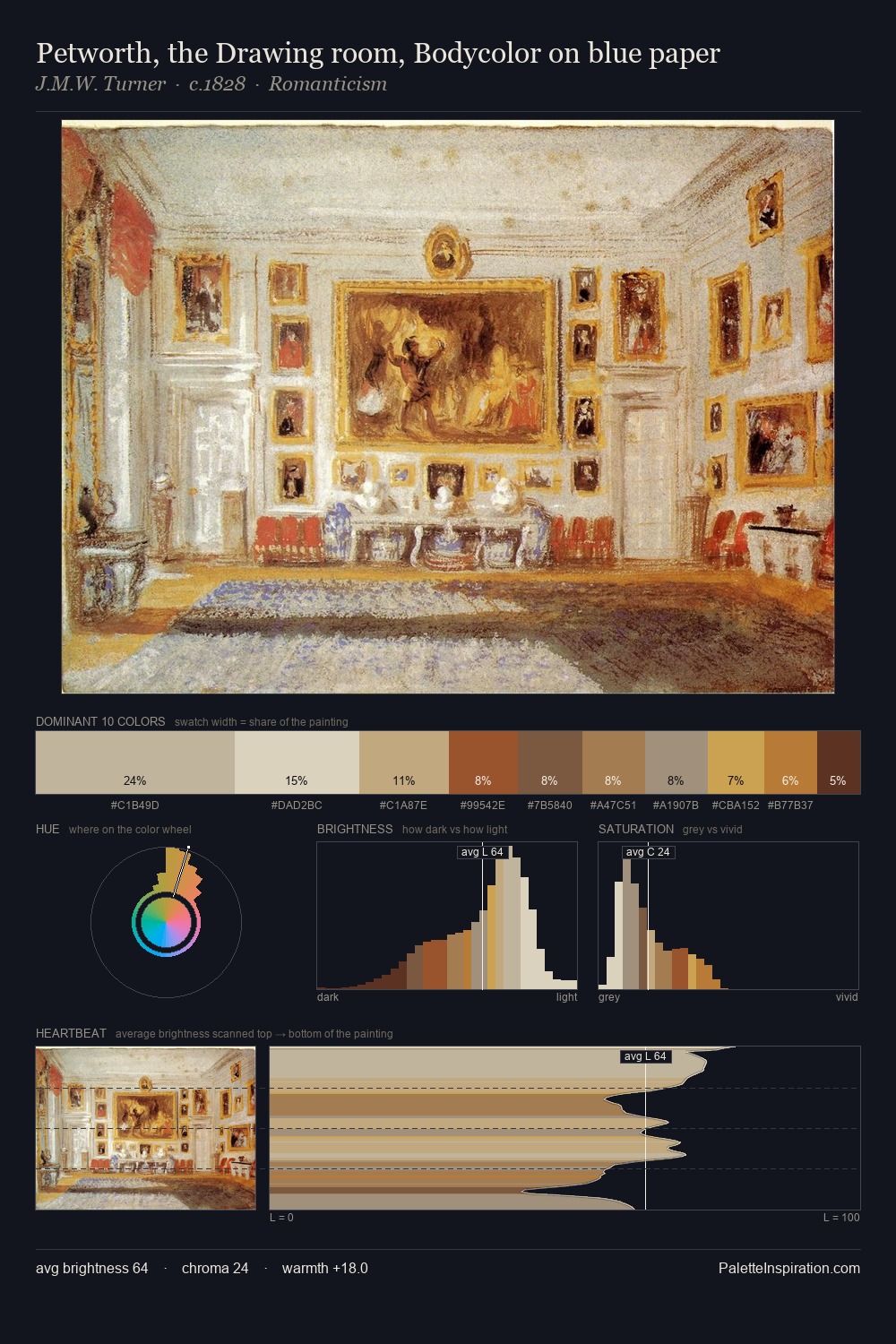
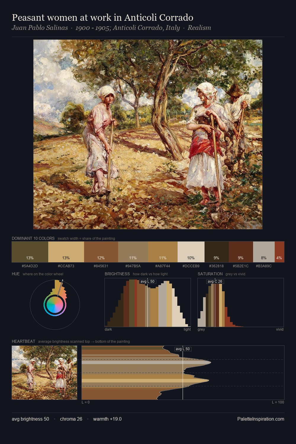
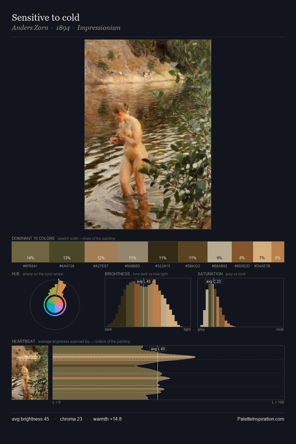
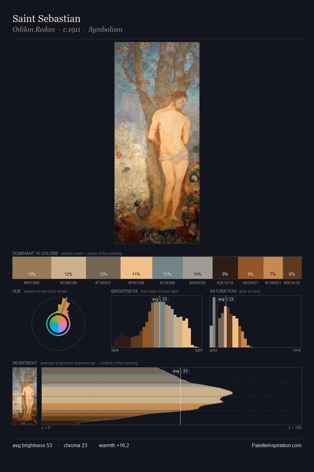
George Frederick Watts distributes its values across the middle register, creating harmony without high contrast. A distinctly cool atmosphere runs through this palette: sky, water, and mist given colour form. Saturation is deliberately withheld - the beauty here lies in the near-monochromatic gradations rather than colour difference. #D9B07F delivers the chromatic peak at only 9.3% - a small shot of colour with outsized visual impact. The palette spans 47 value units: a measured range that delivers coherence over drama. The palette has the character of outdoor light: cool, mid-bright, with colour rendered faithfully rather than expressively. In the context of George Frederick Watts's full range of palettes, group 2 represents one movement in an ongoing chromatic dialogue.
Example use cases
- ceramics & pottery
- boutique hospitality
- menswear
- heritage food brands
- craft & artisan brands
I Love This!
Copy, export, or download for your project