Wilhelm Trübner Palette 3
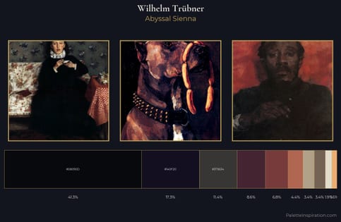
Shadowed Bister
Shadowed Low-key - values weighted toward shadow, the palette of dim interiors and overcast skies.
Bister Dark warm brown - a traditional ink and wash pigment made from wood soot.
Palette Analysis
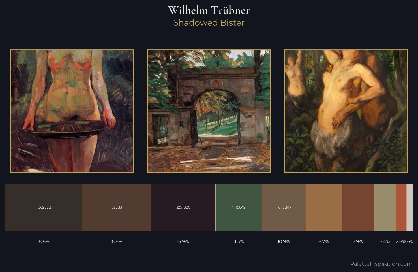
Values in Wilhelm Trübner rest in the mid-range - neither dramatically lit nor steeped in shadow. Warmth dominates - the palette of Wilhelm Trübner leans heavily on the yellow-orange-red arc of the colour wheel. All colours lean toward grey, building depth through value rather than colour punch. Only 8.7% is devoted to #996E47, yet that small allocation delivers the palette's entire chromatic tension. 59 units of value range underpin the palette's structural clarity: the eye always knows where light falls. Wilhelm Trübner's palette 3 carries its own internal logic while remaining in conversation with the artist's broader colour intelligence.
Example use cases
- premium streaming
- cocktail bars
- fashion campaigns
- book covers
- music labels
I Love This!
Use This Palette
Copy, export, or download for your project
Copy, export, or download for your project
Copy:
Download:
Share: