Wilhelm Trübner Master Palette
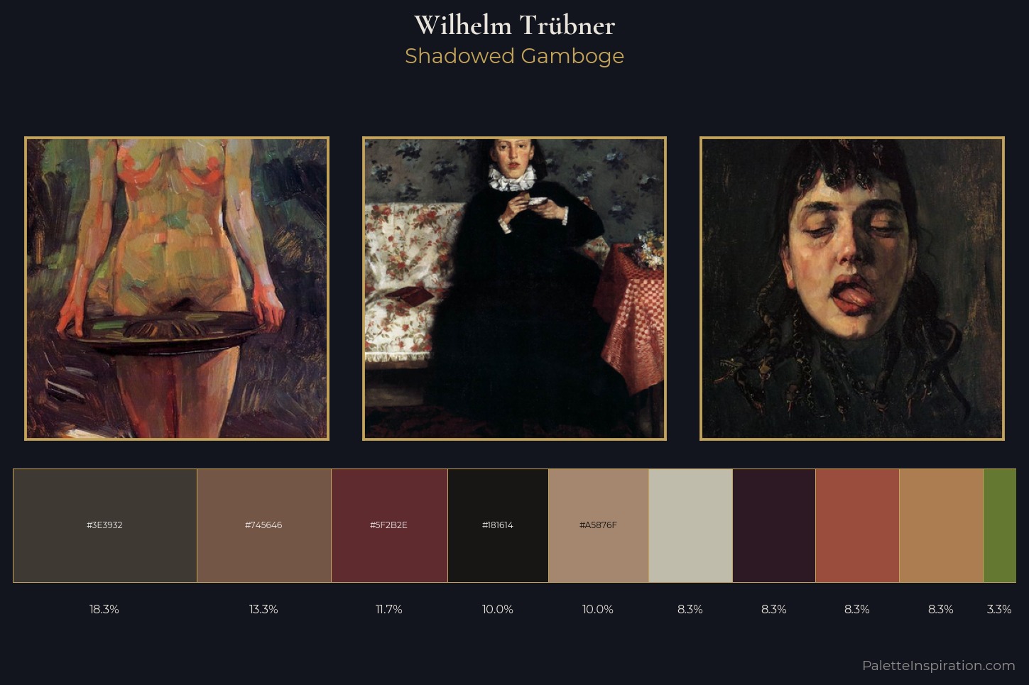
Shadowed Gamboge
Shadowed Low-key - values weighted toward shadow, the palette of dim interiors and overcast skies.
Gamboge Deep golden yellow - a traditional warm pigment, rich amber-gold.
Palette Analysis
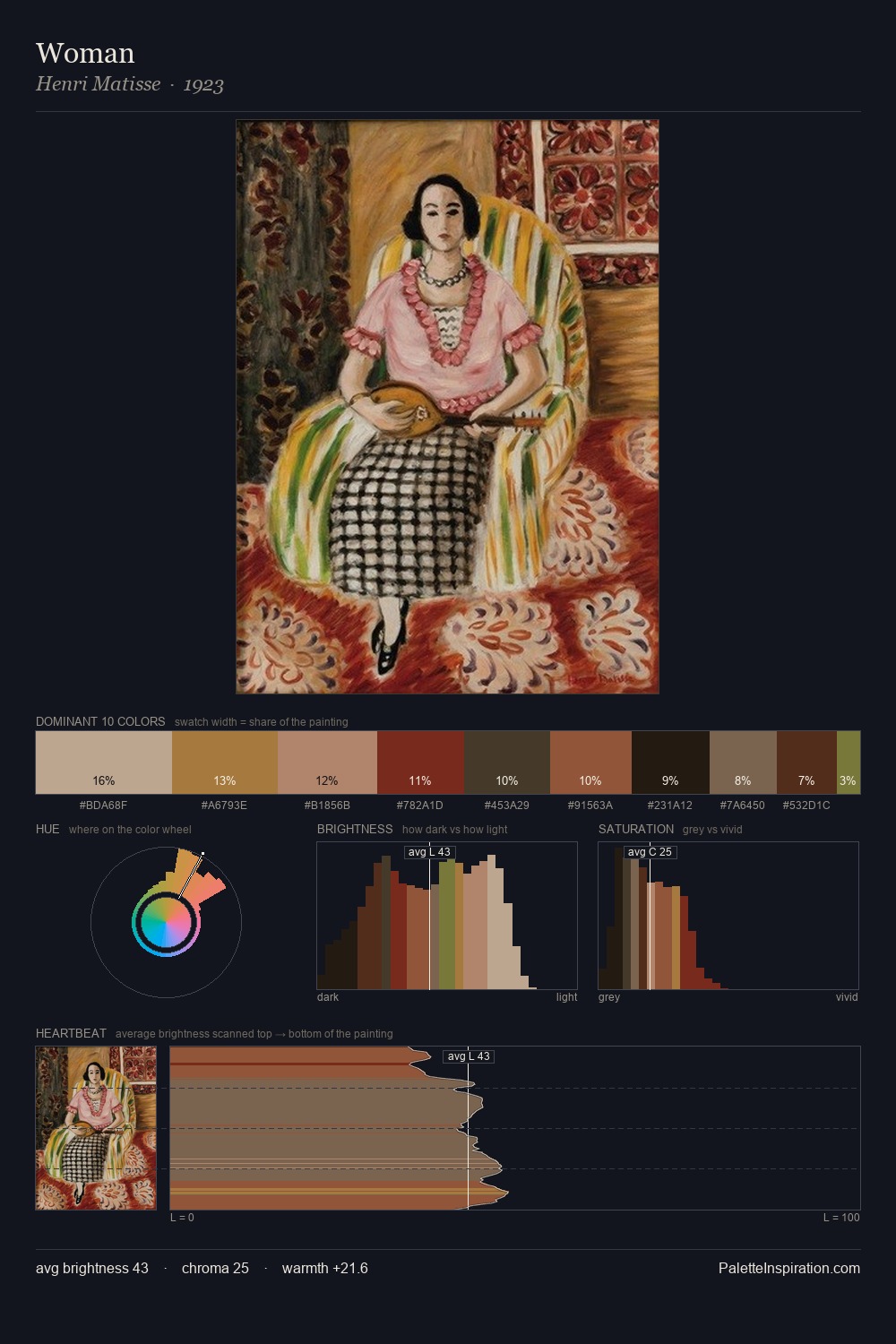
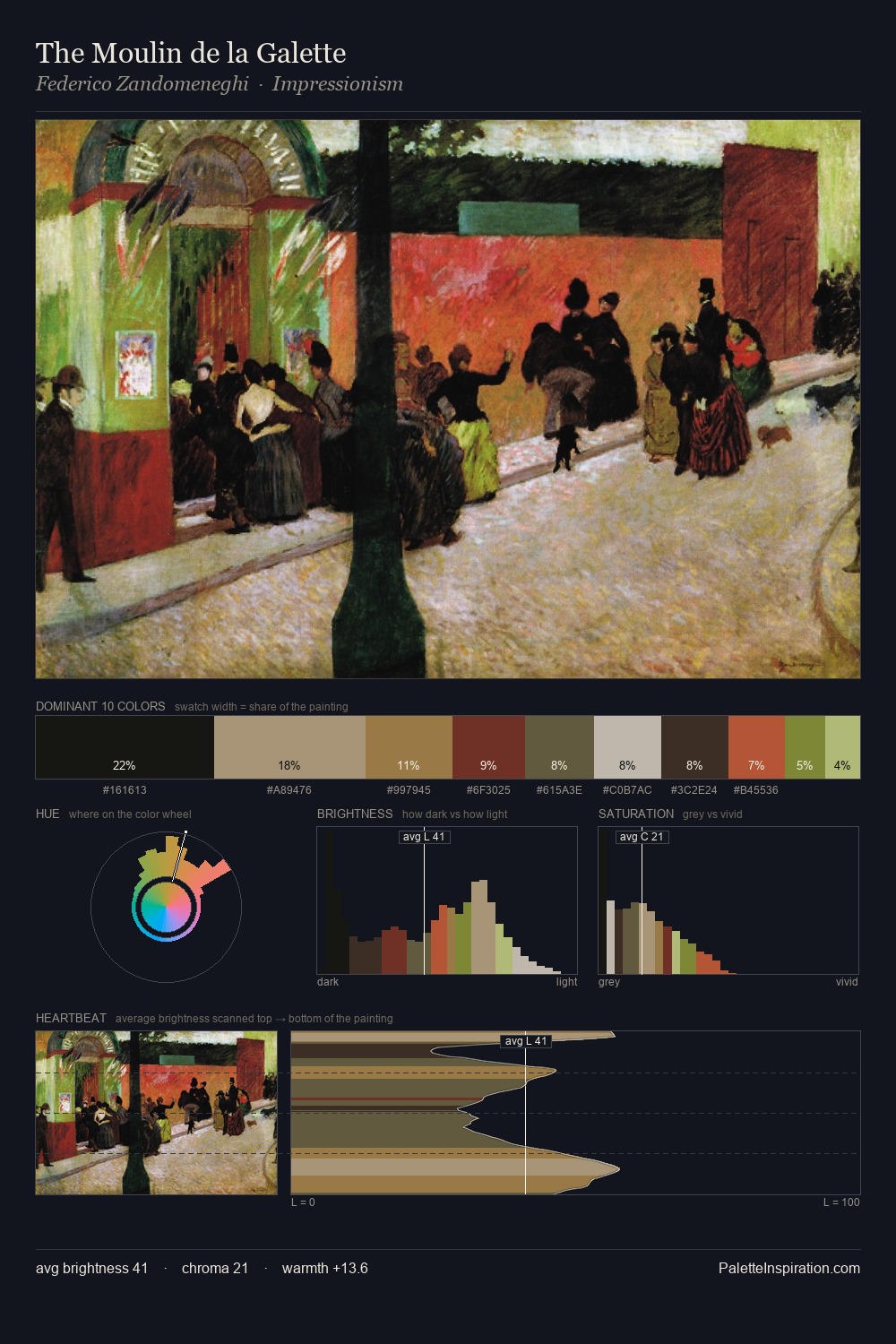
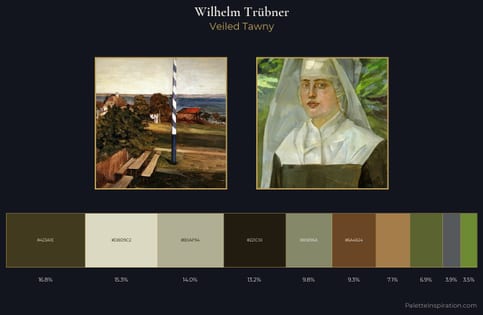
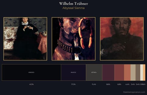
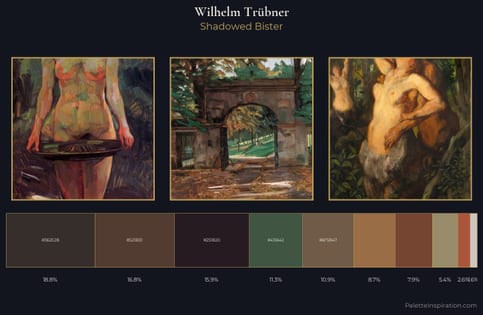
Wilhelm Trübner sits in the centre of the value range, lending the palette a sense of even, sustained light. Warmth dominates - the palette of Wilhelm Trübner leans heavily on the yellow-orange-red arc of the colour wheel. The absence of saturated colour is itself an expressive choice: this is a palette of restraint and atmosphere. Only 8.3% is devoted to #AC7D51, yet that small allocation delivers the palette's entire chromatic tension. A value spread of 59 units gives the palette both depth and air - shadows are genuinely dark, lights genuinely light. The palette is recognisably Wilhelm Trübner's own: particular in its temperature, chroma, and the economy of its brightest note.
Example use cases
- film & entertainment
- fine dining
- spirits branding
- menswear
- theater design
I Love This!
Use This Palette
Copy, export, or download for your project
Copy, export, or download for your project
Copy:
Download:
Share: