Vilhelm Hammershoi Palette 5
Palette Analysis
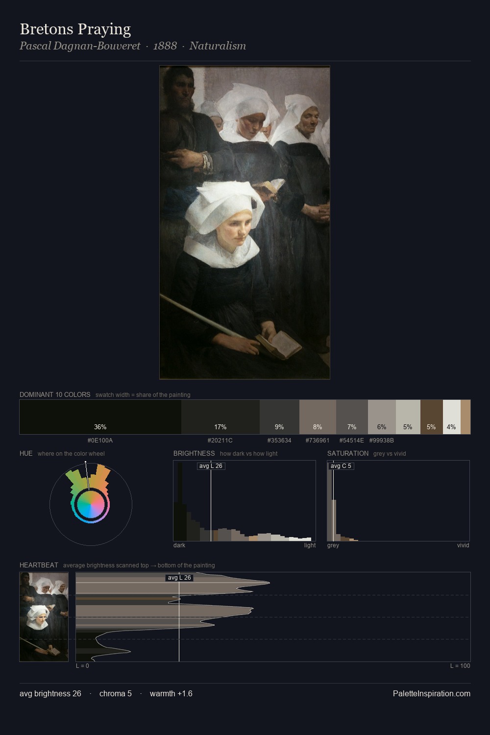
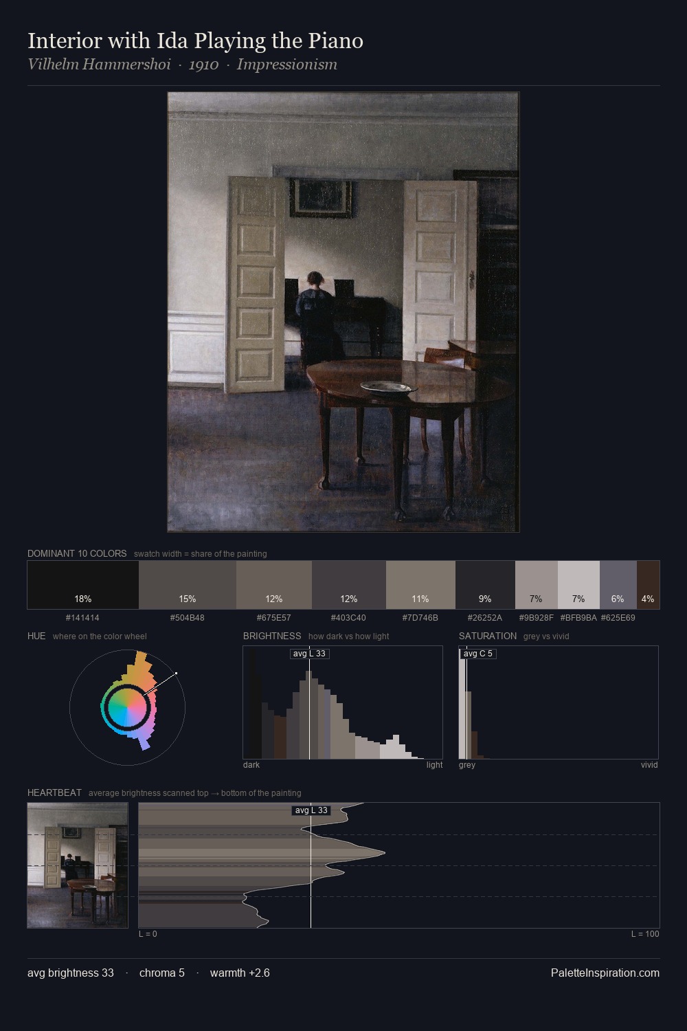
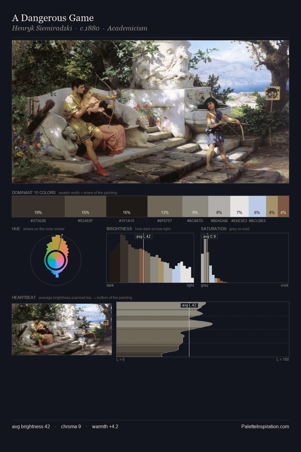
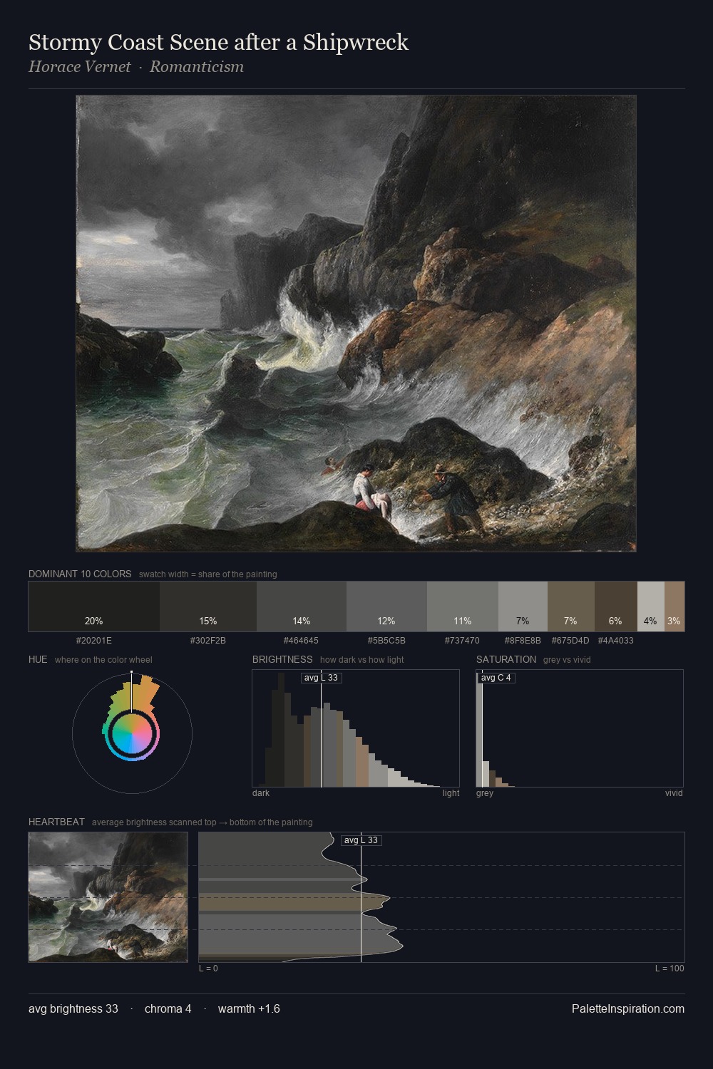
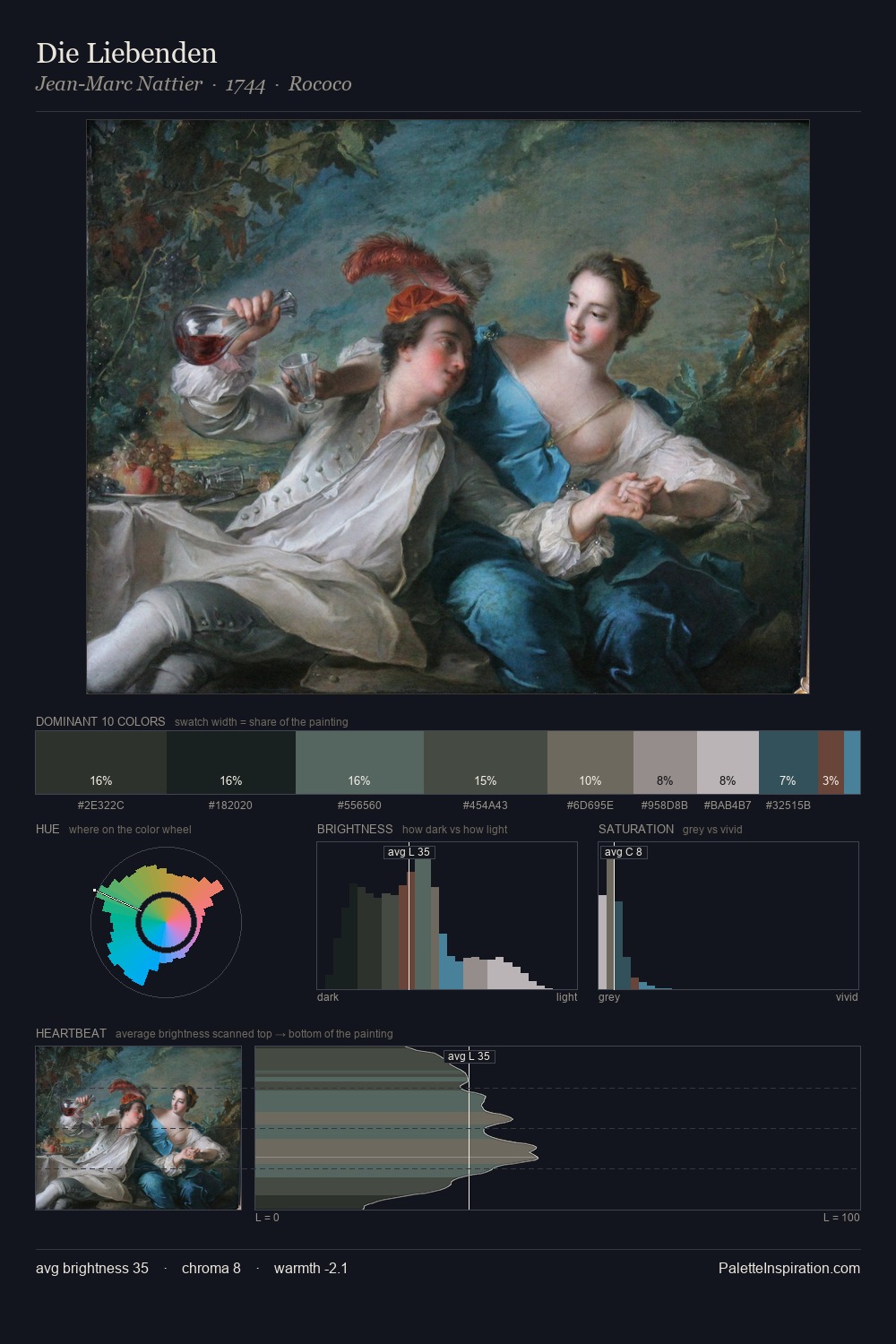
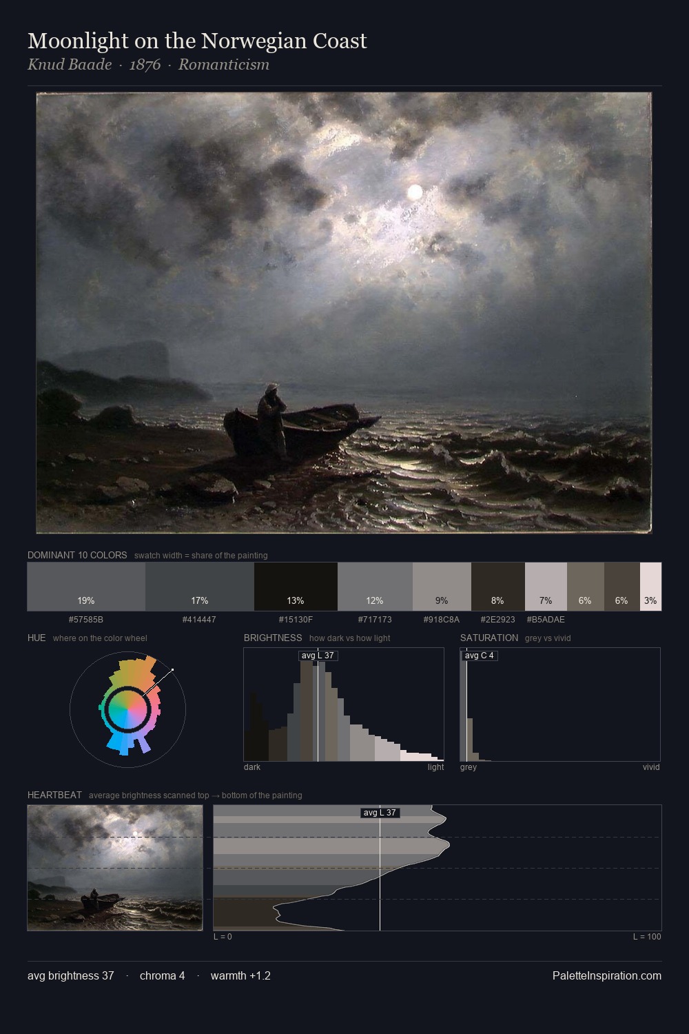
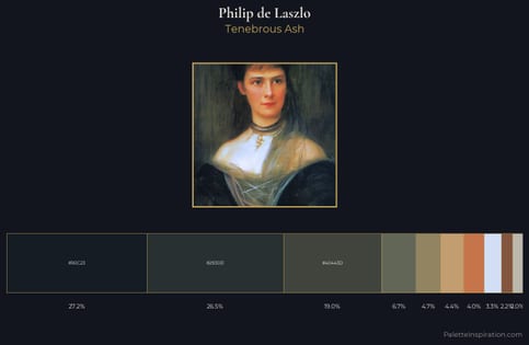
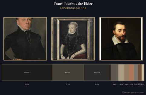
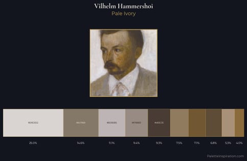
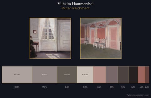
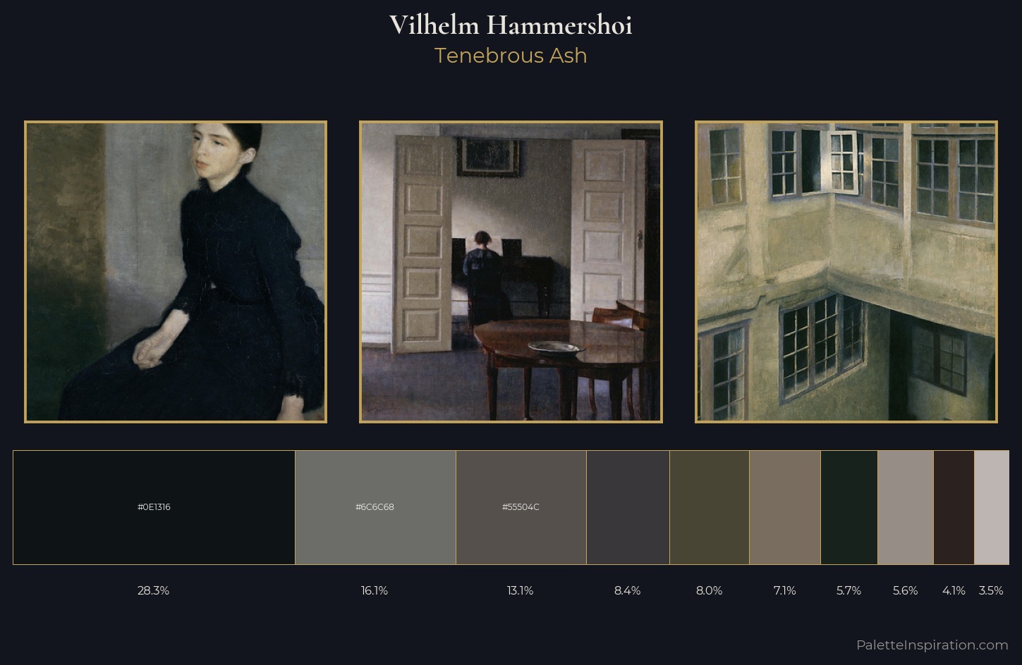
Vilhelm Hammershoi occupies the comfortable middle of the value scale, avoiding both extremes to hold the eye in a sustained middle grey. Temperature is cool-dominant, with blue and green families claiming the largest areas. All colours lean toward grey, building depth through value rather than colour punch. #0E1316 at 28.3% of the palette: an overwhelming presence that pulls all other colours into its gravitational field. The saturated accent, #2B211E, registers at 4.1% - sparse enough to feel like a deliberate surprise. A value spread of 60 units gives the palette both depth and air - shadows are genuinely dark, lights genuinely light. High luminosity and cool temperature suggest the plein-air condition: unfiltered daylight and open sky. Palette 5 sits within the larger chromatic argument that Vilhelm Hammershoi's complete body of work advances.
Example use cases
- luxury automotive
- premium electronics
- private banking
- B2B platforms
- developer tools
I Love This!
Copy, export, or download for your project