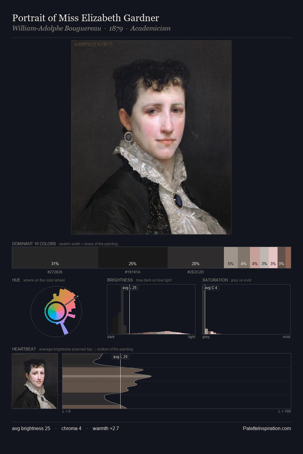
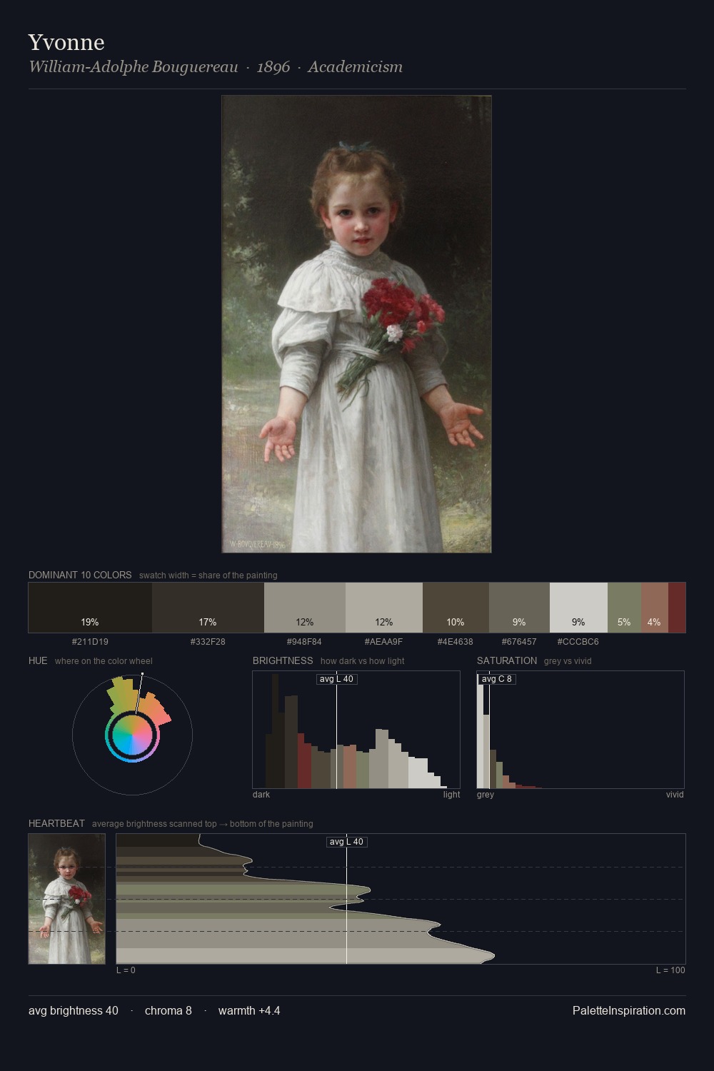
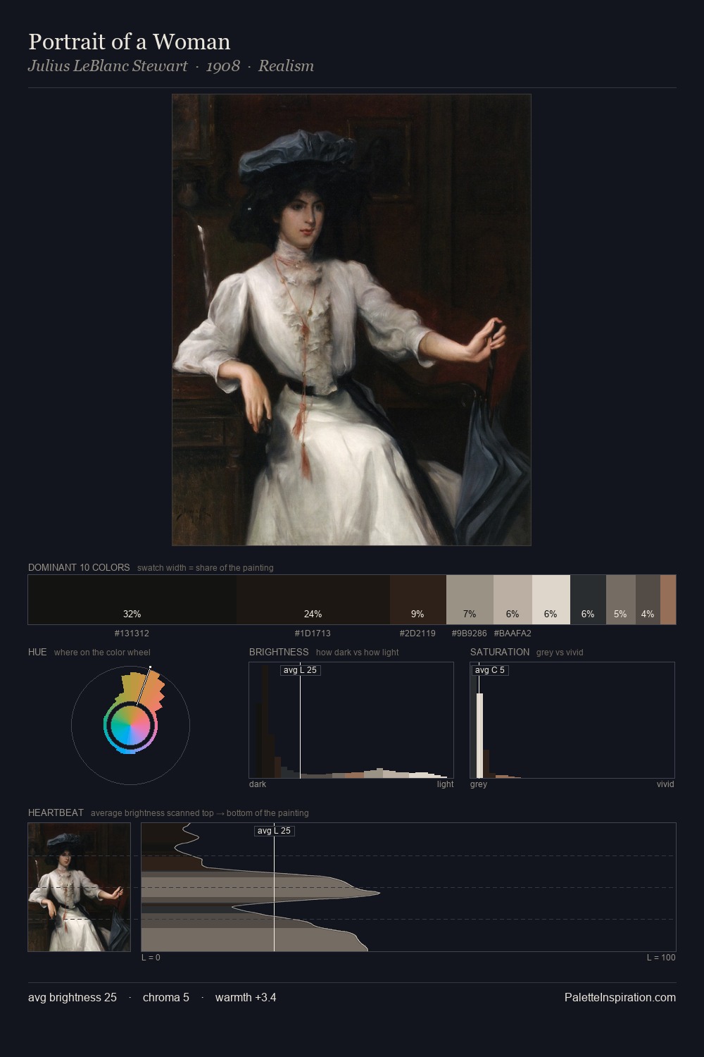
Vilhelm Hammershoi Master Palette
Shadowed Parchment
Shadowed Low-key - values weighted toward shadow, the palette of dim interiors and overcast skies.
Parchment Aged warm neutral - the color of old manuscript parchment, tan and slightly yellowed.

Palette Analysis
Vilhelm Hammershoi keeps values measured and balanced, a hallmark of tonal restraint. Warm hues command this palette; Vilhelm Hammershoi favours the reds, oranges, and yellows of firelight and earth. All colours lean toward grey, building depth through value rather than colour punch. Only 2.0% is devoted to #9C665F, yet that small allocation delivers the palette's entire chromatic tension. A value spread of 60 units gives the palette both depth and air - shadows are genuinely dark, lights genuinely light. This is the light Vilhelm Hammershoi preferred, made measurable.
Example use cases
- museums & galleries
- academic publishing
- heritage brands
- auction houses
- exhibition design
I Love This!
Use This Palette
Copy, export, or download for your project
Copy, export, or download for your project
Copy:
Download:
Share: