Vilhelm Hammershoi Palette 3
Muted Parchment
Muted Deliberately desaturated - chroma pulled toward gray, the restraint of tonal painting.
Parchment Aged warm neutral - the color of old manuscript parchment, tan and slightly yellowed.

Palette Analysis
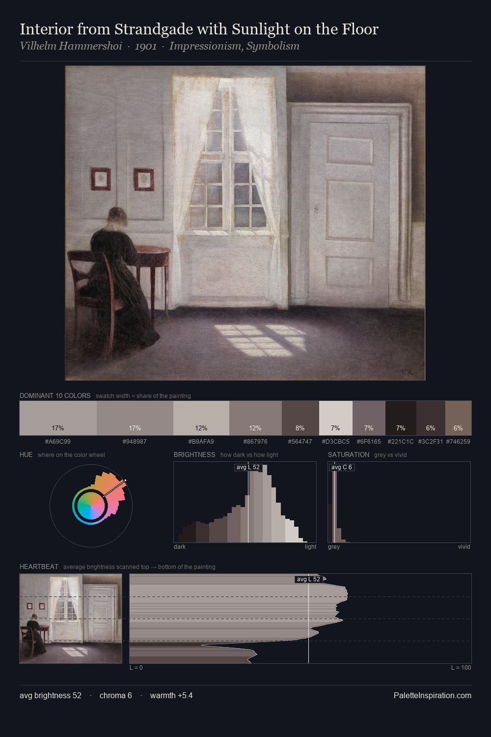
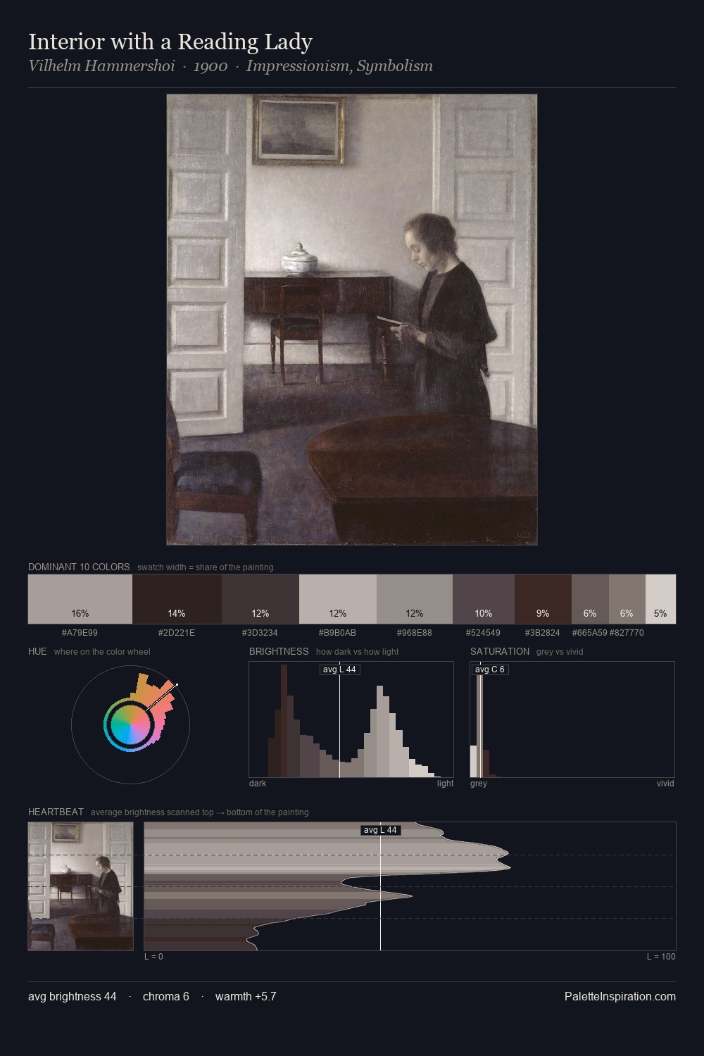
Vilhelm Hammershoi distributes its values across the middle register, creating harmony without high contrast. Warmth dominates - the palette of Vilhelm Hammershoi leans heavily on the yellow-orange-red arc of the colour wheel. Chroma hovers near zero; colour declares itself through subtle shifts in hue rather than outright saturation. #514138 functions as the palette's exclamation mark: highest chroma, lowest percentage (8.2%). The value range of 53 units sits in the comfortable middle: enough depth, enough light, neither extreme. Palette 3 sits within the larger chromatic argument that Vilhelm Hammershoi's complete body of work advances.
Example use cases
- archival print
- university identity
- rare books
- cultural institutions
- nonprofit identity
I Love This!
Use This Palette
Copy, export, or download for your project
Copy, export, or download for your project
Copy:
Download:
Share: