Frans Pourbus the Elder Palette 1

Palette Analysis
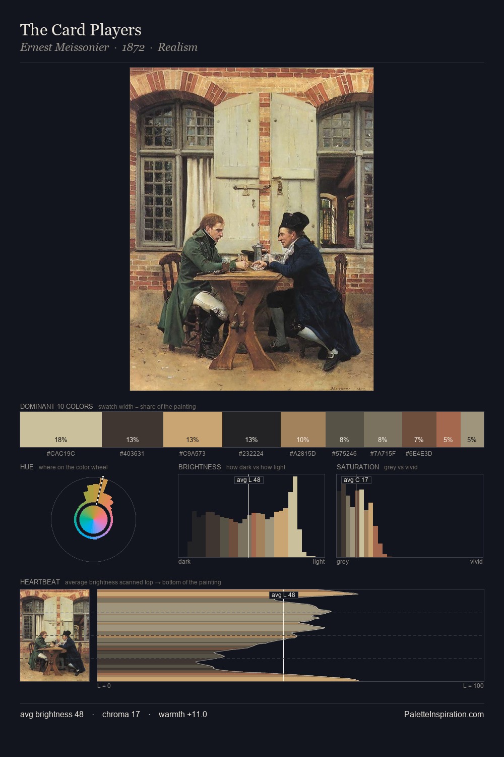
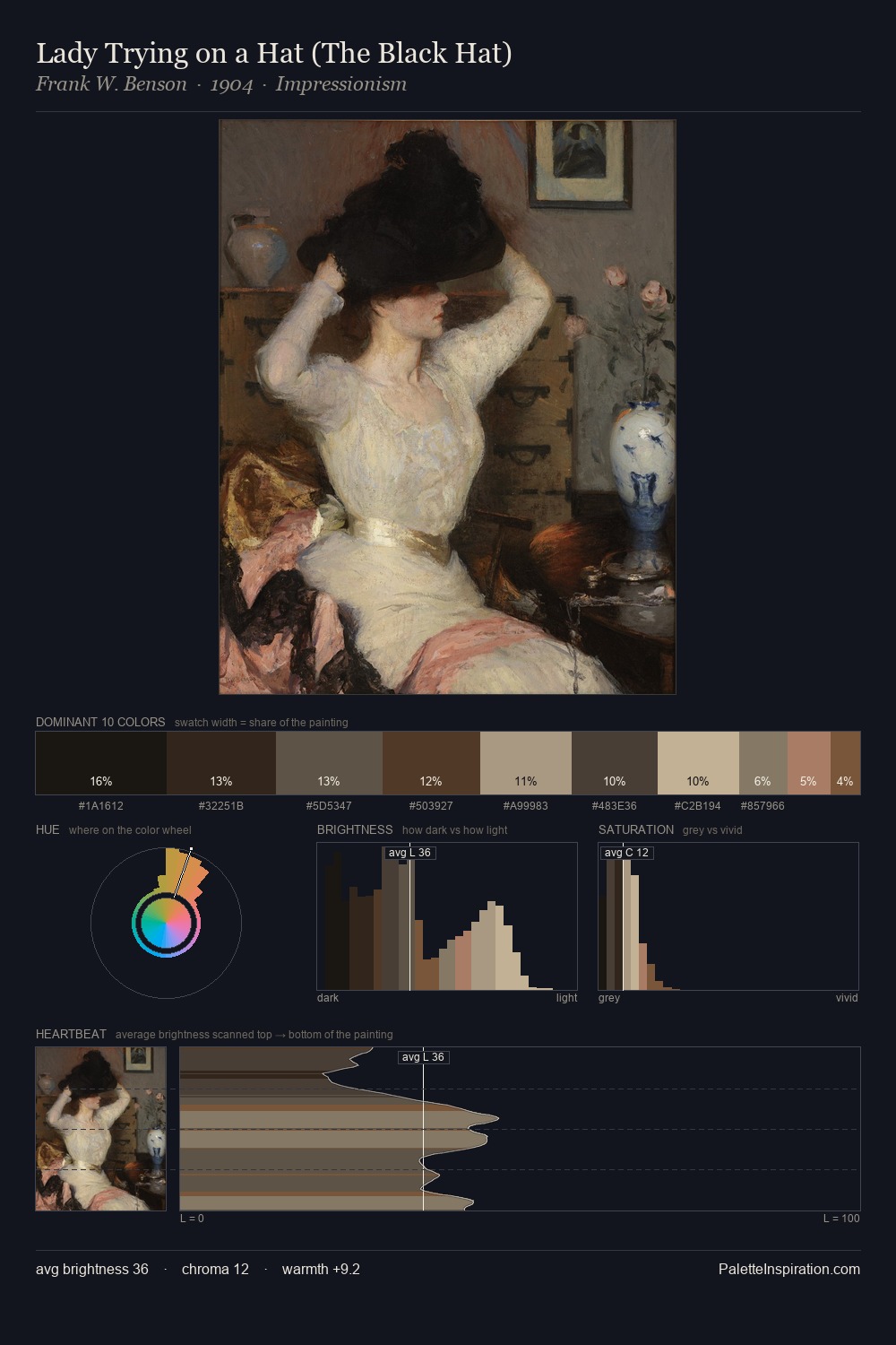
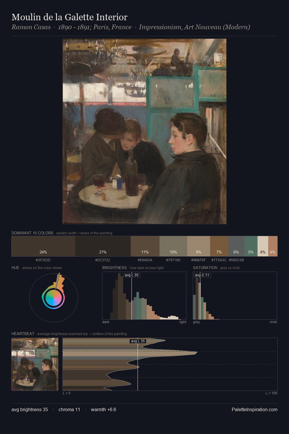
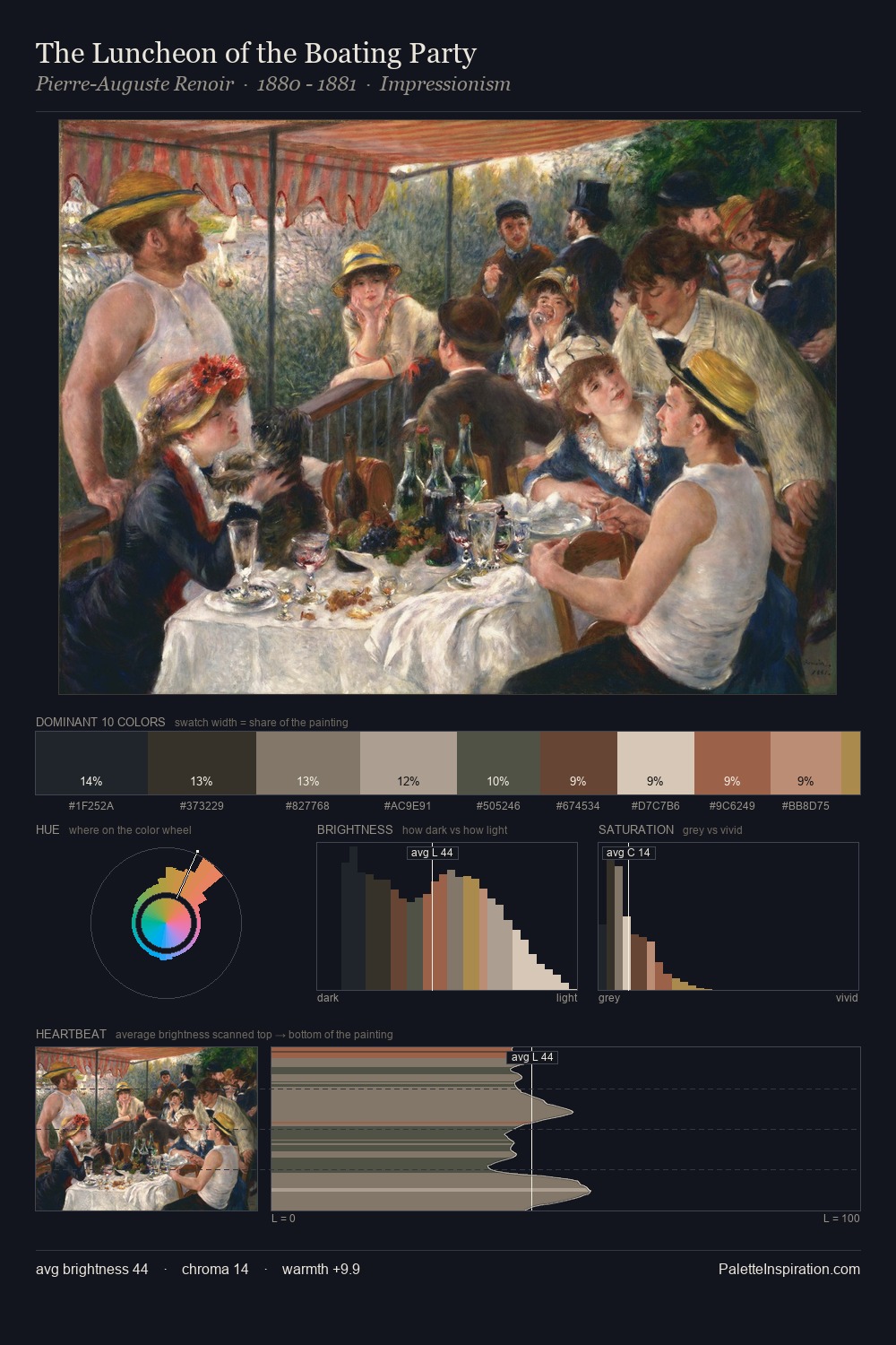
Frans Pourbus the Elder distributes its values across the middle register, creating harmony without high contrast. Blues and teal-greys govern the palette, lending it an aquatic or atmospheric quality. Saturation is deliberately withheld - the beauty here lies in the near-monochromatic gradations rather than colour difference. At 35.1%, #1D1D1B functions less as a colour accent and more as a complete atmospheric environment. The most saturated colour, #6E513A, is reserved to 2.5% of the surface, where it acts as a focal punctuation. The value range spans 58 units across the palette, providing the full gamut from deep shadow to near-white and ensuring clear tonal hierarchy. The palette has the character of outdoor light: cool, mid-bright, with colour rendered faithfully rather than expressively. Frans Pourbus the Elder's palette 1 carries its own internal logic while remaining in conversation with the artist's broader colour intelligence.
Example use cases
- theater design
- jewelry brands
- tobacco-adjacent retail
- event branding
- film & entertainment
I Love This!
Copy, export, or download for your project