Vilhelm Hammershoi Palette 4
Penumbral Sienna
Penumbral Partial shadow - the transitional zone between light and full dark, soft-edged.
Sienna Warm red-brown earth - named after the Sienese pigment, a fundamental artist earth color.

Palette Analysis
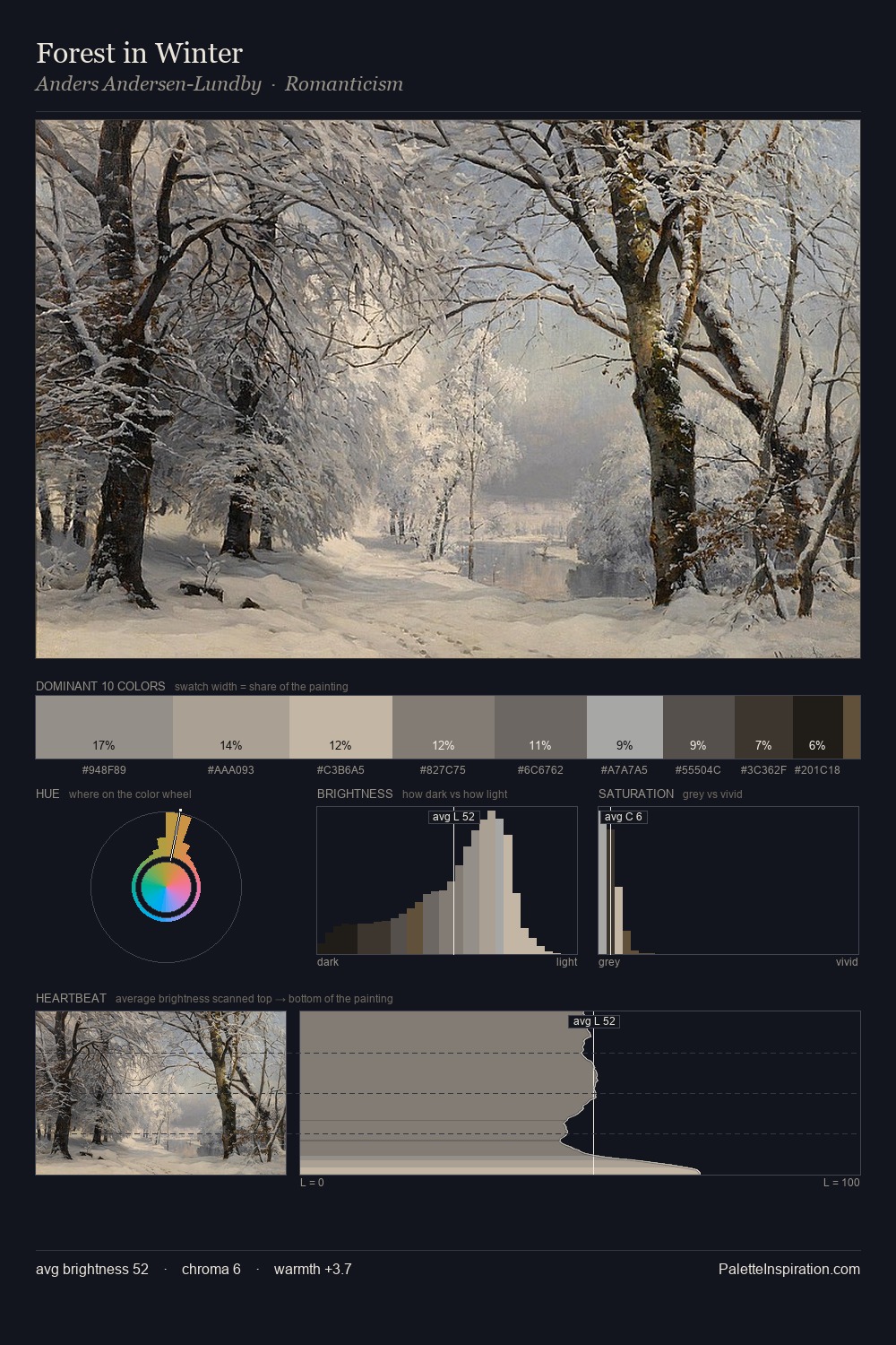
Vilhelm Hammershoi distributes its values across the middle register, creating harmony without high contrast. Yellow, ochre, sienna: warm hues that Vilhelm Hammershoi deploys as the palette's primary energy. Saturation is deliberately withheld - the beauty here lies in the near-monochromatic gradations rather than colour difference. Rather than a studied accent, #604F3E takes 8.6% - a bold allocation that saturates the composition's atmosphere. From deepest dark to palest light, the palette traverses 58 units of the value scale - a span that creates natural depth. Palette 4 sits within the larger chromatic argument that Vilhelm Hammershoi's complete body of work advances.
Example use cases
- theater design
- jewelry brands
- tobacco-adjacent retail
- event branding
- film & entertainment
I Love This!
Use This Palette
Copy, export, or download for your project
Copy, export, or download for your project
Copy:
Download:
Share: