Valentin Serov Palette 2

Palette Analysis
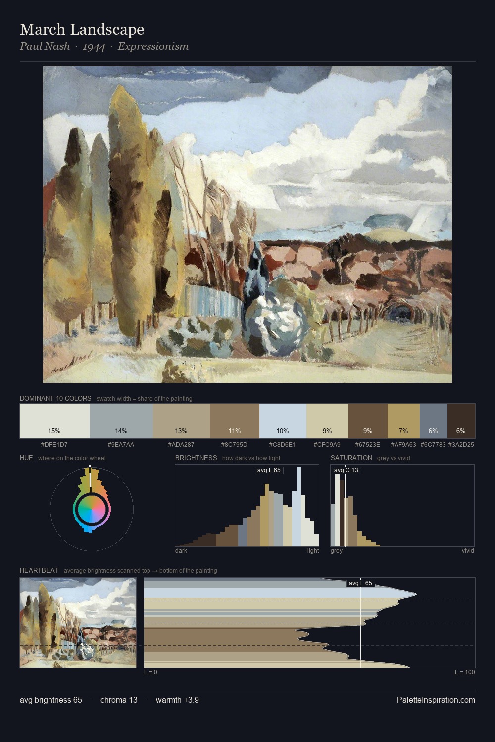
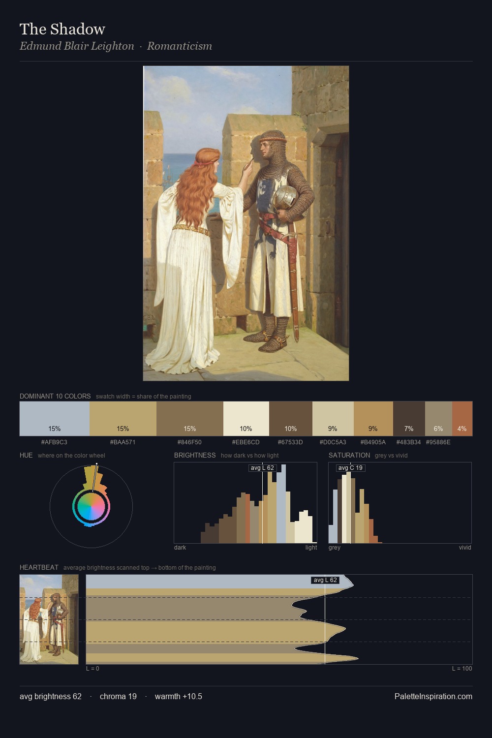
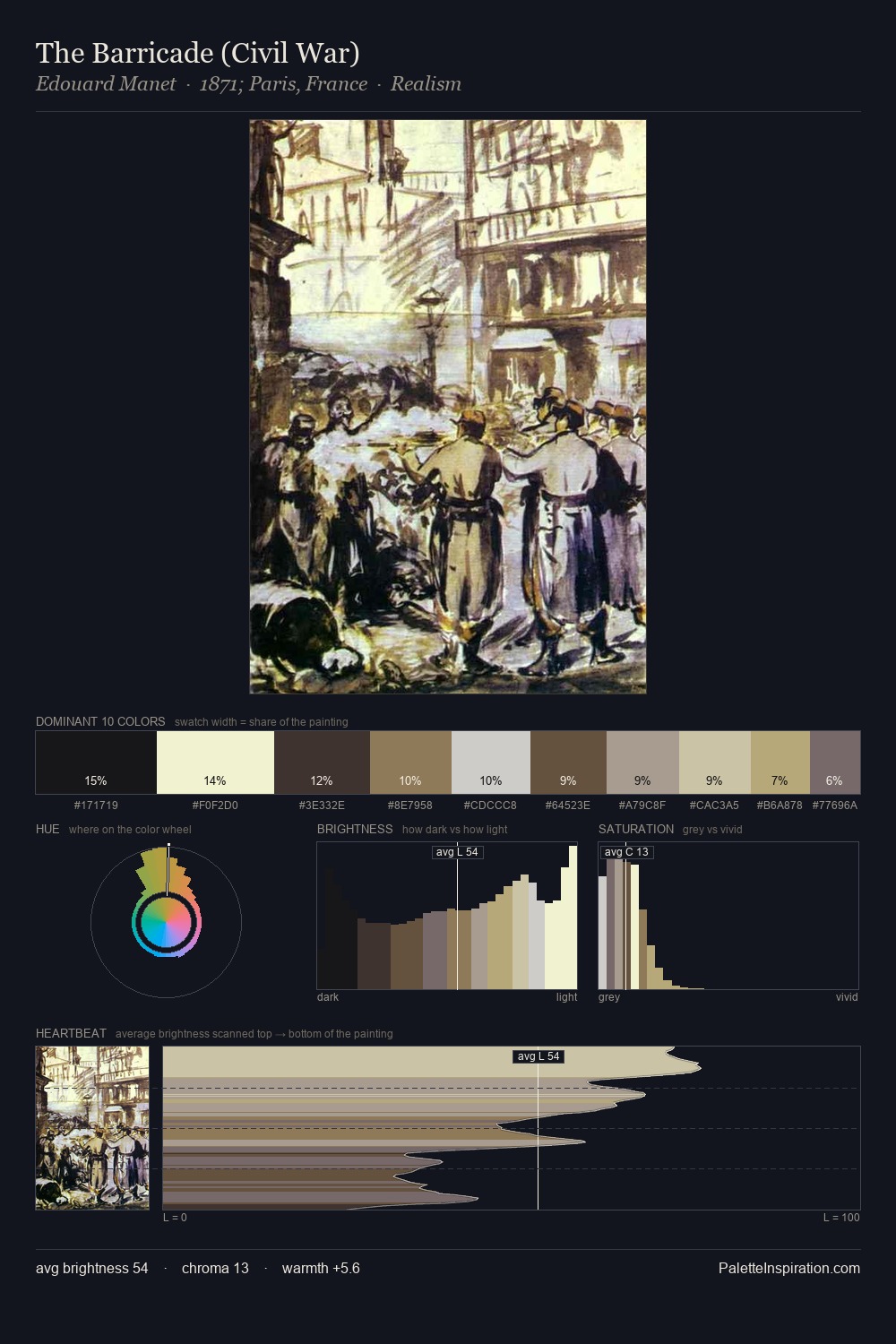
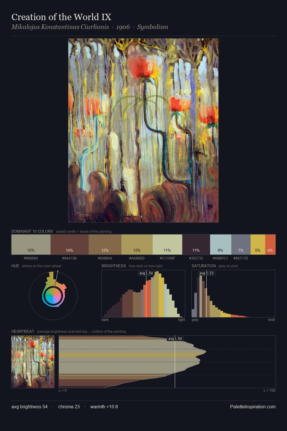
Valentin Serov occupies the comfortable middle of the value scale, avoiding both extremes to hold the eye in a sustained middle grey. Warmth dominates - the palette of Valentin Serov leans heavily on the yellow-orange-red arc of the colour wheel. Saturation is deliberately withheld - the beauty here lies in the near-monochromatic gradations rather than colour difference. At 8.1%, #CBBD9A carries the palette's sharpest chromatic charge: an accent that earns its place precisely because it is withheld. From deepest dark to palest light, the palette traverses 57 units of the value scale - a span that creates natural depth. In the context of Valentin Serov's full range of palettes, group 2 represents one movement in an ongoing chromatic dialogue.
Example use cases
- exhibition design
- foundation branding
- estate management
- art education
- museums & galleries
I Love This!
Copy, export, or download for your project