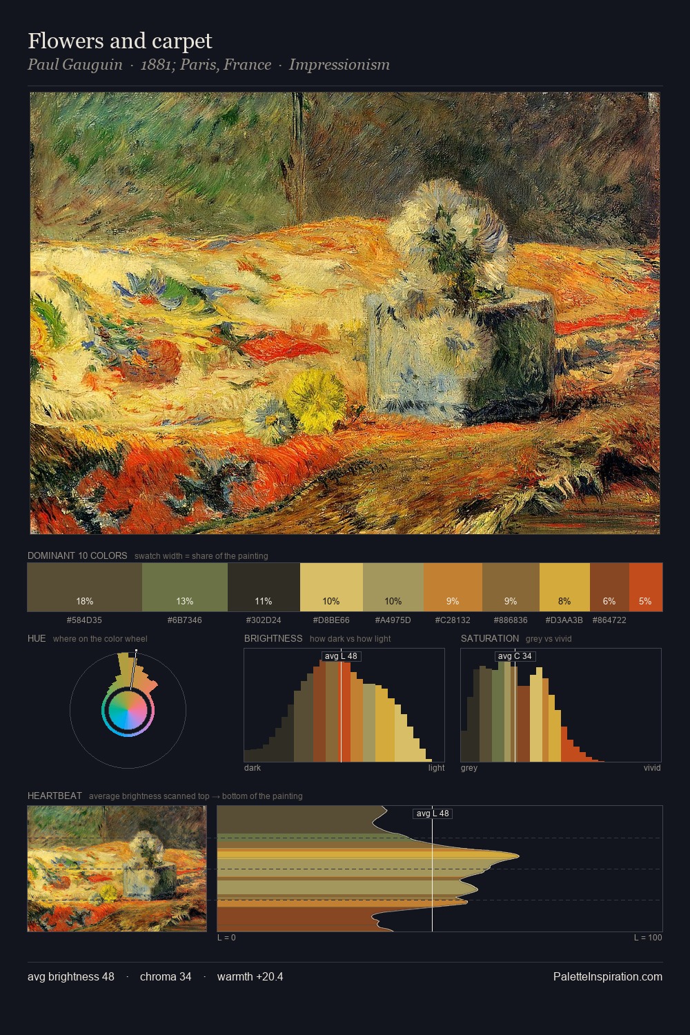
Valentin Serov Palette 13

Palette Analysis
Valentin Serov distributes its values across the middle register, creating harmony without high contrast. Warm and cool are kept in productive tension, creating the kind of chromatic harmony that sustains the eye. Saturation is deliberately withheld - the beauty here lies in the near-monochromatic gradations rather than colour difference. 25.2% of the palette belongs to #1B1816, a concentration that makes it the unmistakable visual centre. The highest-chroma note - #7E4219 - appears at just 2.2%, deployed as a precision accent against the quieter ground. The full value range is 58 units: broad enough to build convincing three-dimensional form. Valentin Serov's palette 13 carries its own internal logic while remaining in conversation with the artist's broader colour intelligence.
Example use cases
- theater design
- jewelry brands
- tobacco-adjacent retail
- event branding
- film & entertainment
I Love This!
Copy, export, or download for your project